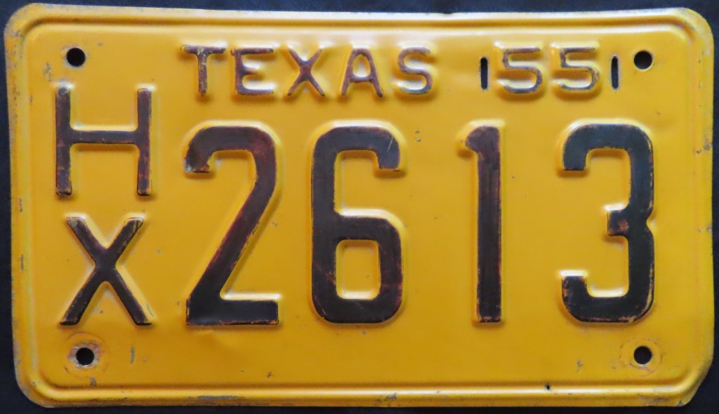
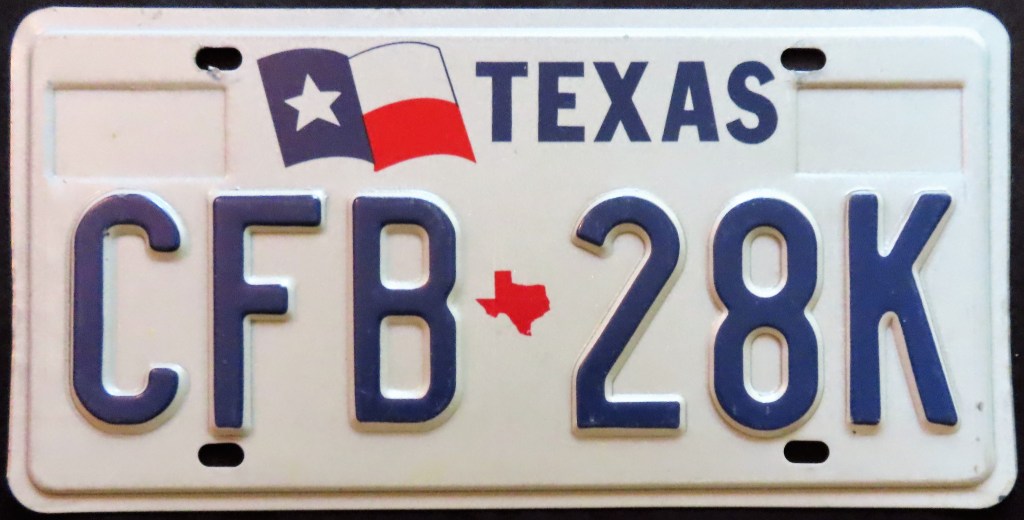
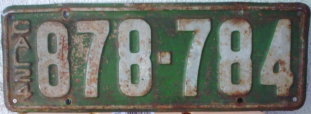
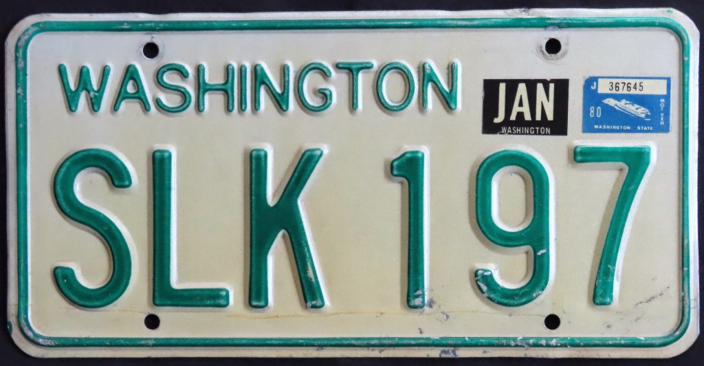
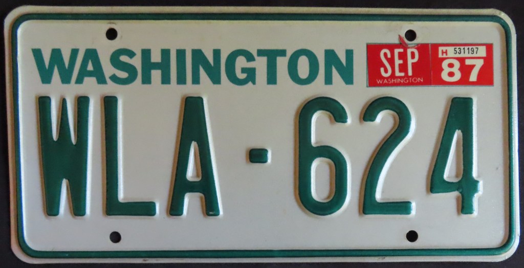
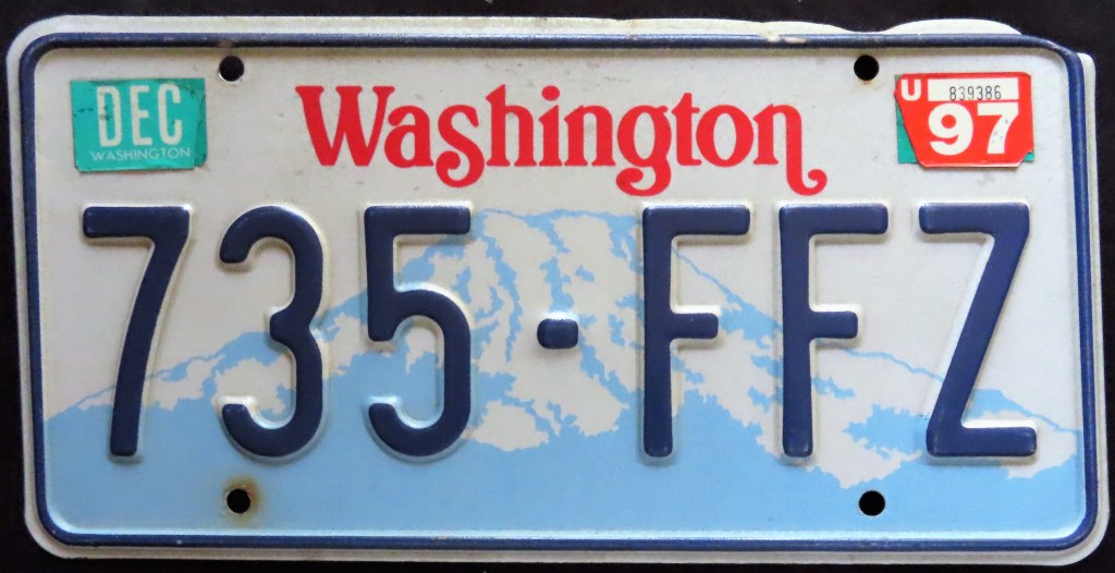
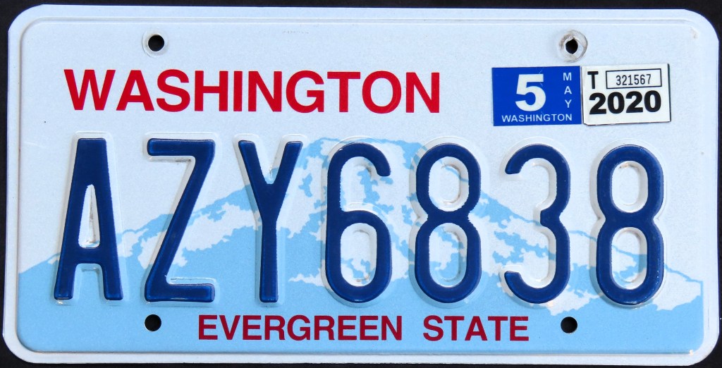
This page features a review of passenger and no- or low-cost optionals for all 50 states from my collection, put in order of states’ admittance to the Union.
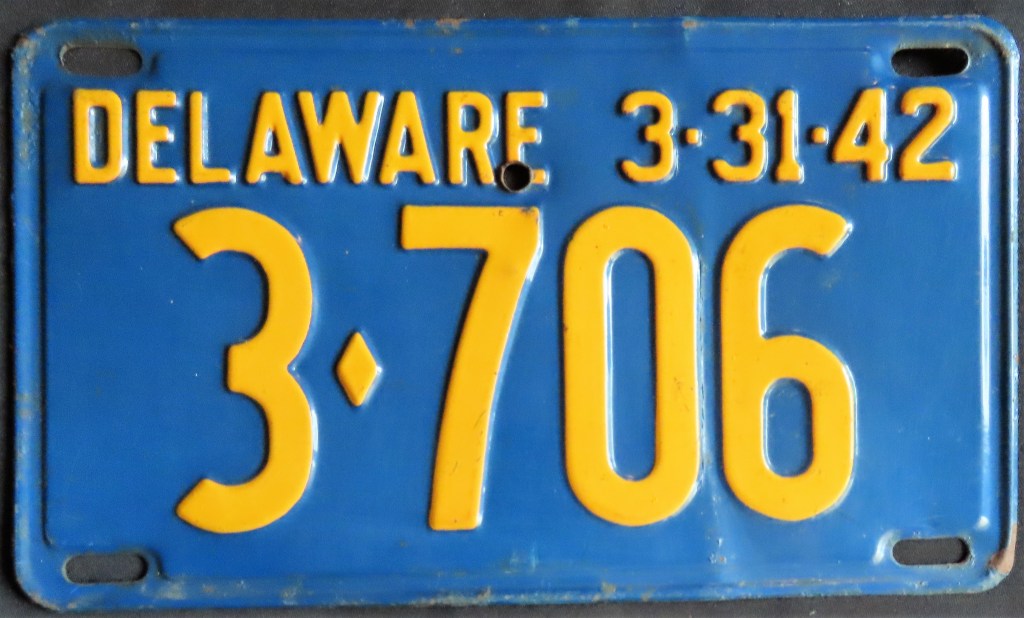
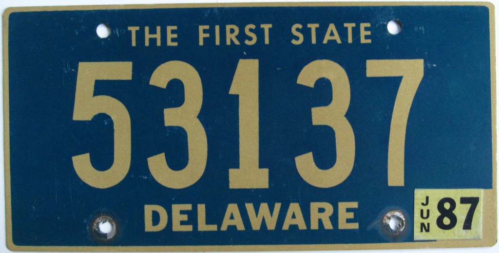
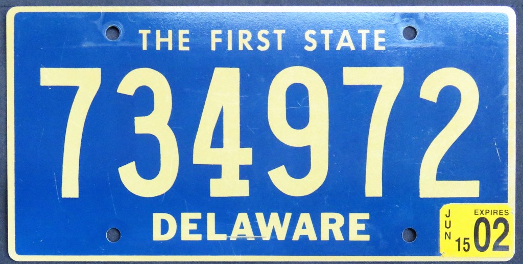
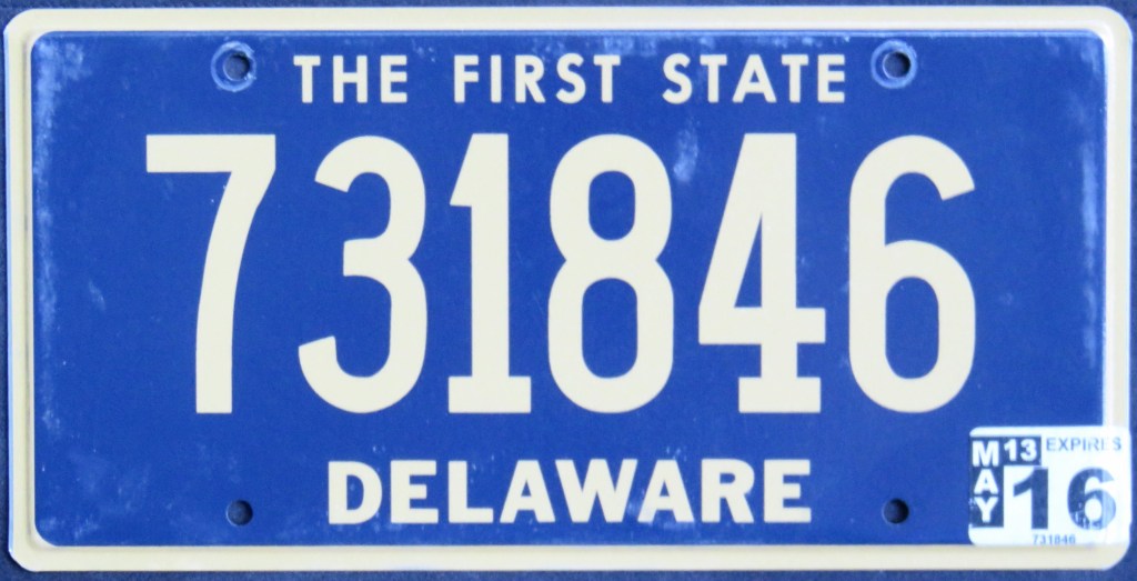
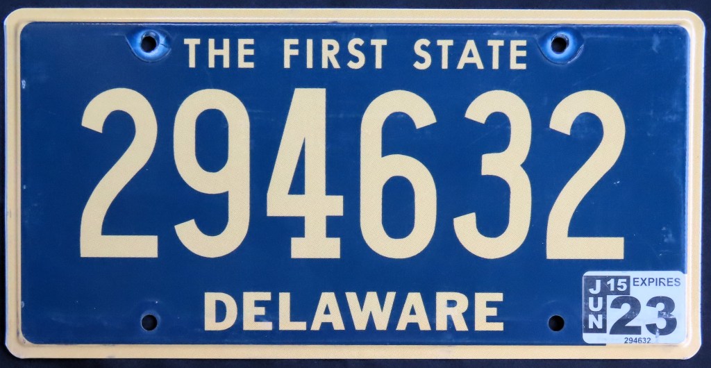
Delaware has had the same base plate since 1969, a flat gold-on-teal design. There’s been very minor changes, and the shade of color varies at times, but that’s it. The serial combination is all-numeric, and the state recycles unused combinations on new plates.
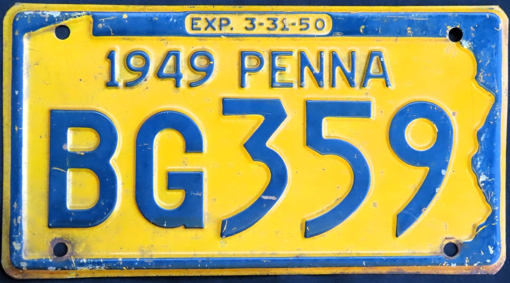
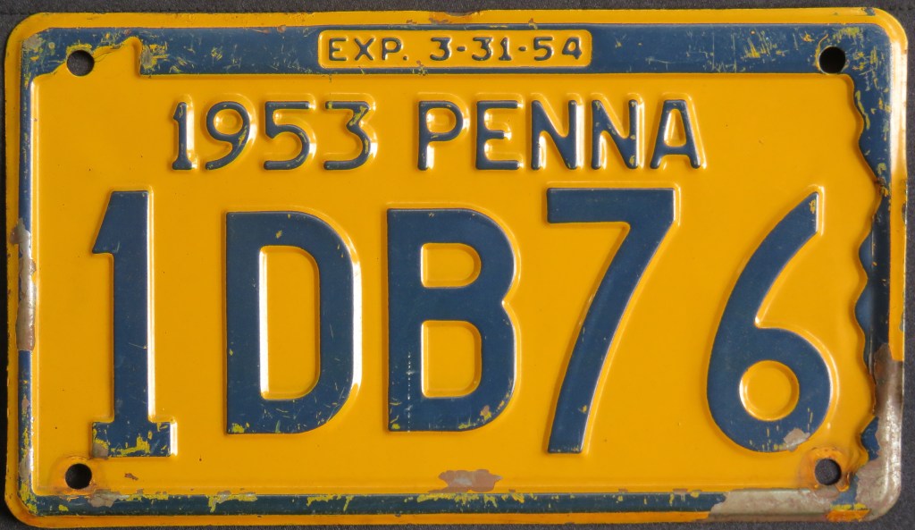
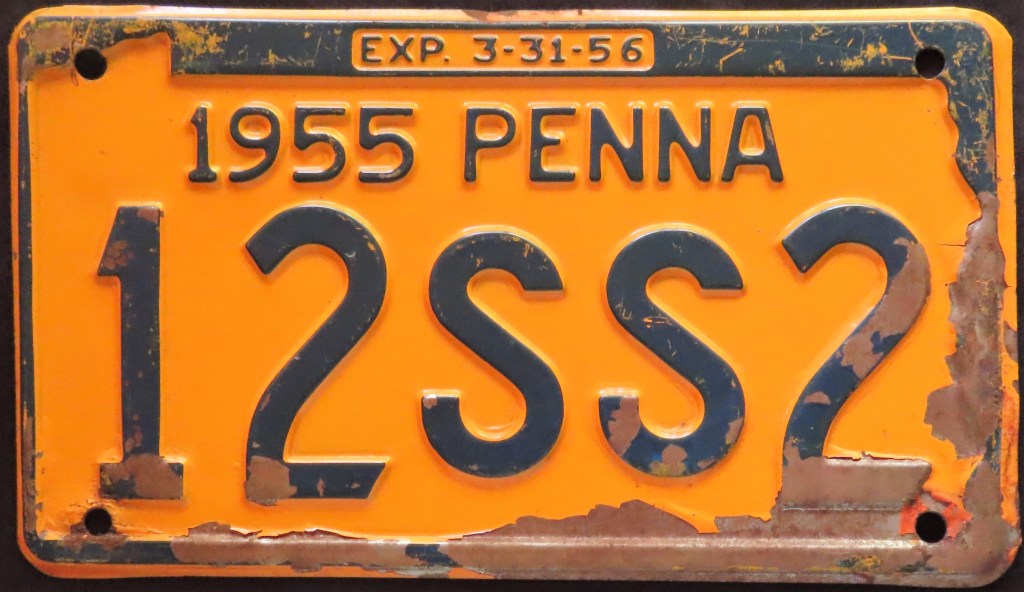
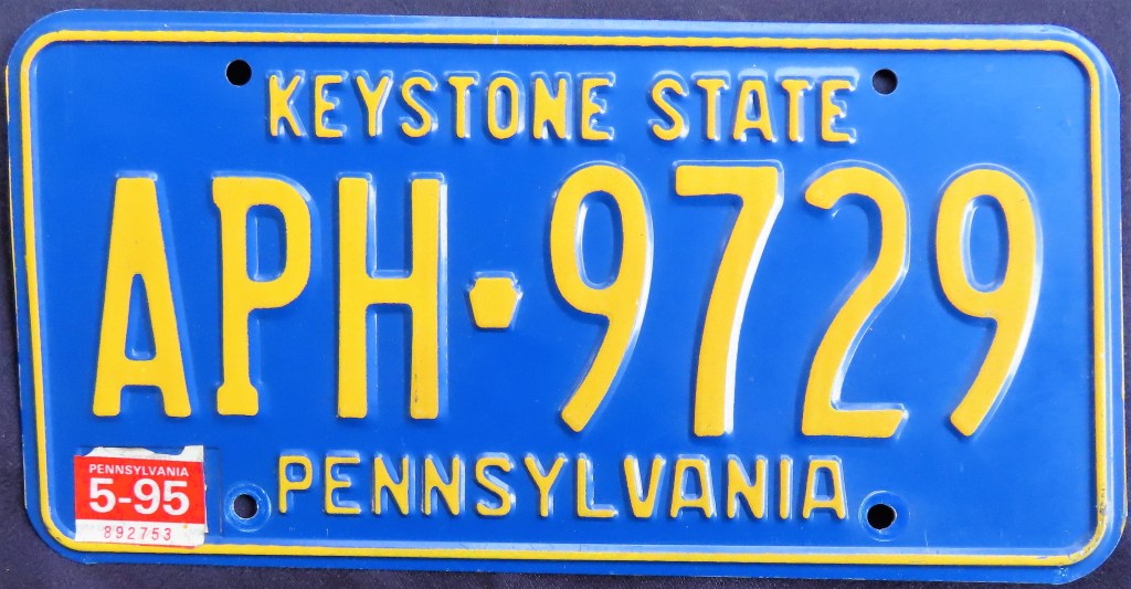
Pennsylvania did not spell out its name in full until the 1960s, when it also started using the keystone image with regularity. A couple of interesting bases include the US Bicentennial base, which was issued a full five years before the actual Bicentennial year (and didn’t follow the typical color scheme of red and/or blue), and the 1986 base featuring the unusual slogan “You’ve Got a Friend in”. In 2016, the state stopped issuing registration stickers (going with a windshield sticker), and put a state map outline in the no-longer-used sticker well.
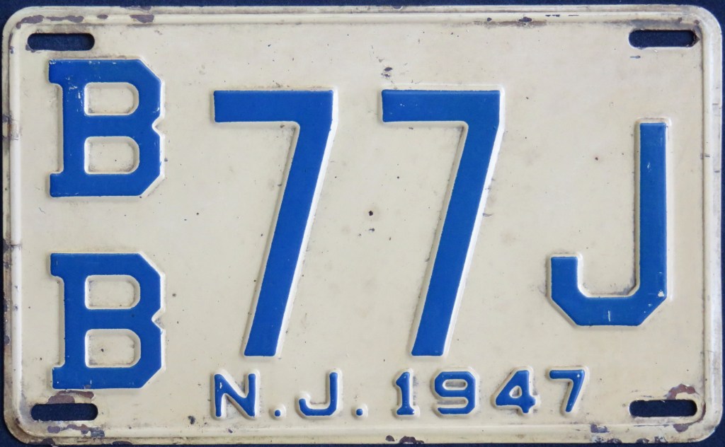
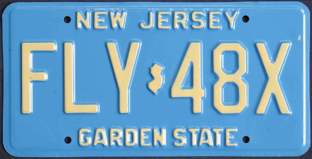
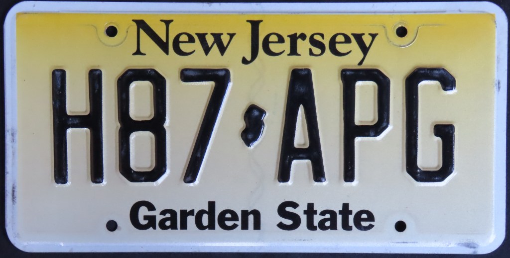
Like Pennsylvania, New Jersey was late to spell out its full name. The black-on-straw base debuted in 1959 and lasted 20 years with slight modifications. In 1979, one of my personal favorites, the buff-on-blue base with a state shape separator, hit the roads. Since 1993, the state has had the same basic base plate, with relatively small changes.
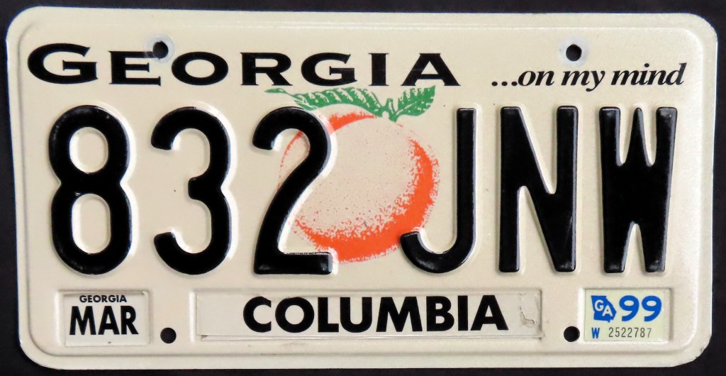
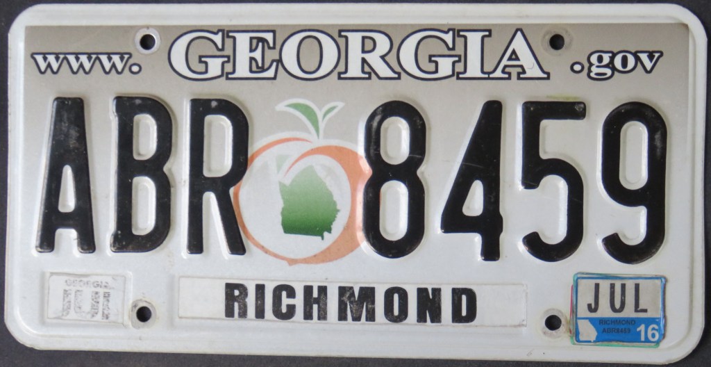
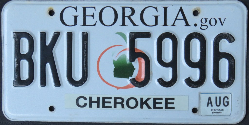
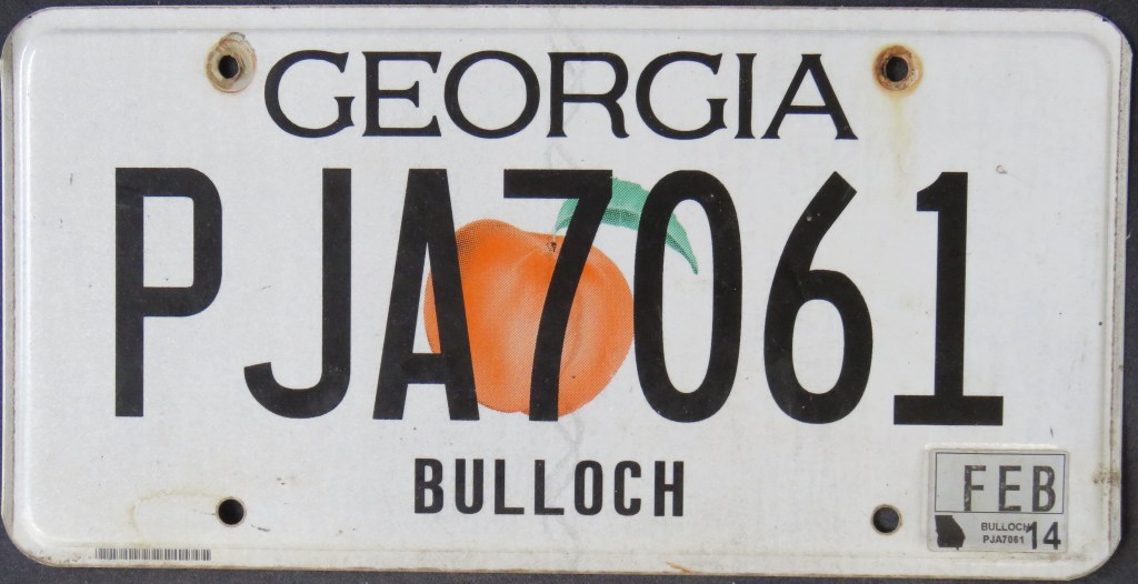
Apart from a prized 1941 issue which had a large peach decal in the center, and a US Bicentennial plate booster, Georgia issued fairly plain plates until 1990, when the peach made a triumphant return, replacing the “O” in the state name on a base also featuring a nice shade of peach on the bottom. Since then it’s been a part of each base. Motorists were split on the busy 2012 base, prompting an alternative base (PJA7061) to be offered concurrently.
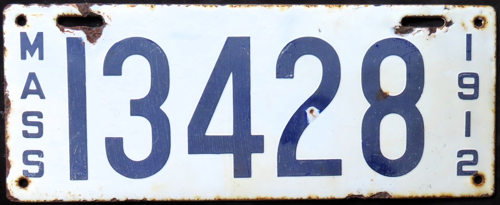
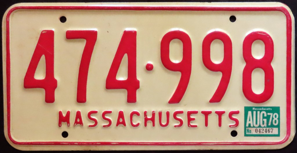
Massachusetts featured the abbreviation “MASS” from the first issue (1903, the first state-issued plate in the U.S.) through 1966, and the box design from 1947-1966. The state has used some varying serial formats over the years, as shown with the two blue-on-white bases. Massachusetts didn’t use a slogan until the 1993 “Spirit of America” base, which remains the current base.
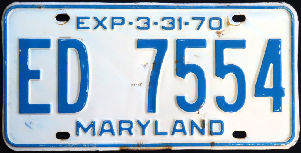
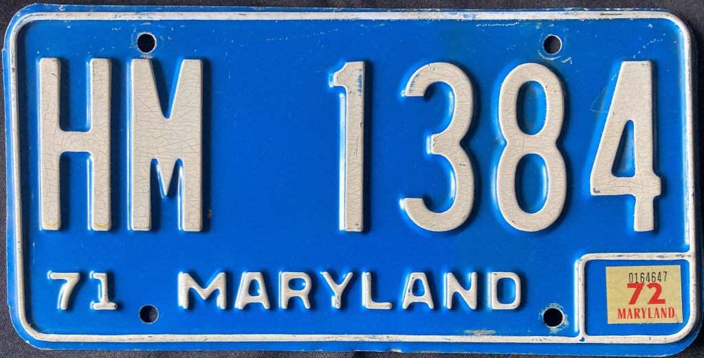
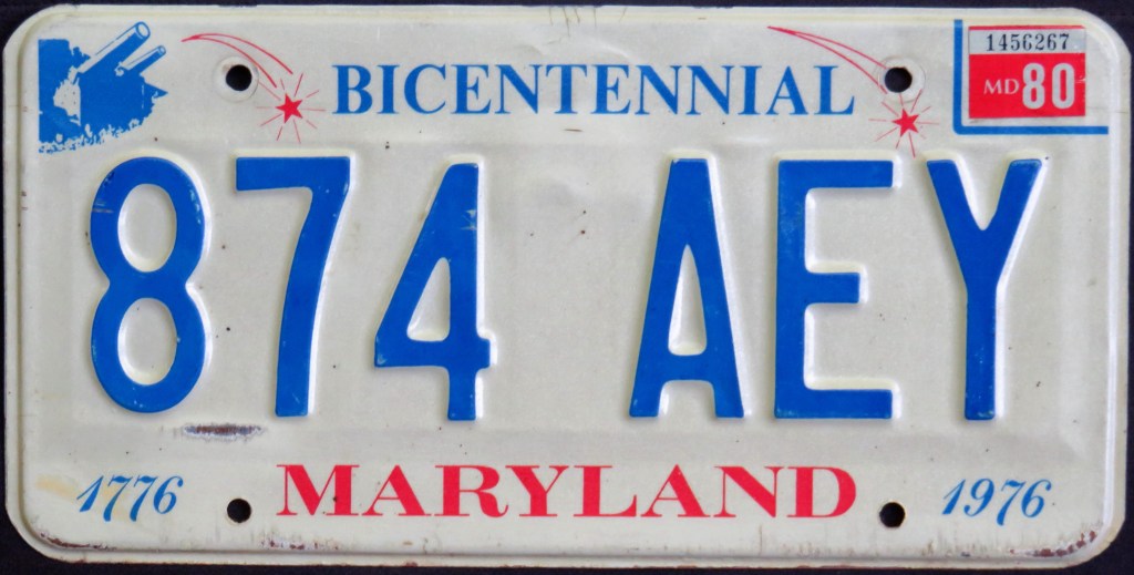
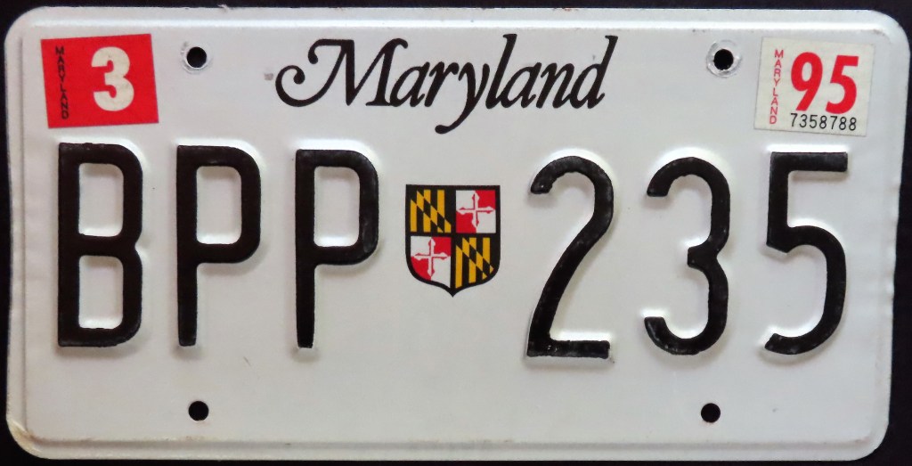
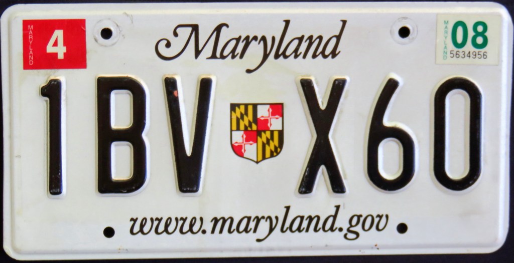
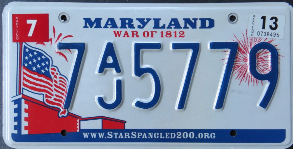
Maryland’s U.S. Bicentennial optional came out alongside the red-on-white 1976 base. Eight years later the 350th anniversary optional was popular enough that it became the basis for the 1986 “shield” base, used for many years thereafter with the modification of a website in 2005. New bases followed in 2010 and 2016.
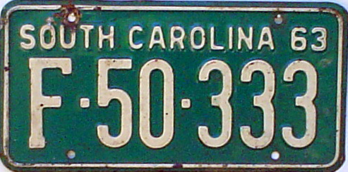
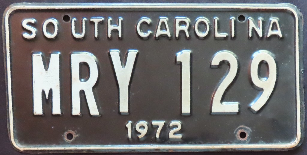
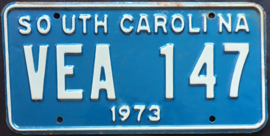
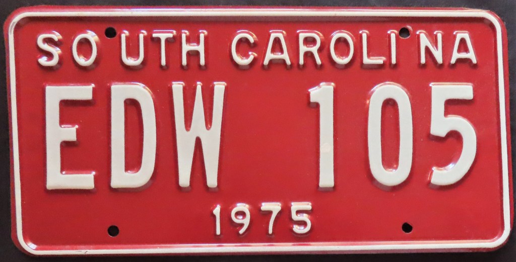
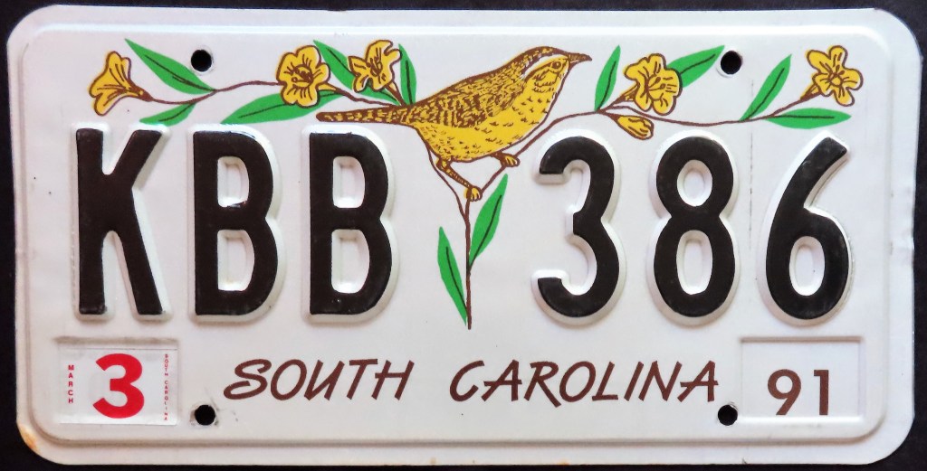
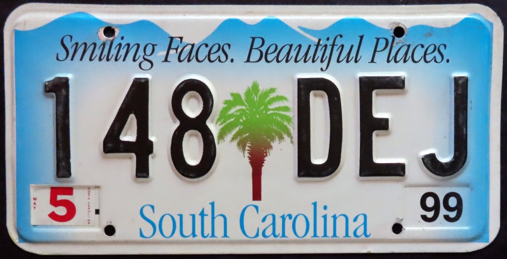
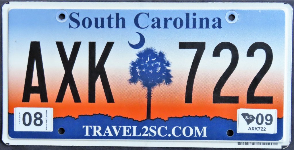
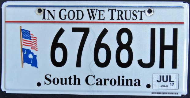
South Carolina initiated base plates with the 1976 U.S. Bicentennial issue. The 1981 base featured a state map and state seal, while most bases since included a palmetto (the state tree) separator. South Carolina went to flat plates midway through the 1999 “Smiling Faces. Beautiful Places.” base.
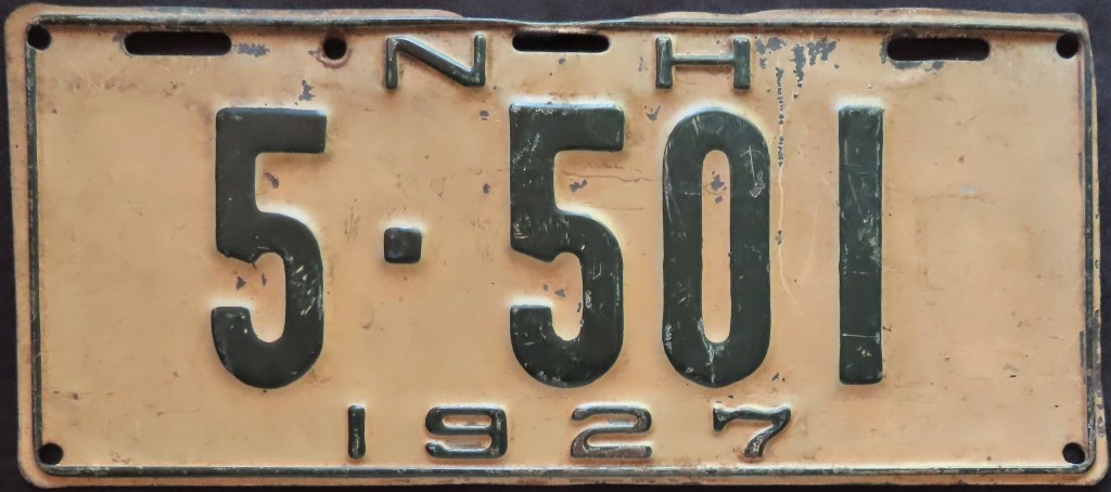
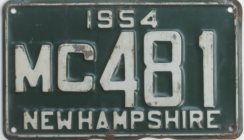
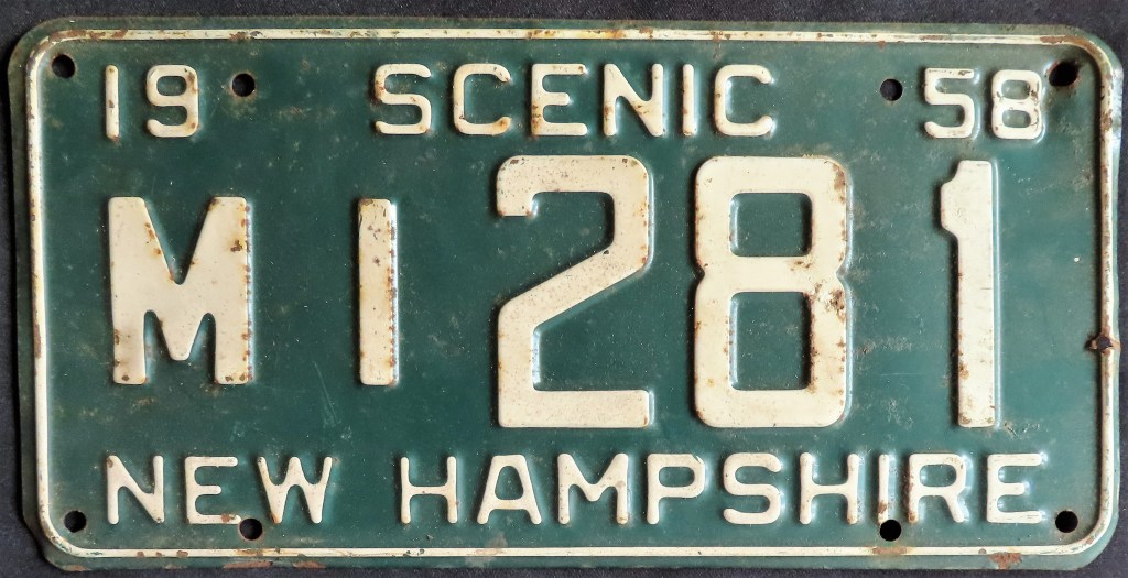
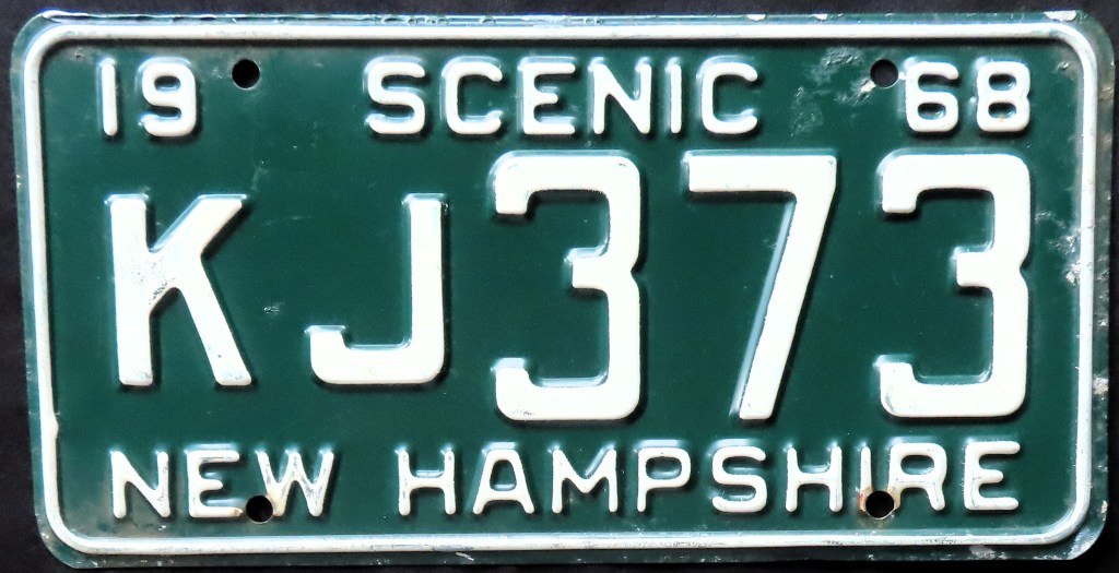
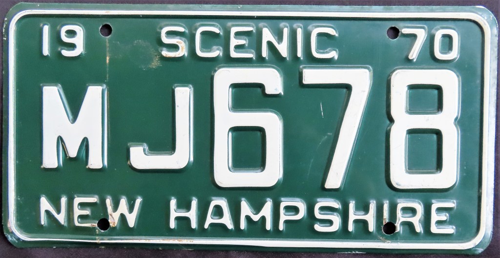
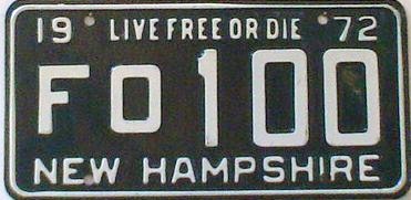
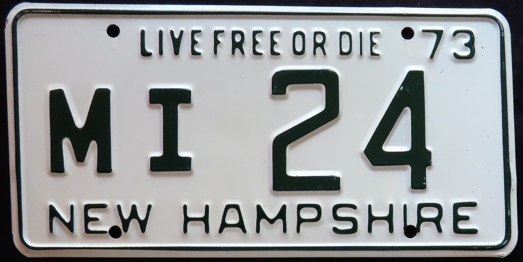
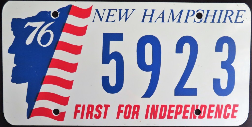
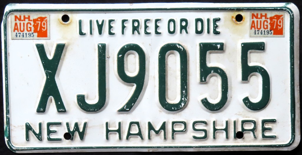
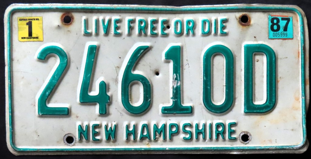
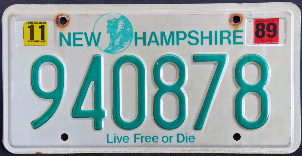
New Hampshire residents had green and white plates for the state’s entire license plate history until a short-lived red-on-white base in 1978. The governor felt it closely resembled the plate of nearby Massachusetts and had them sent back to the prison for a repaint (XE6118 is an example; note how the red paint is still visible). The 1980 base eliminated county codes (the alpha prefix). The slogan “Live Free or Die” and the Old Man of the Mountain have both been hallmarks in the last several decades. The U.S. Bicentennial booster was only issued to cover the front plate.
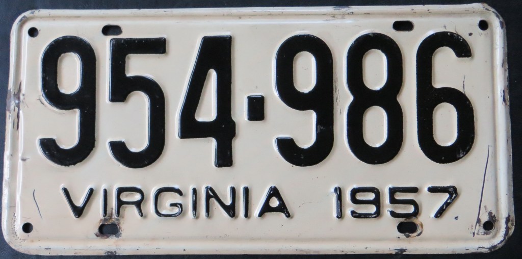
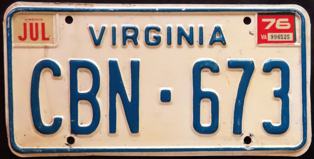
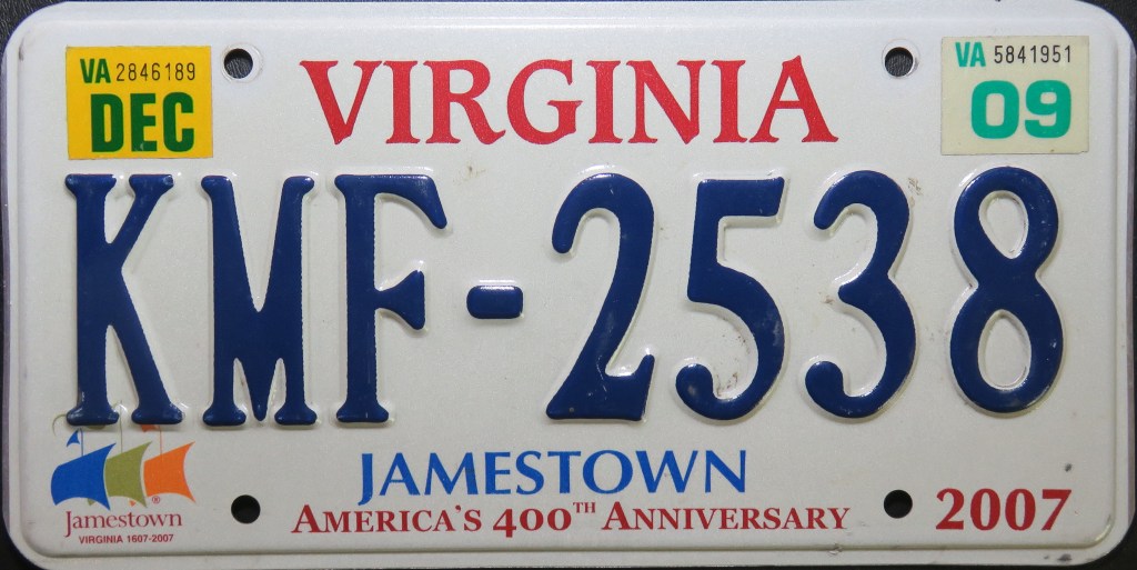
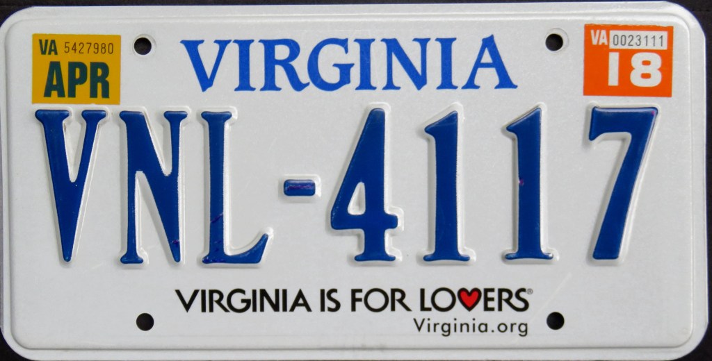
Virginia’s plain issues over the years – including the 1974 base which included a revision in the dies used in the state name – continued even after the U.S. Bicentennial optional. However, to celebrate the anniversary of the settlement of Jamestown, the state included some minor graphics. The 2009 base closely resembled the 1979 base, then a few years later slapped on the tourism slogan “Virginia is For Lovers.”
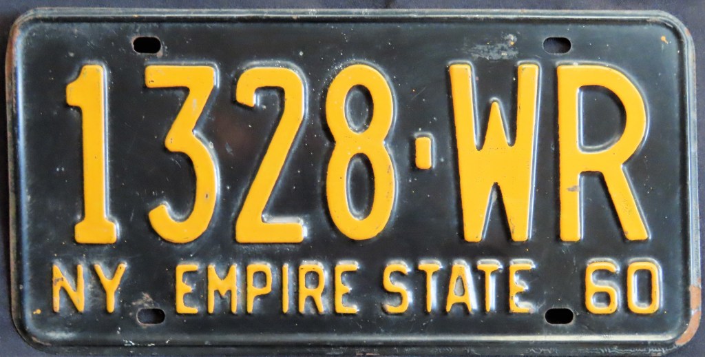
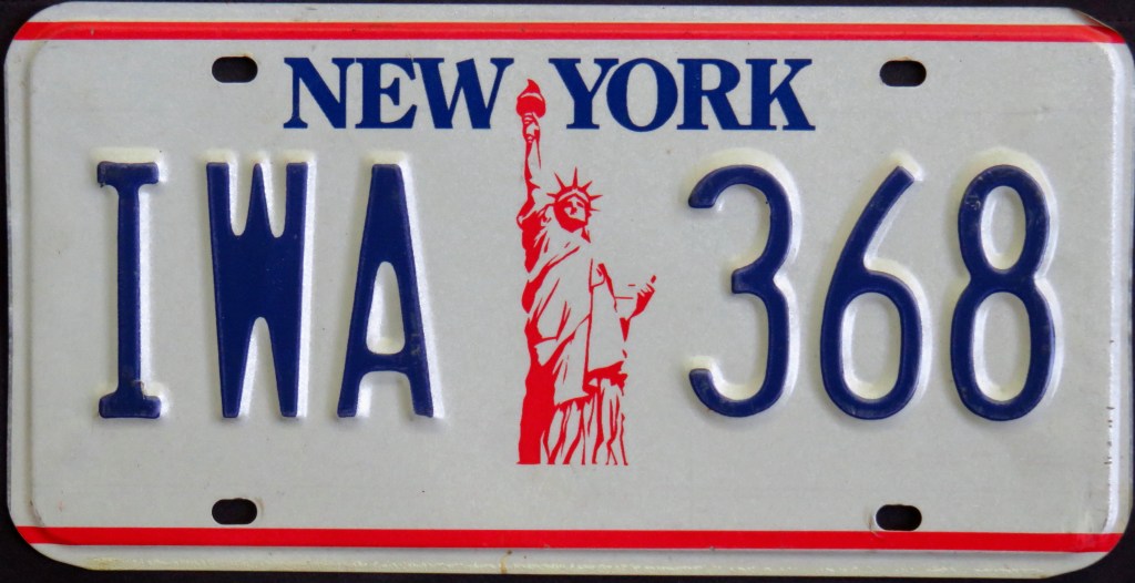
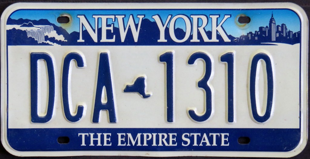
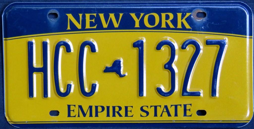
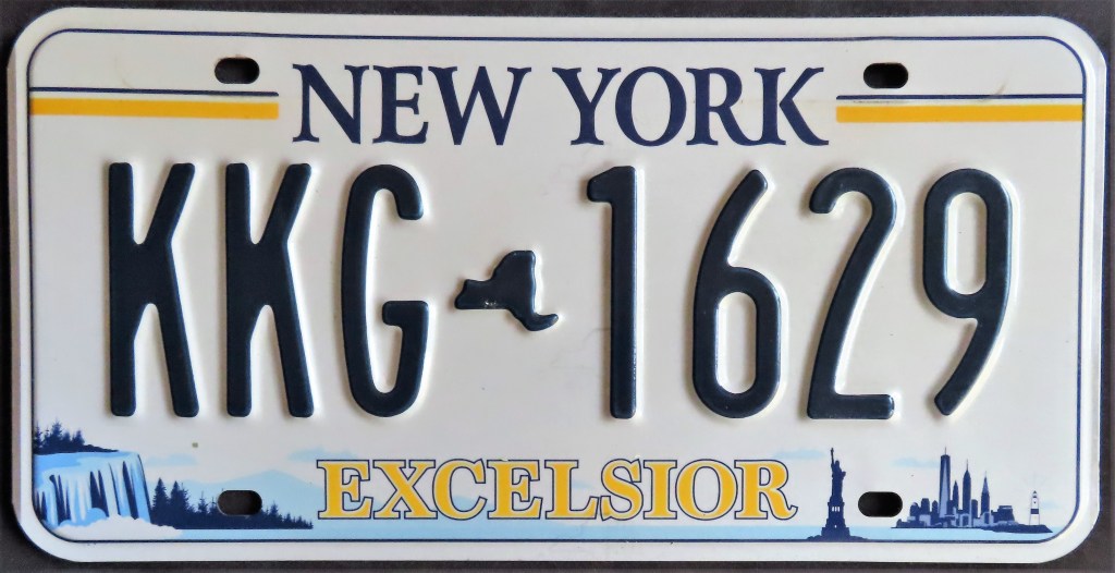
The iconic 1986 Statue of Liberty base followed the blue and orange bases of the 1960s and 70s. In 2001 “Empire State” made a comeback on a base featuring Niagara Falls, the highlands, and the cityscape of New York City. The 2010 base, dubbed “Empire Gold,” had a unique curved bar top and removed the landscape. The 2020 base brought the 2001 base landscape back along with the state motto, “Excelsior” (Latin for “ever upward”).
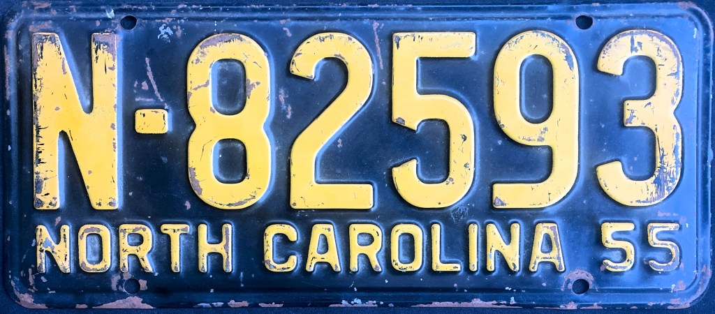
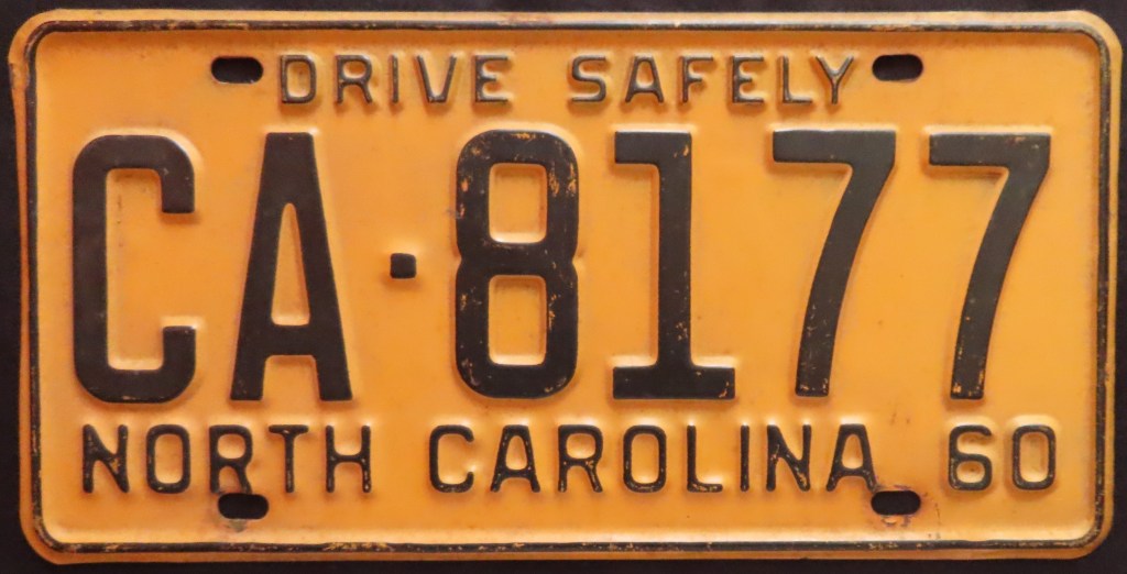
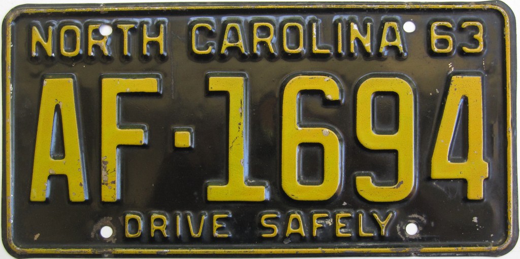
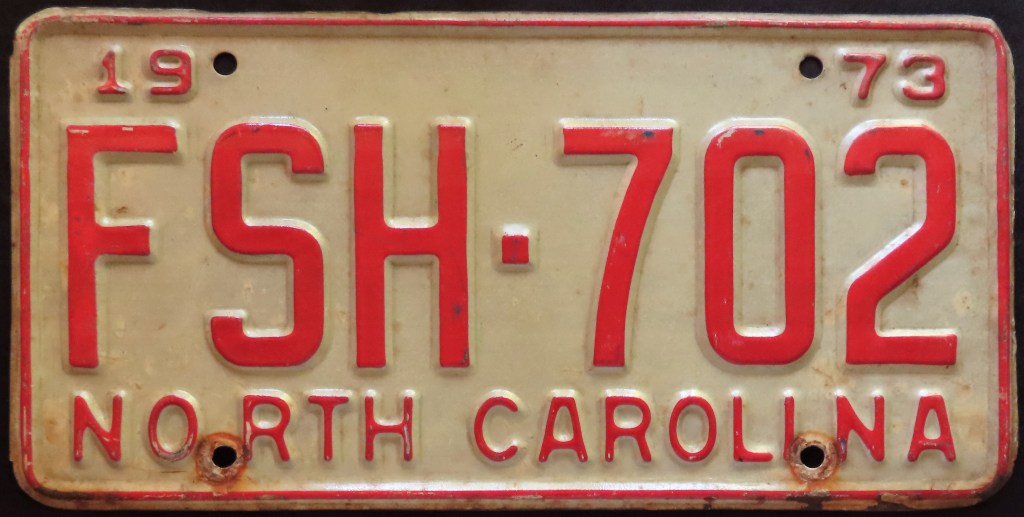
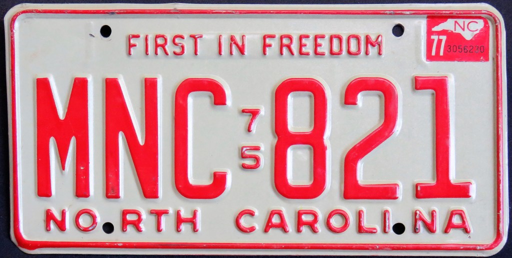
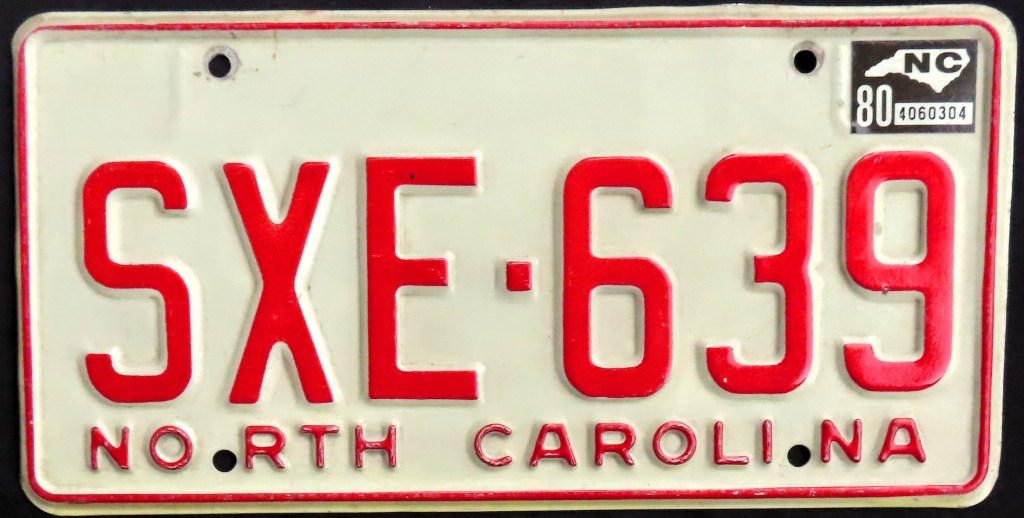
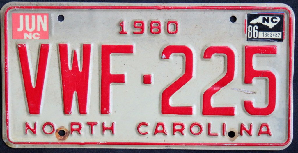
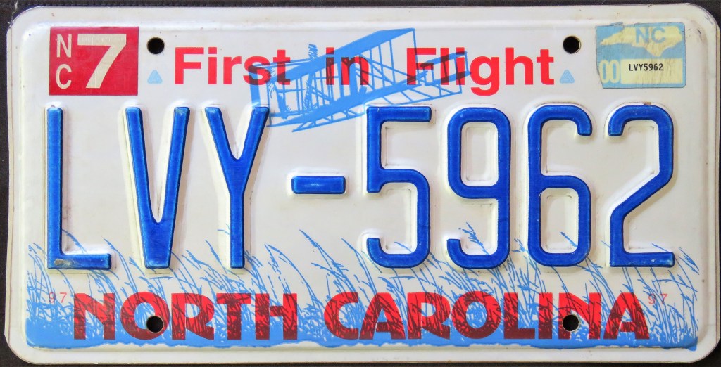
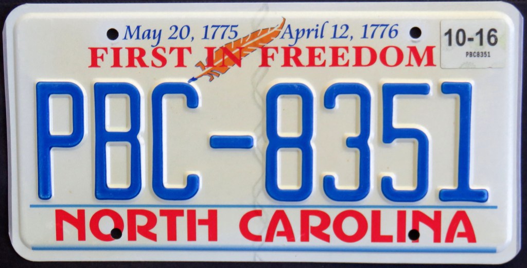
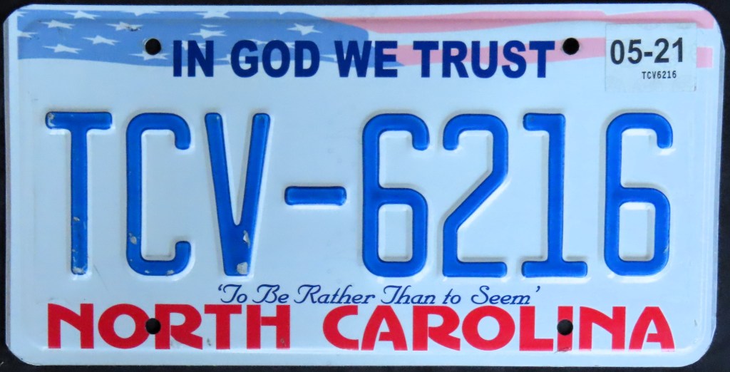
The “First in Freedom” base, celebrating the U.S. Bicentennial, ushered in the base plate era in North Carolina. The 1983 “First in Flight” base remains on the roads today. Some variations include an all-painted, non-reflectorized version (CXA-564), and one with a red serial; both had short runs. In 2015 “First in Freedom” returned on a no-cost alternate, and in 2019 the state offered a third standard issue, with the In God We Trust slogan.
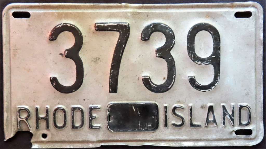
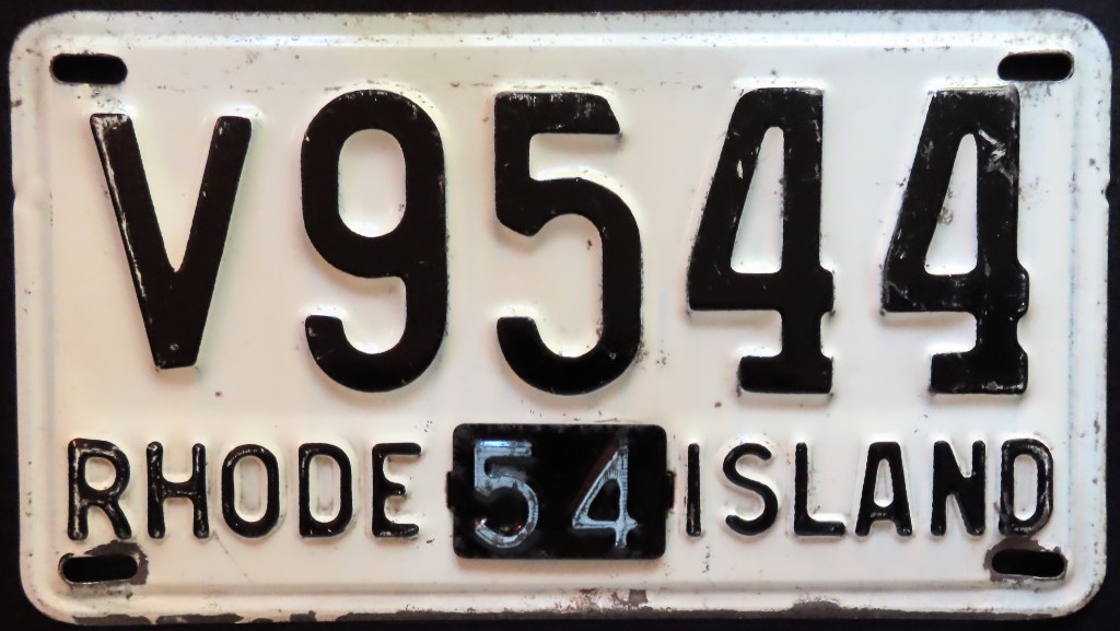
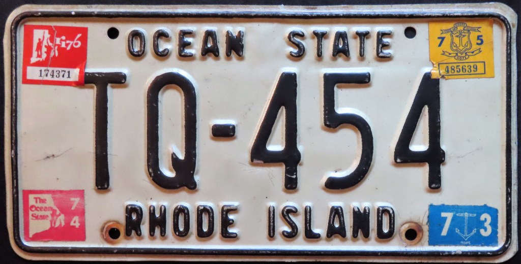
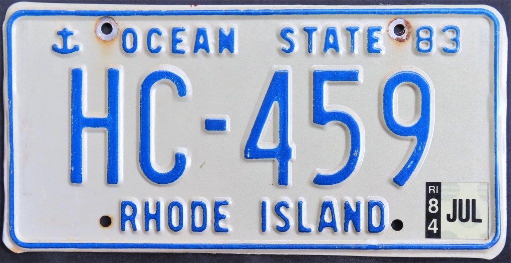
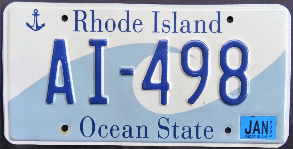
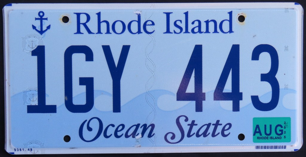
Rhode Island’s first graphic base arrived in 1996, which retained the “Ocean State” slogan and anchor of previous years. The current base is a modification of that, using five wave tips to represent each of the state’s five counties. Like Massachusetts, Rhode Island recycles and reissues plate serials, leading to various combinations.
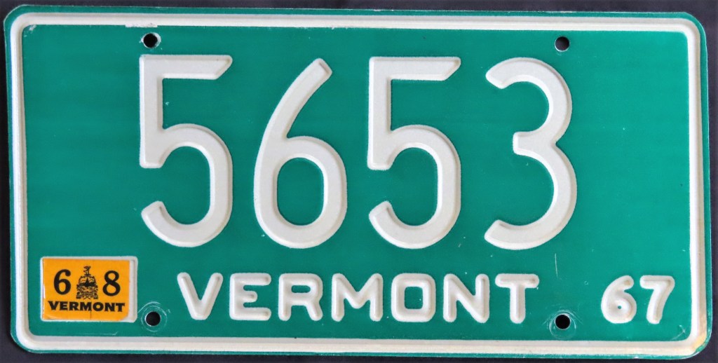
Like neighboring New Hampshire, Vermont has a long-standing run of green and white plates (though “only” since 1949). The 1977 base featured an unusual round sticker well which was never used. In 1985 the current base hit the roads.
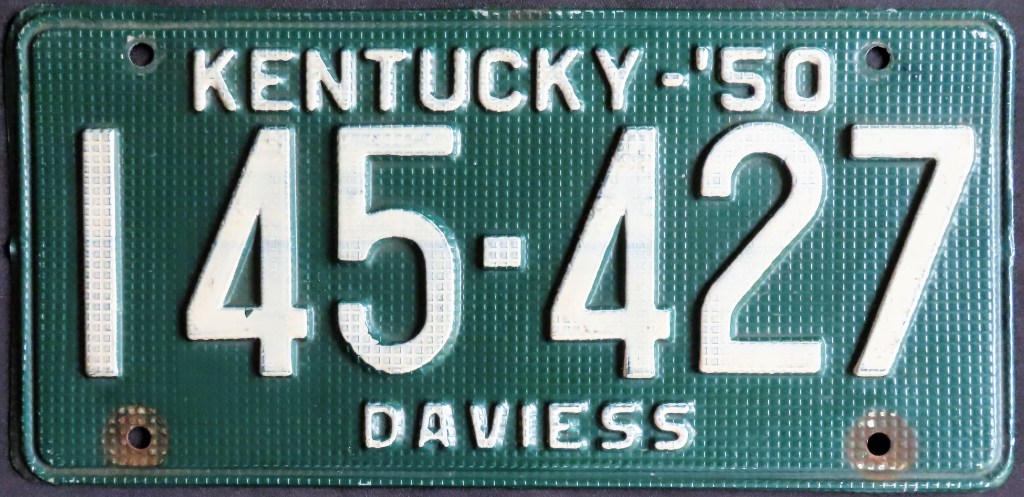
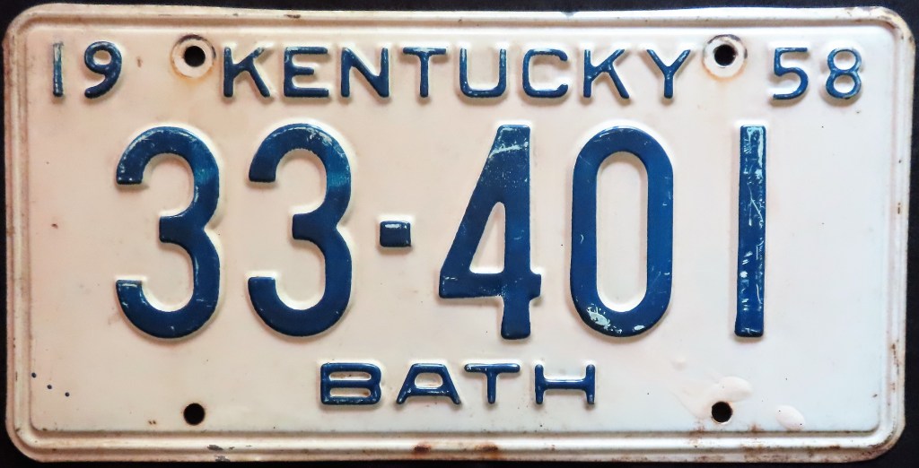
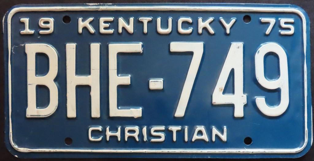
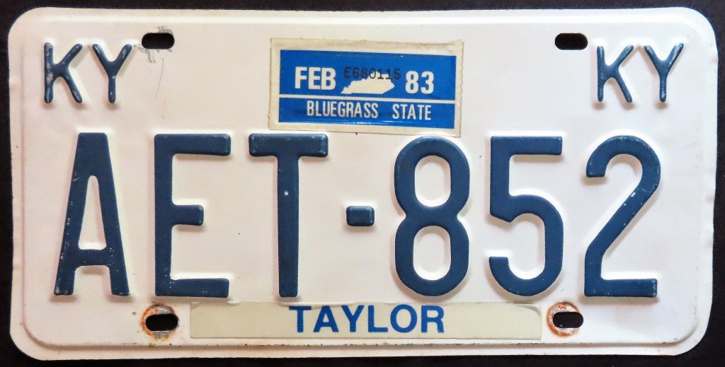
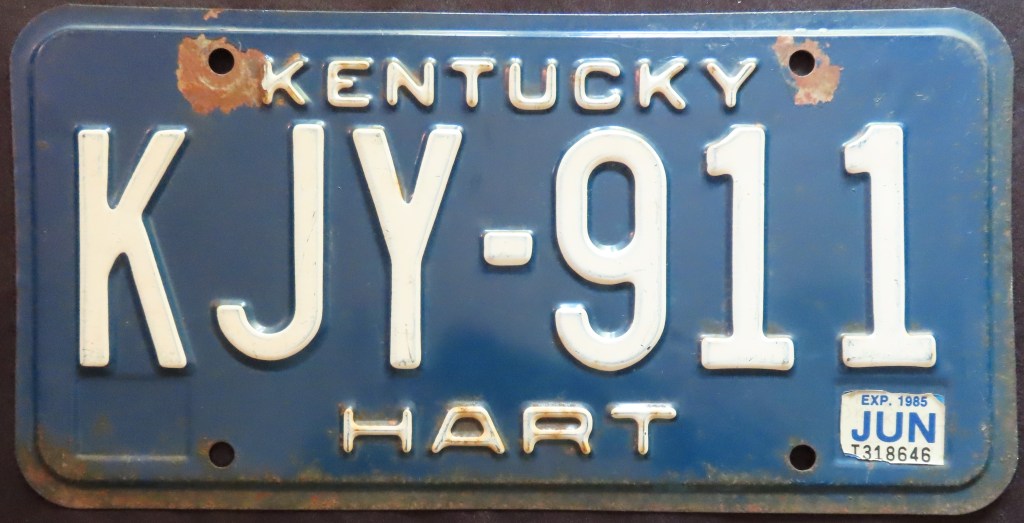
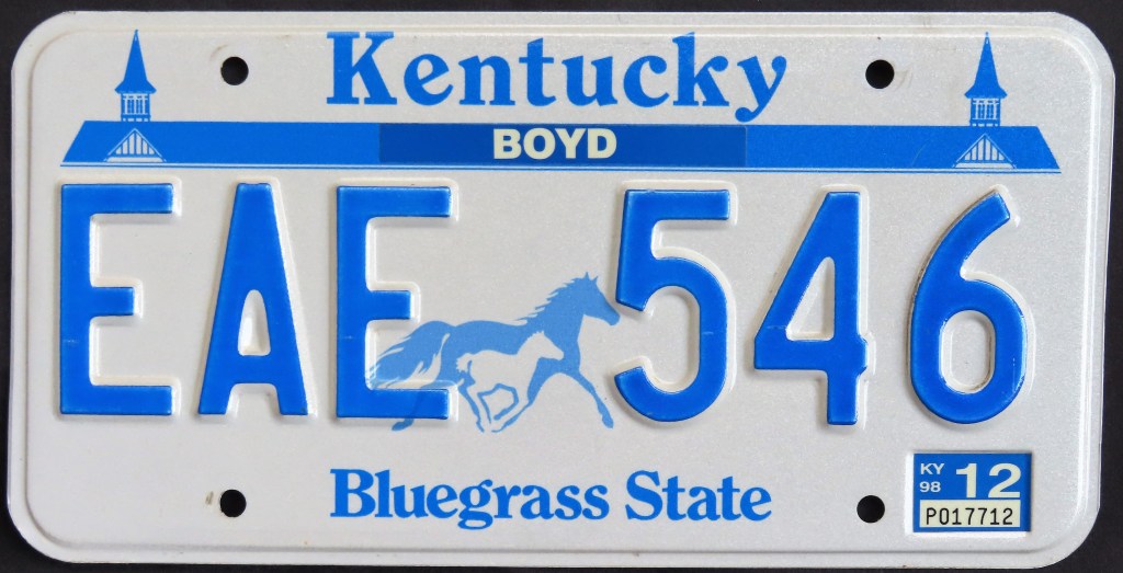
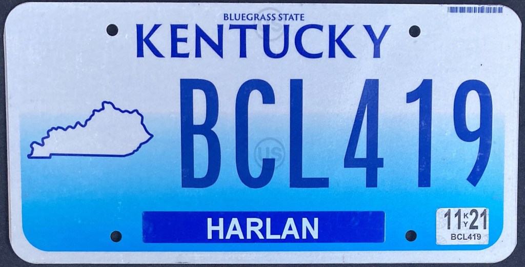
A blue-and-white color scheme has ruled supreme in the Bluegrass State since 1953. A variety of colors, including dark green on the 1950 “waffle-style” plate, were used prior. The unusual 1978 base, with its single elongated sticker in the center and state abbreviation in each corner, lasted until 1983; KJY-911 and PPX-739 are steel and aluminum versions of that base. The 1988 base paid homage to the state’s horseracing industry and one of America’s most famous tracks, Churchill Downs. When pending litigation over use of the mare and foal image put a pause on production, the state issued plain blue on white plates until the matter was resolved. The 1998 base included a cloud in the state map and the 2003 base sported “Mr. Smiley.” The latter was unpopular with motorists, so the next base was rushed into service. The 2005 base, featuring the tourism branding “Unbridled Spirit,” had a long run before being replaced in 2020 by a modification of the ’05 base. Most notably this base dropped the branding and enlarged the map and moved it to the left. The “Team Kentucky” base lasted from 2022 to 2023; it refers to a Governor-promoted concept that the people in the state are working together for the greater good of Kentucky, an economic initiative in response to the pandemic and natural disasters in recent years. The last three bases have all had no-cost In God We Trust versions.
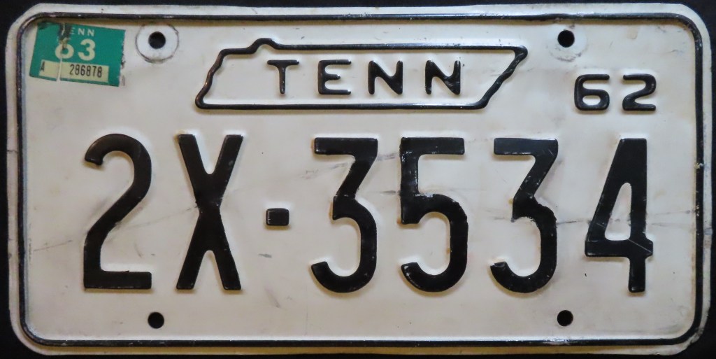
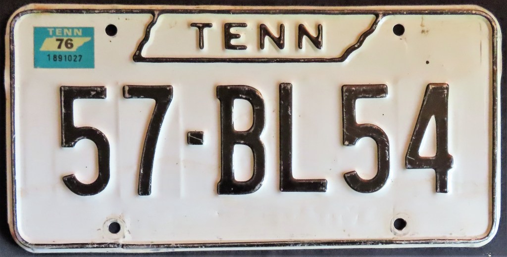
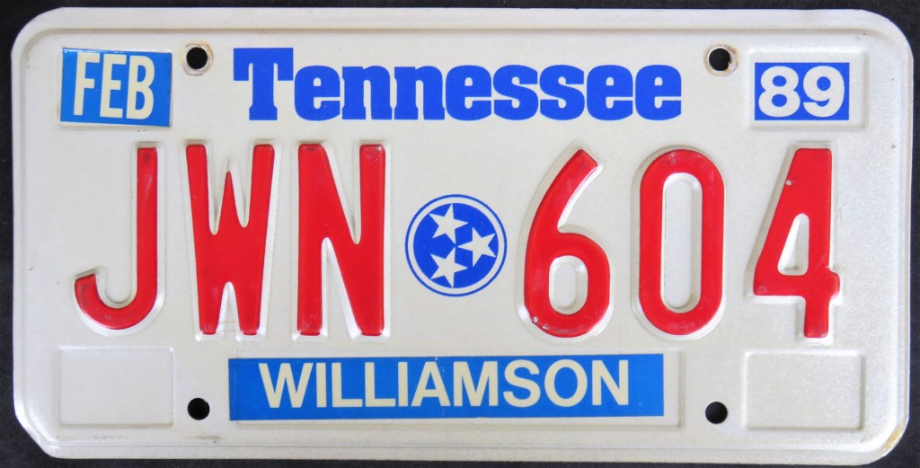
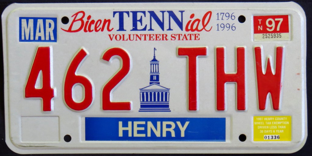
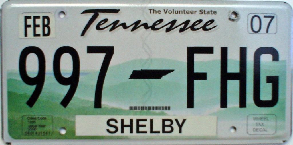
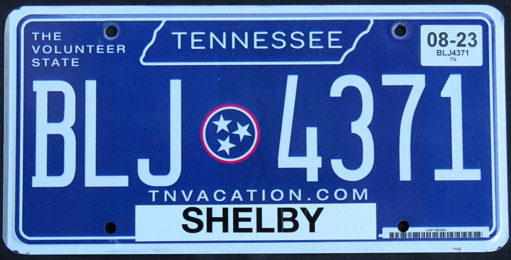
Tennessee’s bases include multiple ones with state maps, one with a state seal, a state Bicentennial cleverly incorporating the state abbreviation, and multiple varieties of one featuring a graphic of the Great Smoky Mountains. The last two bases have each come in an “In God We Trust” version.
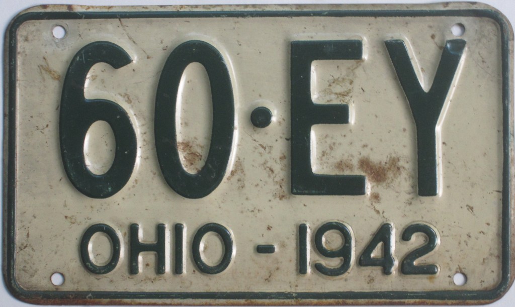
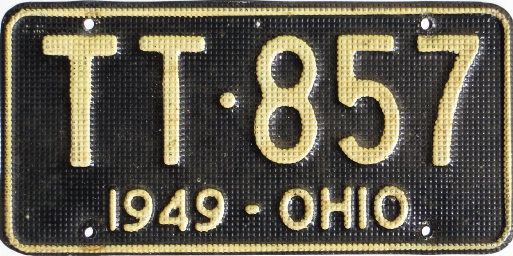
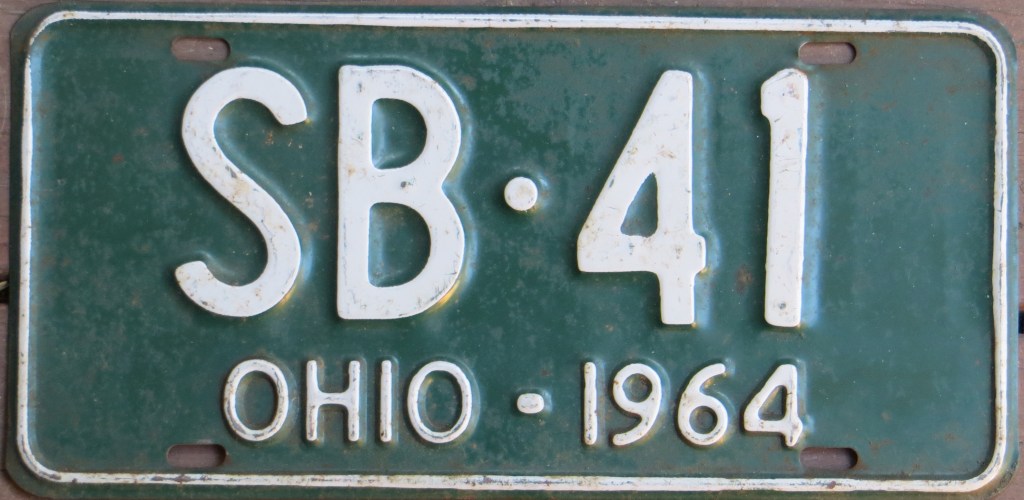
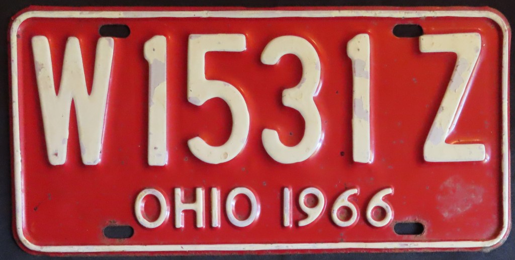
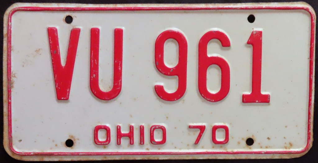
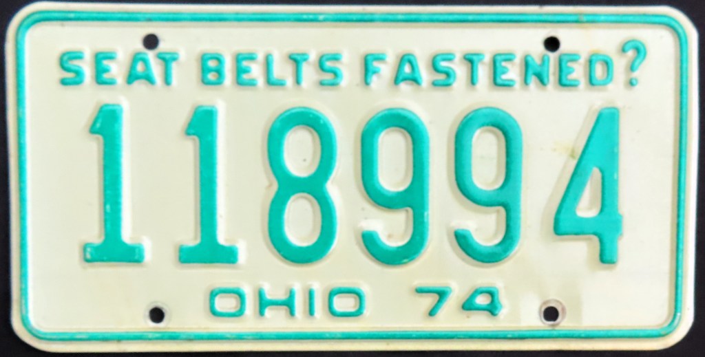
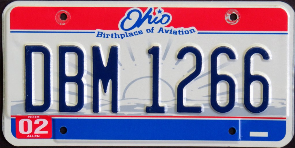
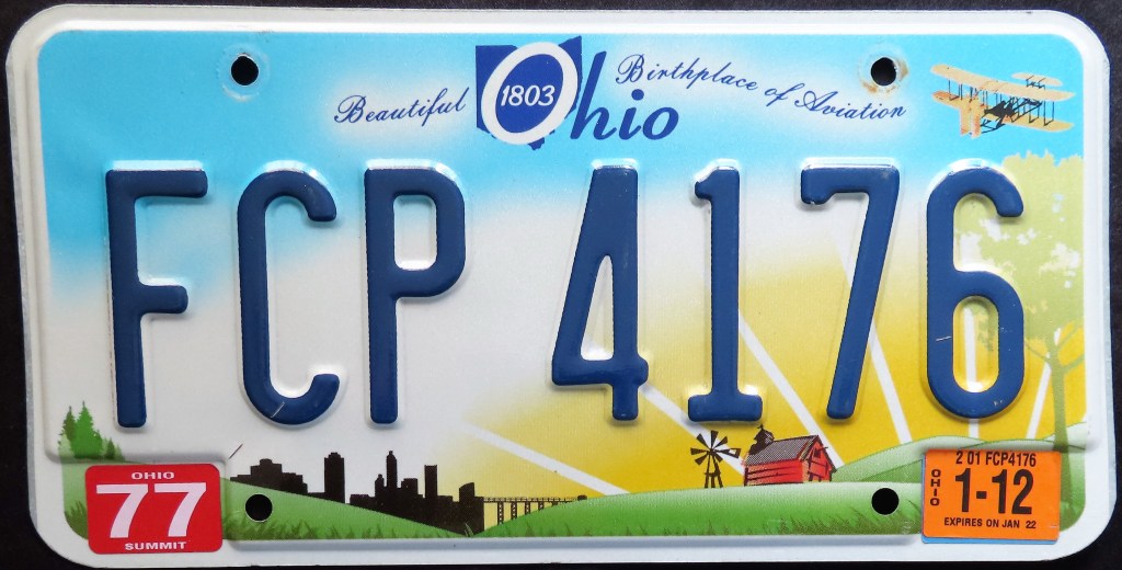
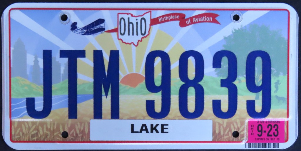
Ohio’s license plate history includes the oxen-and-wagon combo of 1938 celebrating establishment of the Northwest Territory, the safety-conscious 1974 base, references to the aviation history of the state (the Wright Brothers were born and worked in Dayton, more Ohio natives have gone on to become astronauts than from any other state, etc.), and state maps used as both separators and as part of the state name. The “Ohio Pride” base, which debuted in 2013. includes 46 unique slogans all printed in shades of grey in various sizes. The 2022 base wonderfully incorporates the state’s geography and history as the 2009 base did, but with larger graphics.
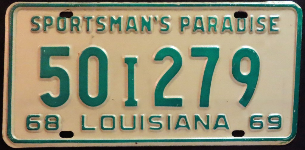
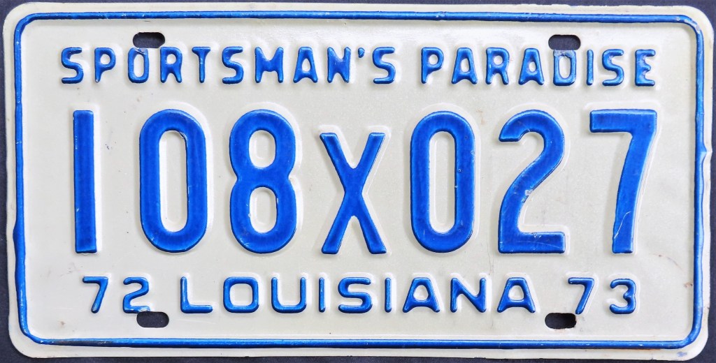
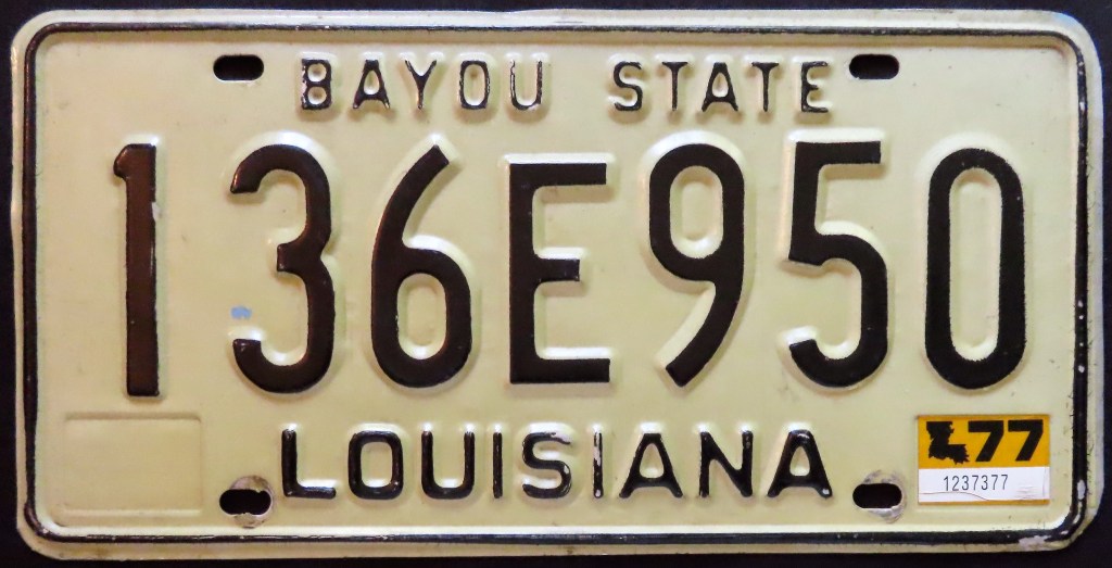
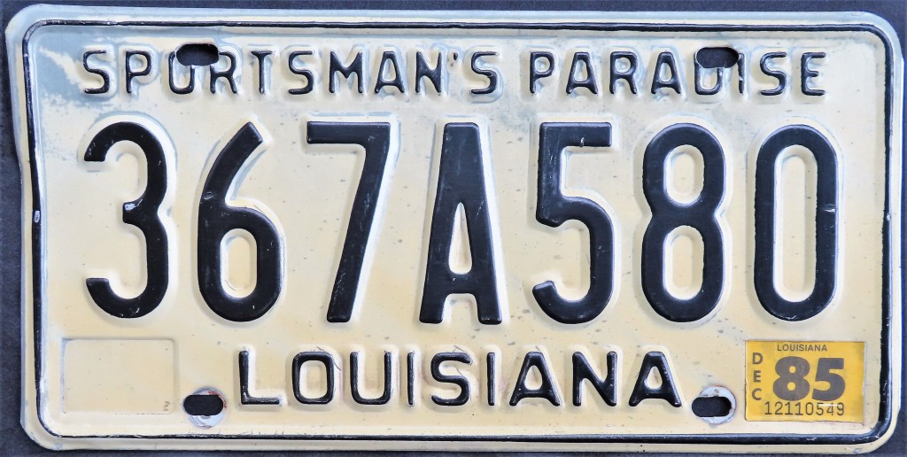
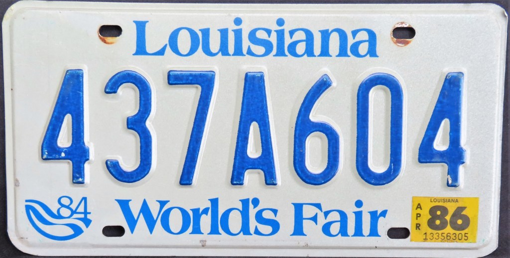
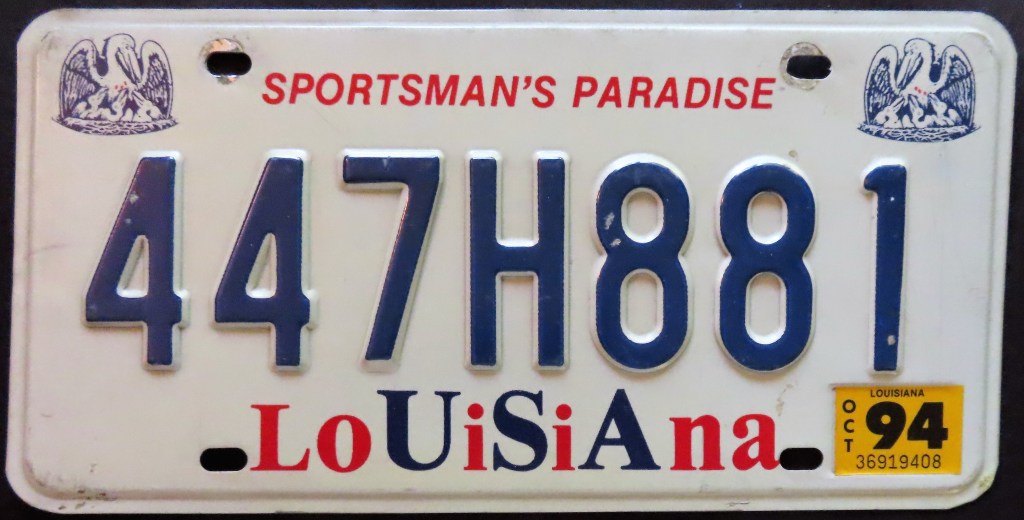
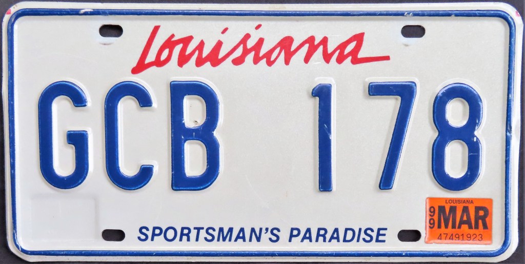
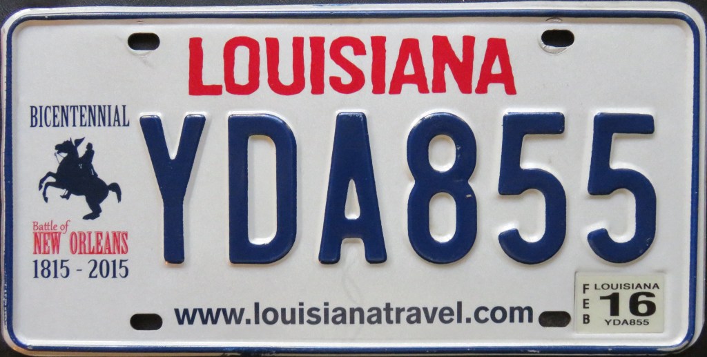
The pelican made an appearance on Louisiana plates consistently throughout the 1940s, 50s, and early 60s, then appeared on the 1989 “USA” base and on the current base, first issued in 2006. In 1984 the state became the most recent to date to feature a “World’s Fair” slogan, and in the 21st century it’s already celebrate three different bicentennials (the latter two issued concurrently with the pelican base for a limited time).
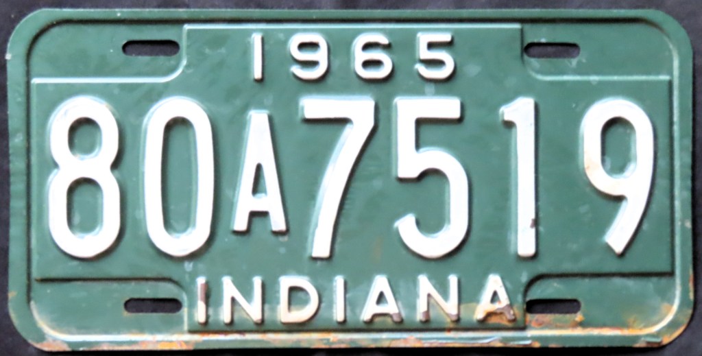
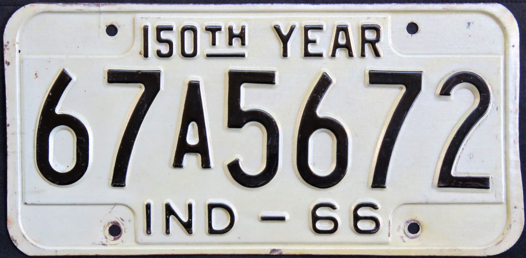
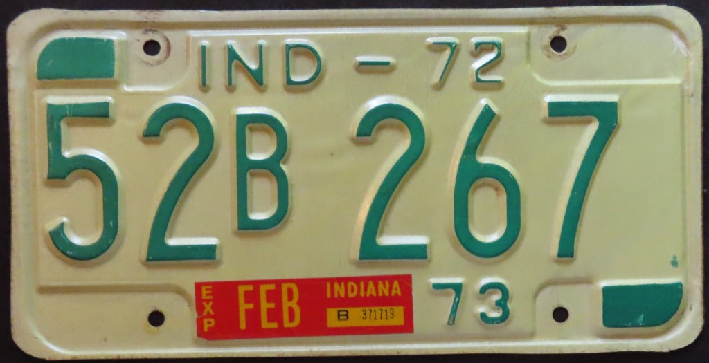
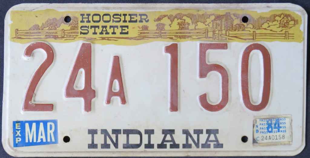
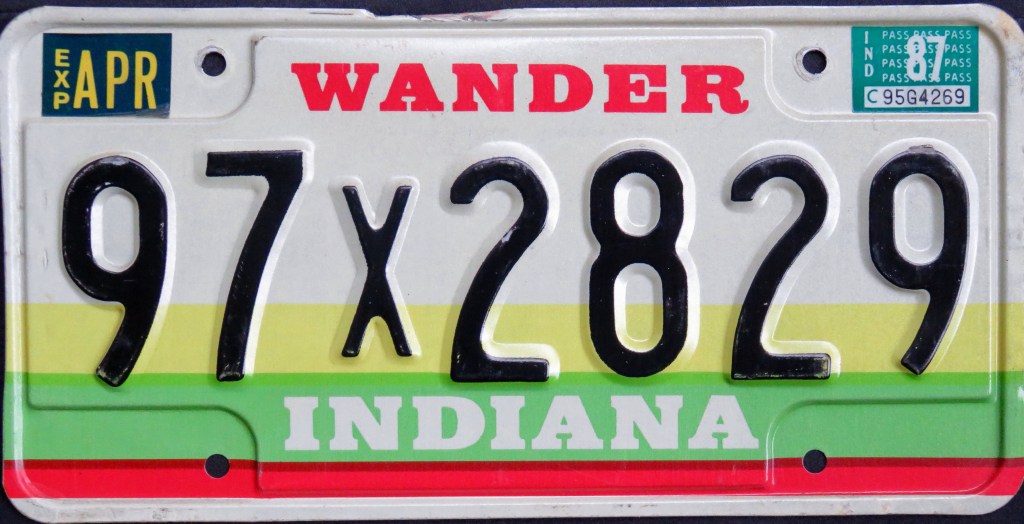
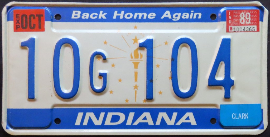
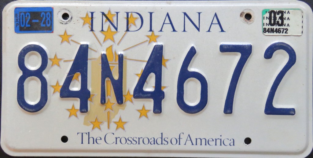
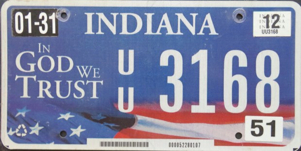
One of my personal favorites for license plate designs is Indiana, which has issued a series of catchy graphic general-issue plates since the U.S. Bicentennial plate of 1976/77. Interestingly, it has found a new slogan for each one, whether it’s the unusual “Wander,” the patriotic “Amber Waves of Grain,” or even the far less-exciting website or “Bicentennial.” The latest issue features a covered bridge, something no other plate in U.S. history can claim.
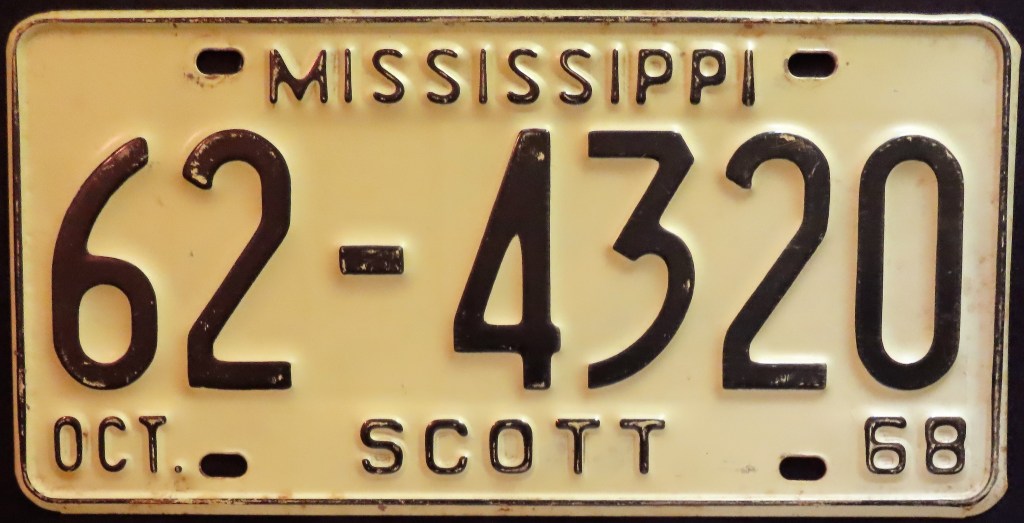
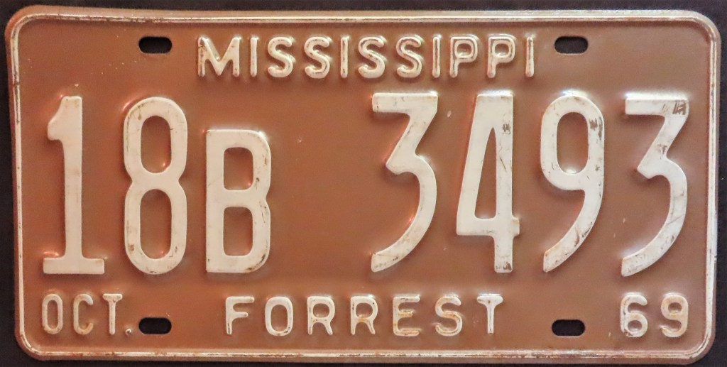
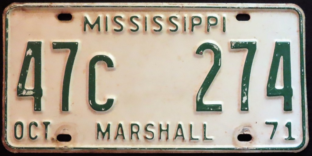
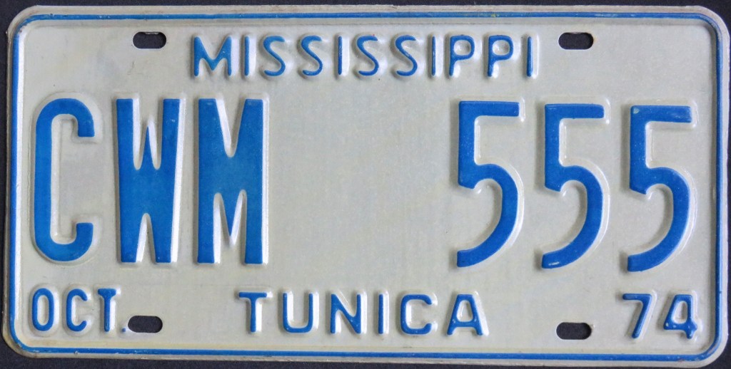
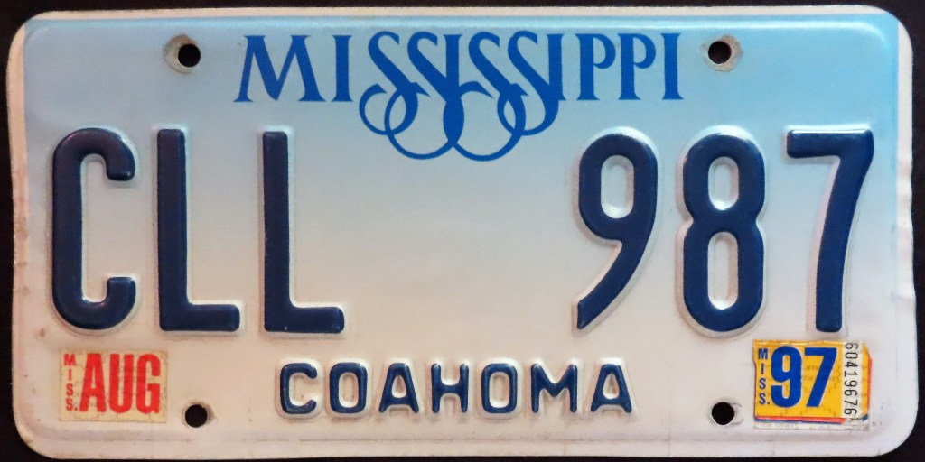
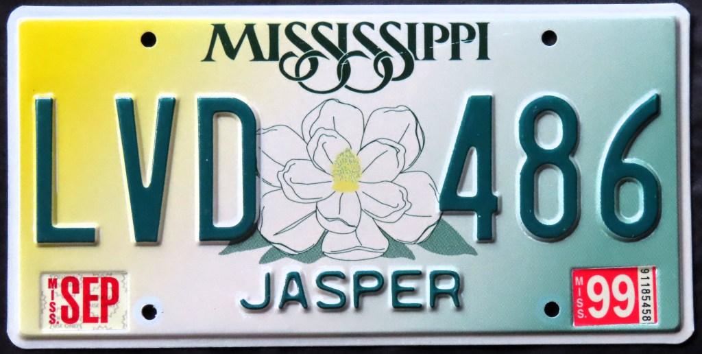
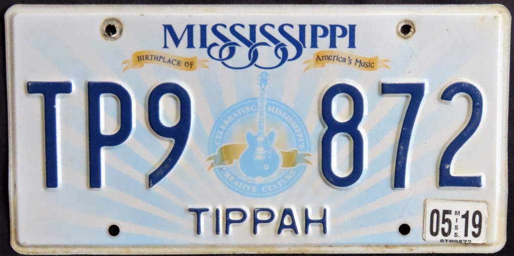
Mississippi has had county names printed on its plates from 1941 to present. The 1977, 1998, and 2003 bases all featured the state flower (the magnolia) in the center of varying sizes. The 1981 base introduced the “sagging S” motif in the state name, in use on all plates ever since. The 2007 base showed the Biloxi lighthouse, which survived Hurricane Katrina in 2005, and the 2012 base marked the musical heritage of the state as it depicts “Lucille,” famous Blues artist B.B. King’s guitar. The 2019 base was the first standard, non-optional issue to feature the words “In God We Trust.”
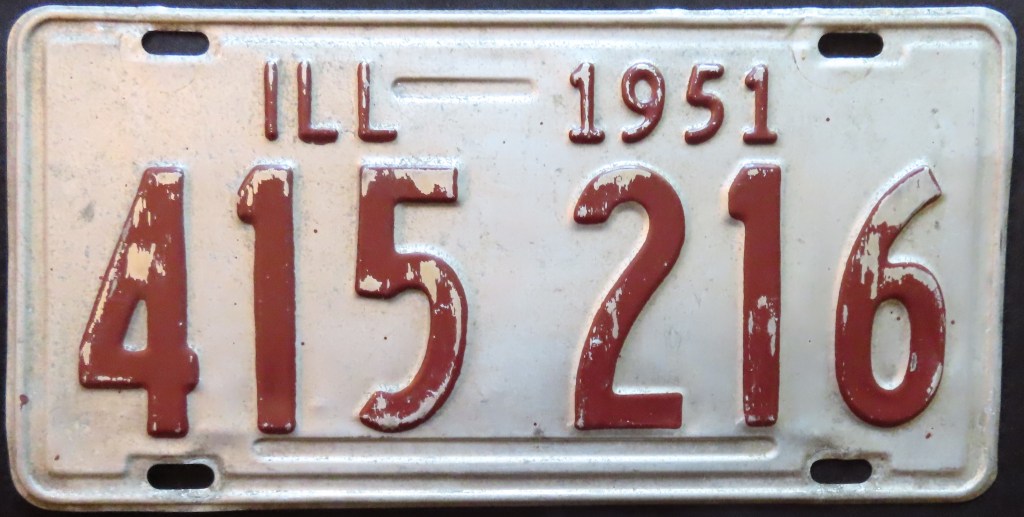
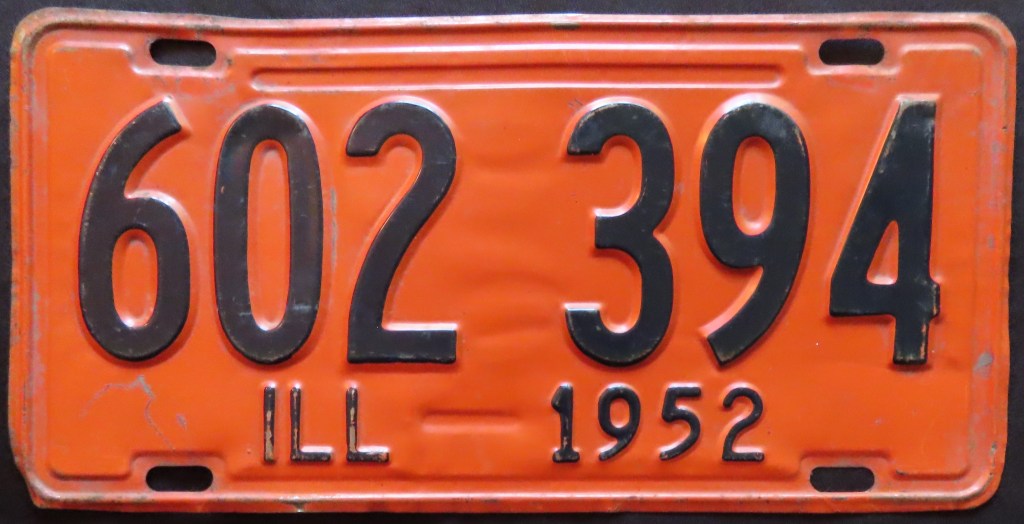
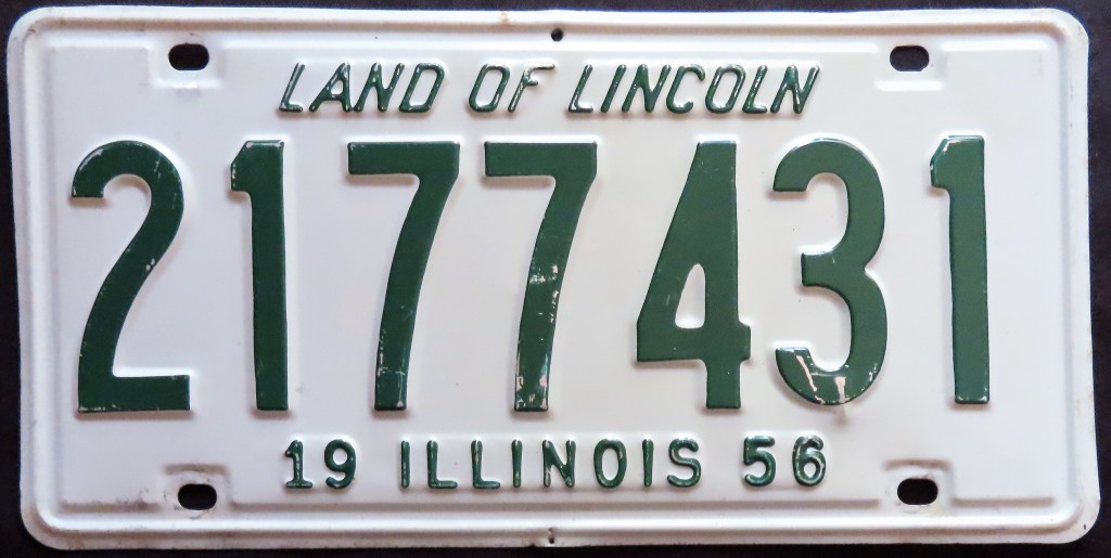
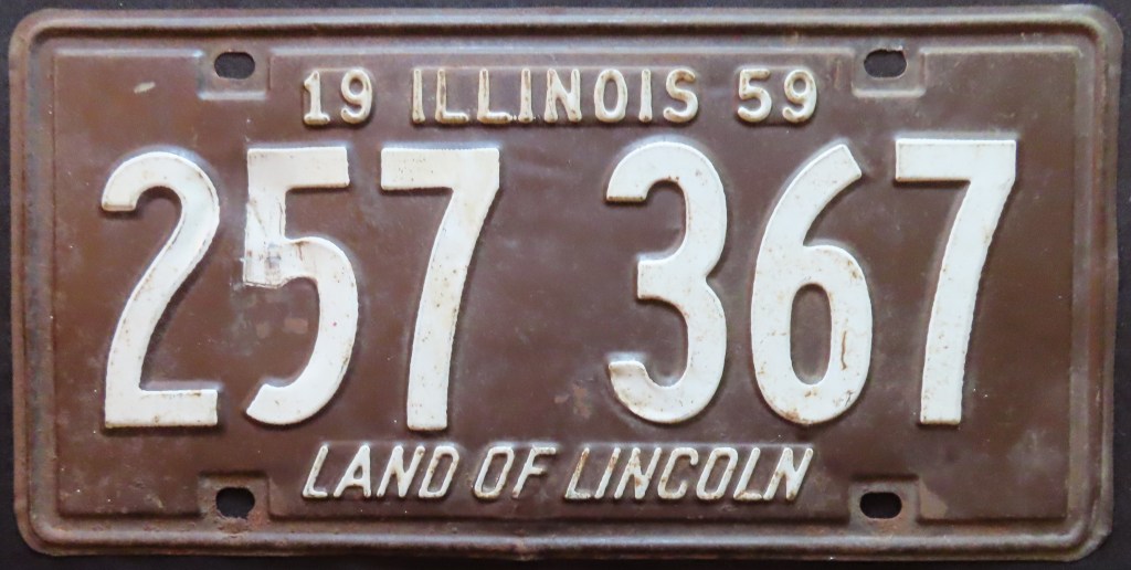
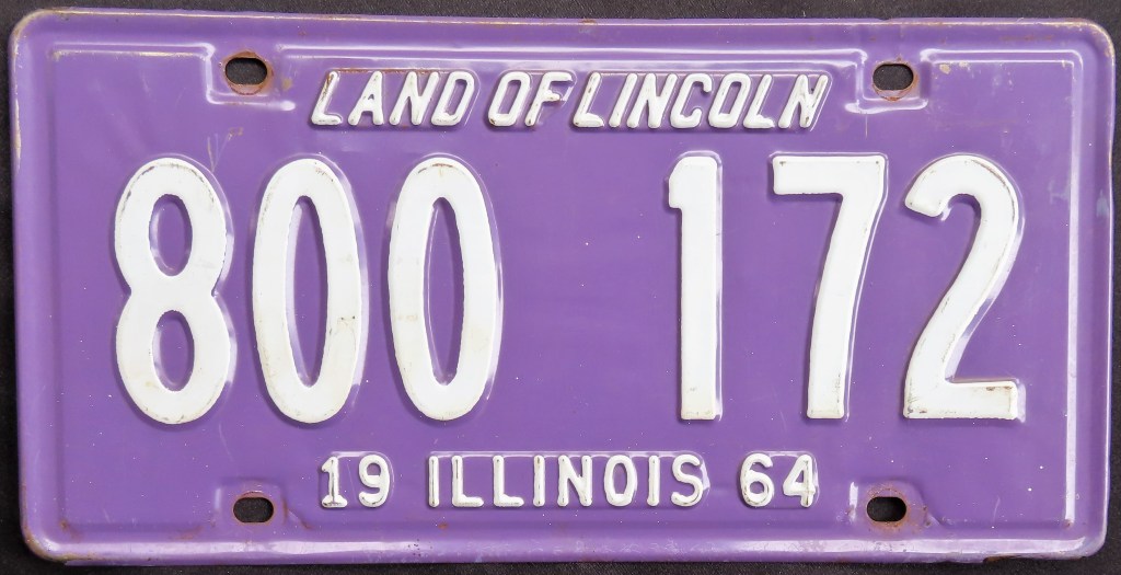
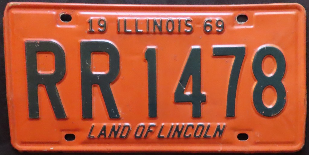
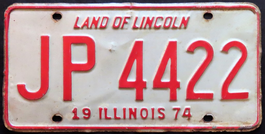
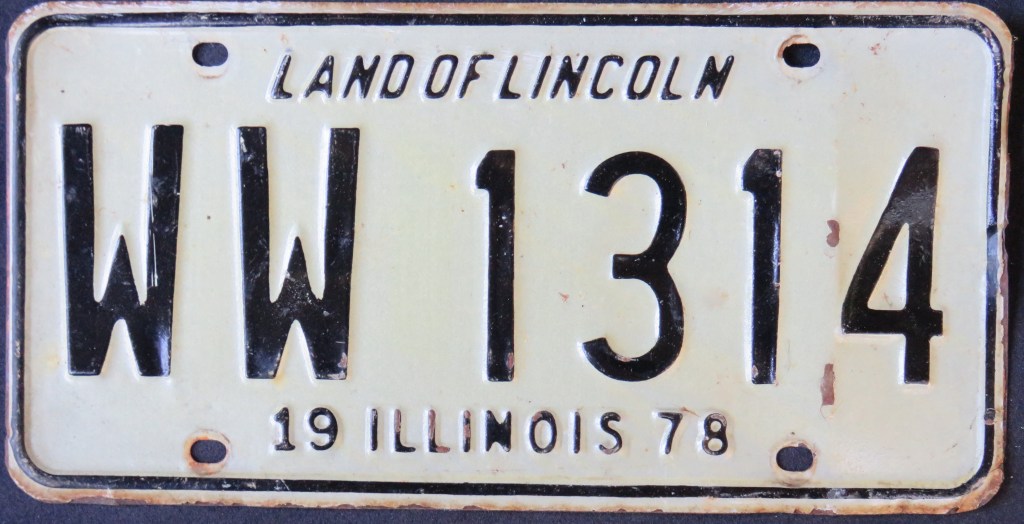
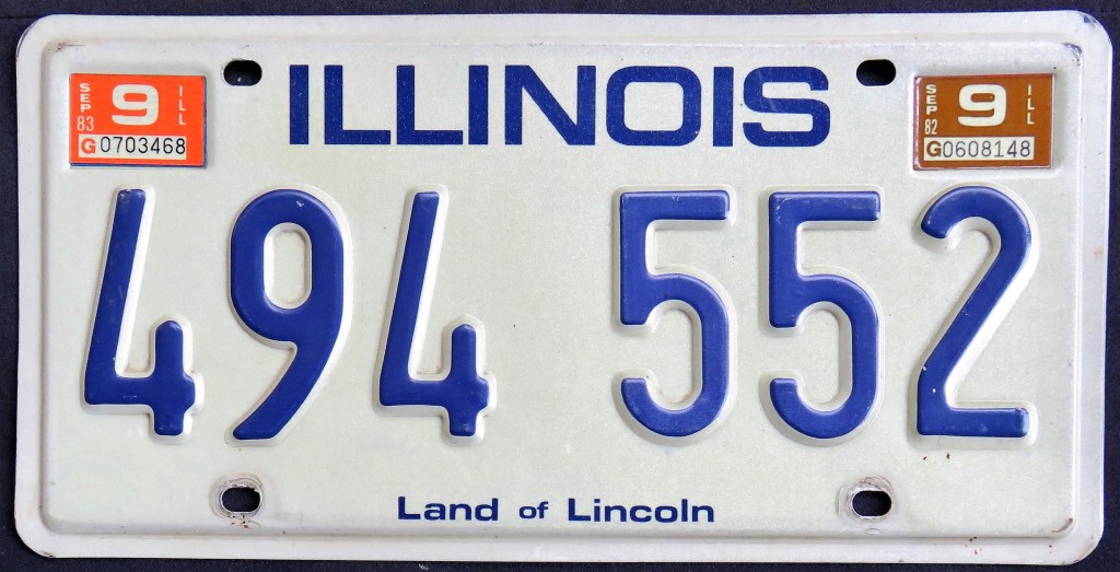
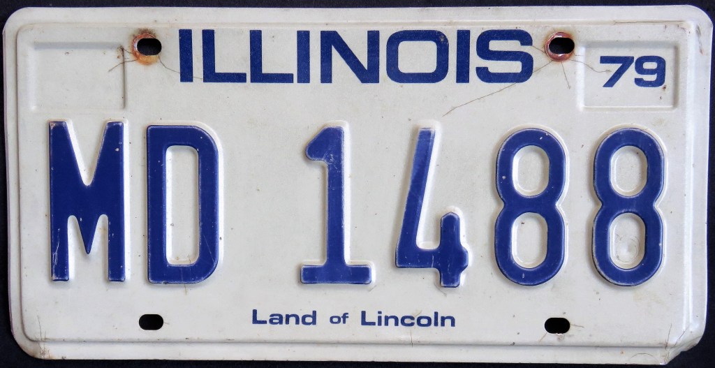
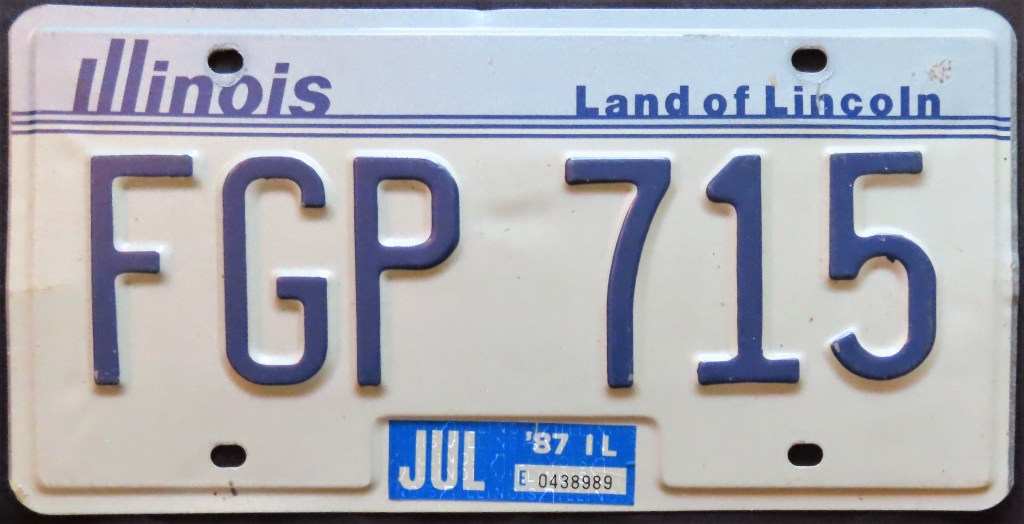
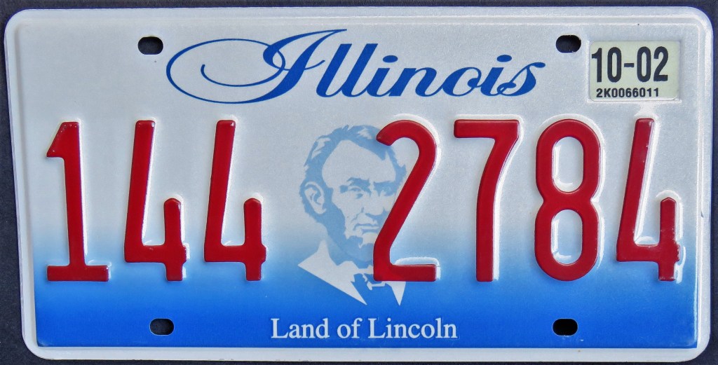
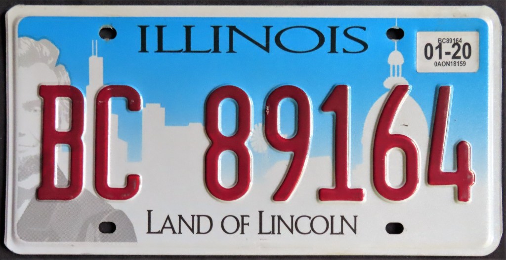
Illinois had yearly plates until 1979. Certain plates in the 1940s were made of soybean material, which led to some of them being consumed by goats. The color schemes of the plates from the 1950s through 70s were intentional, often chosen to represent a college, person, or organization; many from this period were also made of a particularly flimsy material. The U.S. Bicentennial plate was designed by a teenager in a statewide contest. “Land of Lincoln” has been a slogan since 1954, but it wasn’t until the 2001 base that the man himself made a graphic appearance.
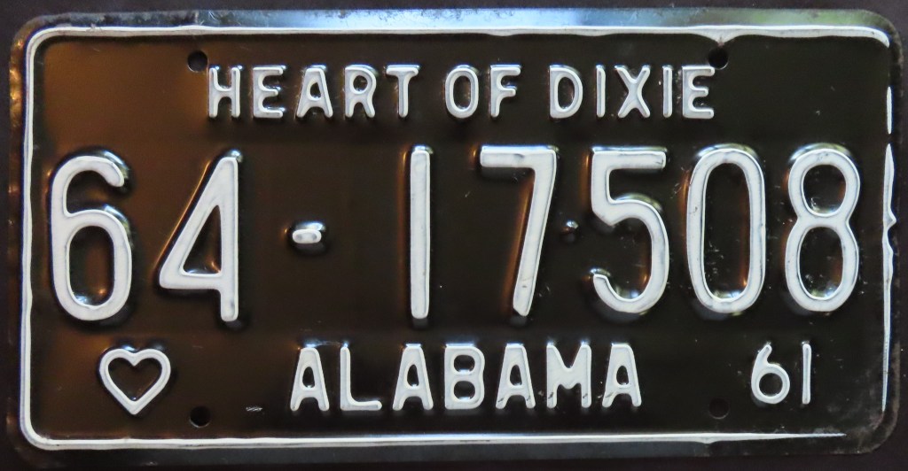
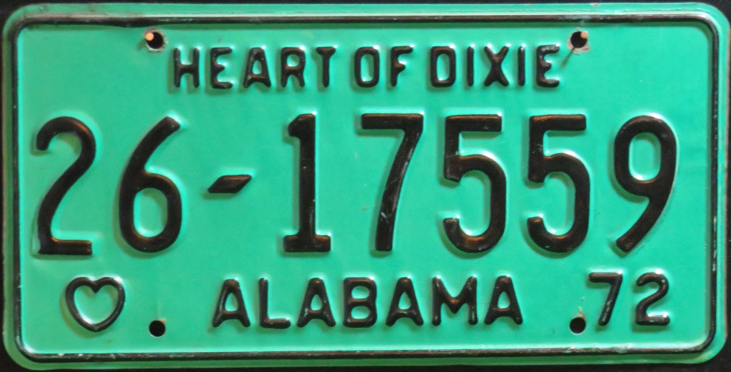
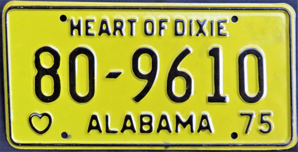
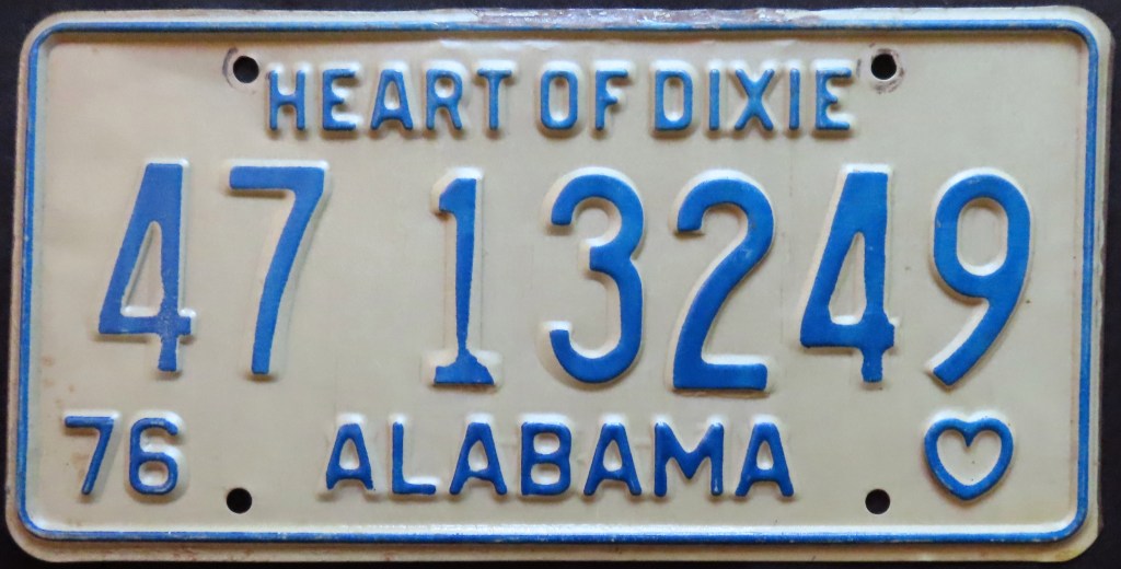
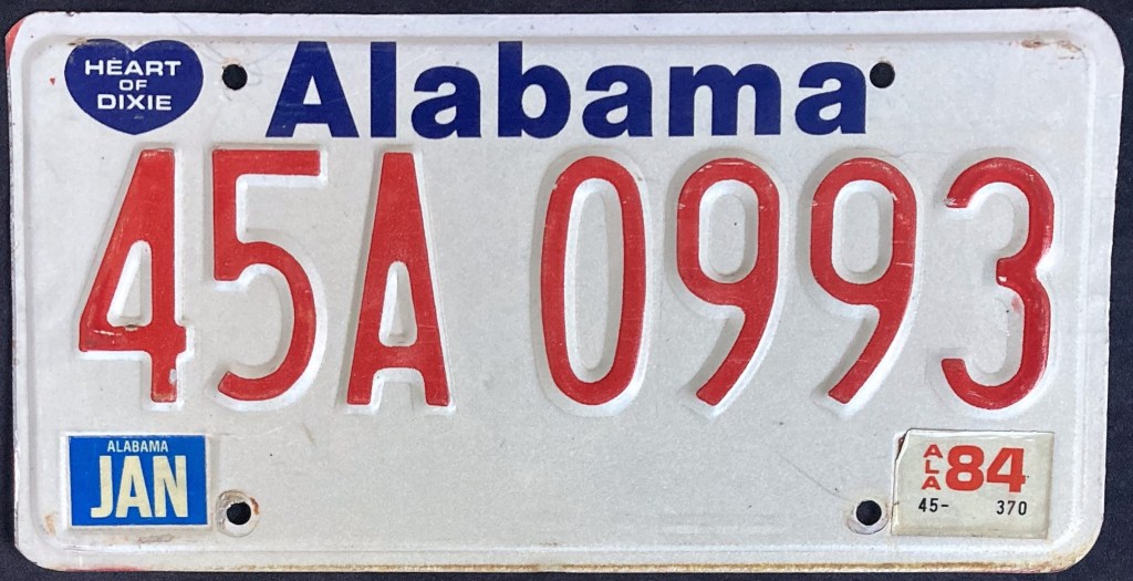
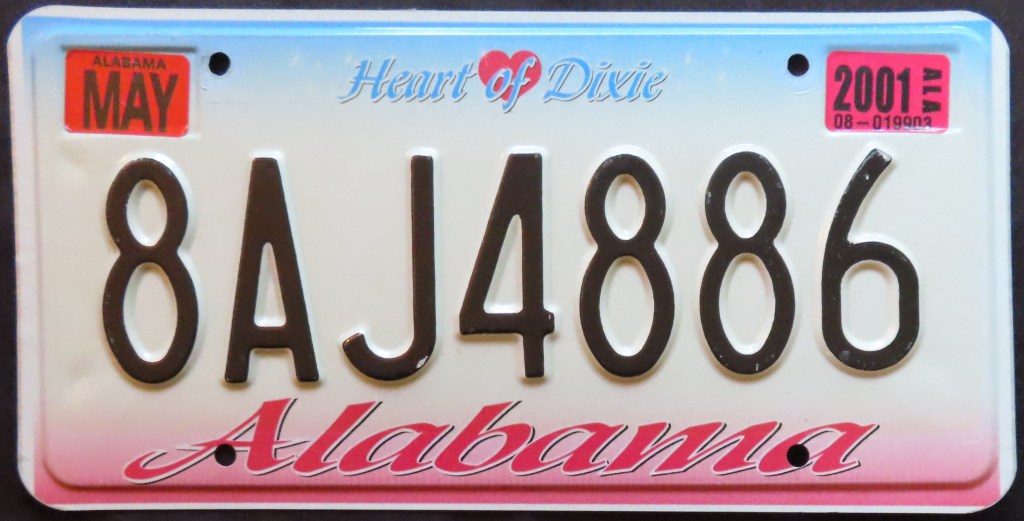
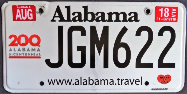
New base plates have hit the Alabama roads every 5-7 years since the first multi-year issue of the U.S. Bicentennial base. While “Heart of Dixie” appeared plainly on the plates from 1955 until then, since they have been sometimes minimized, but they are always there, often inside or accompanied by a heart graphic. The latest three bases (not including the Bicentennial no-cost optional) have emphasized the state’s gulf coast.
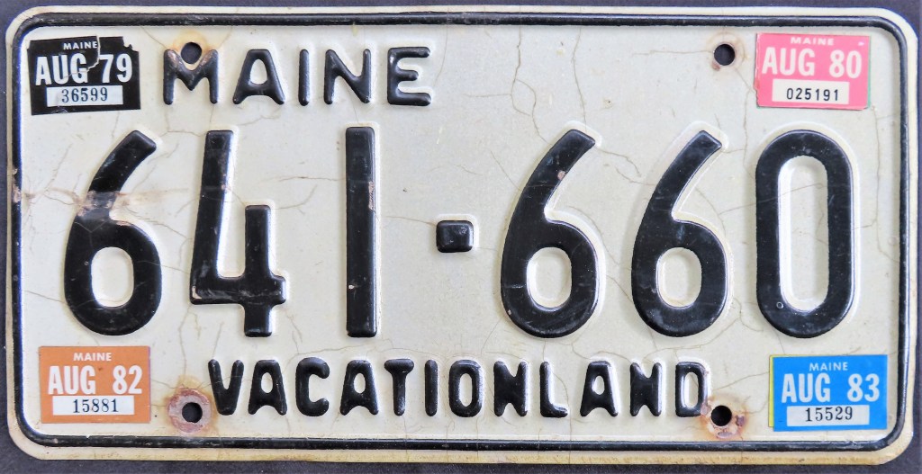
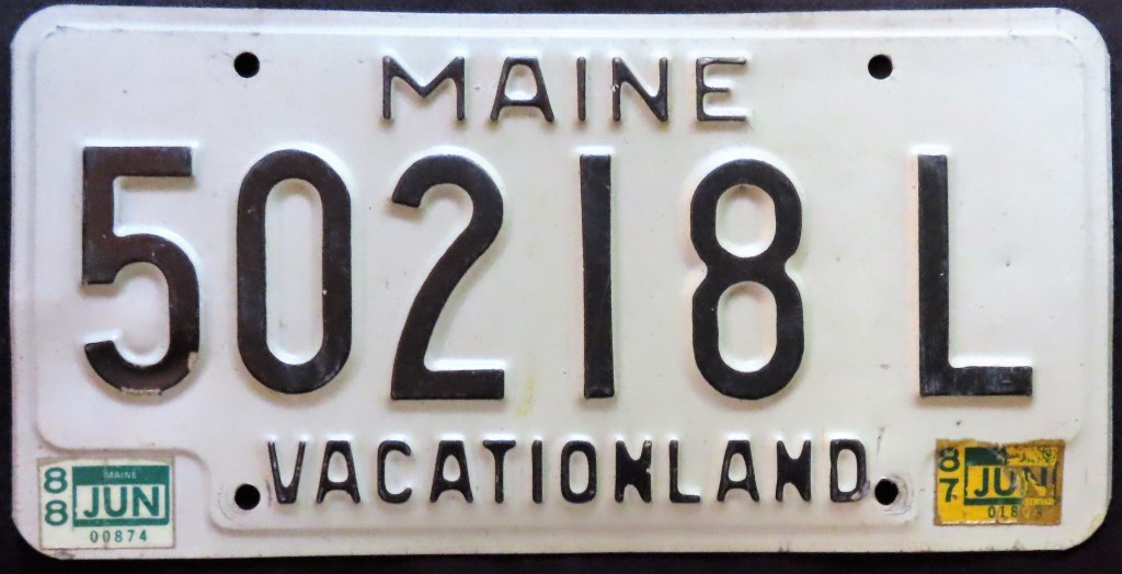
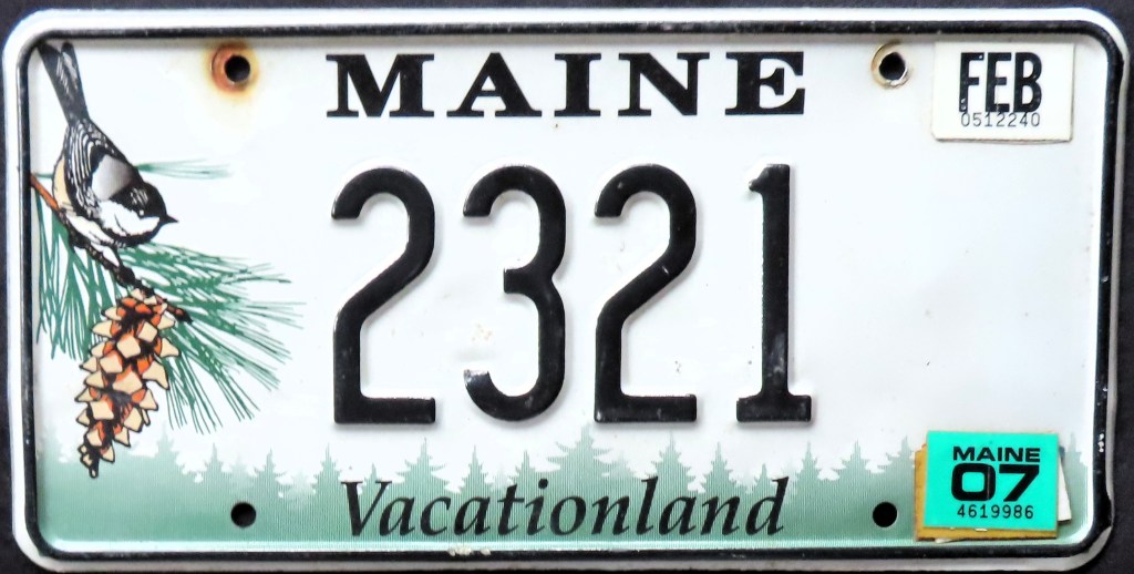
Maine has featured graphics of a lobster and a chickadee (the state crustacean and bird, respectively) on the two most recent bases (1987, 1999); prior to that the plates were quite plain, though I love the look of the older issues shown above. Note the low number 2321; this is a reissued serial (plate numbers can be carried over to new plates or be passed down to family members).
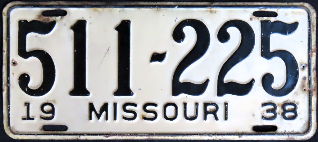
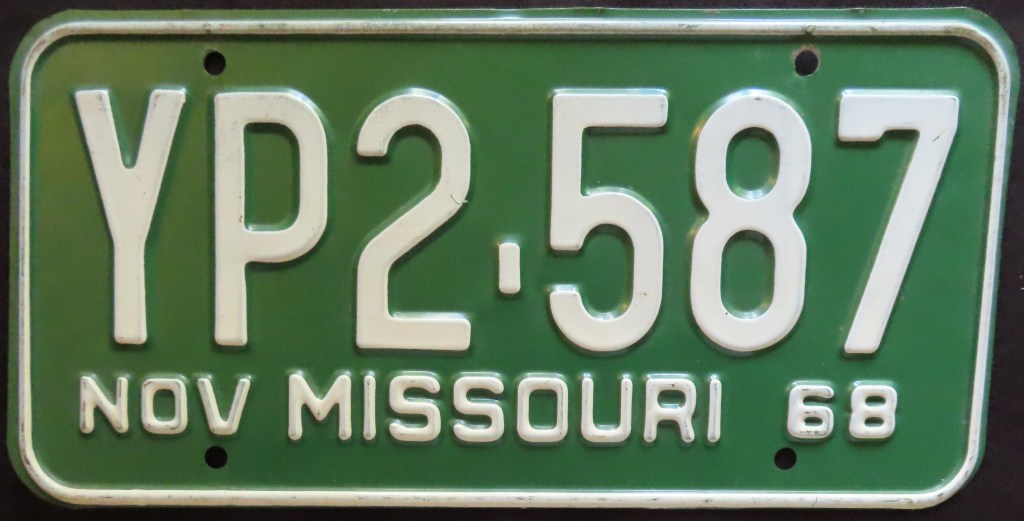
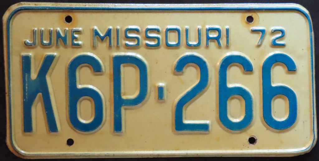
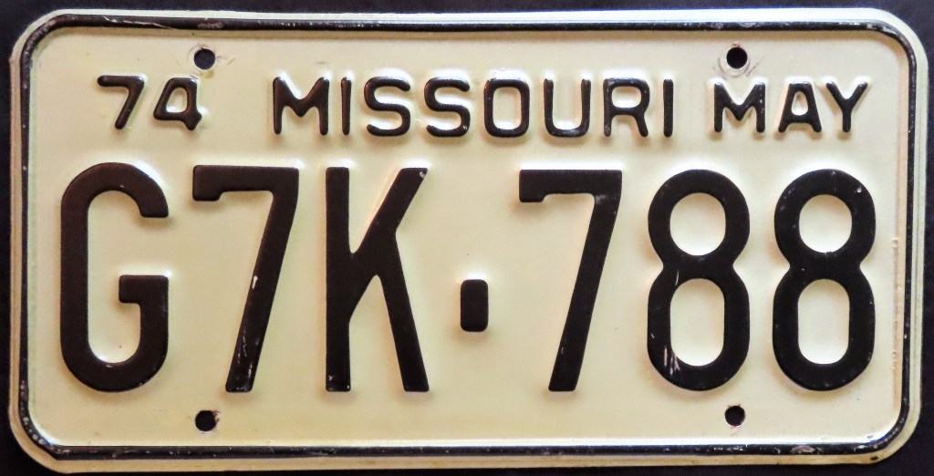
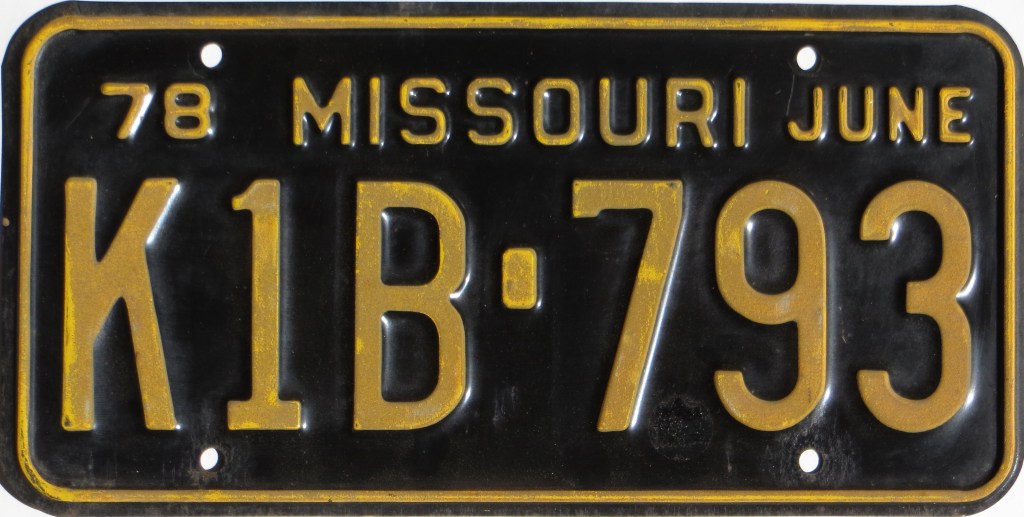
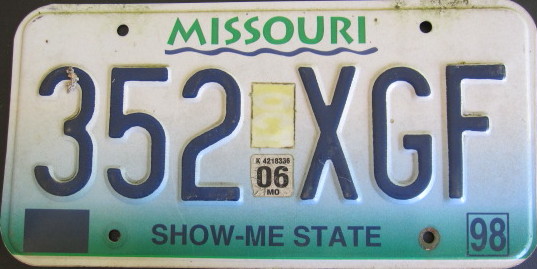
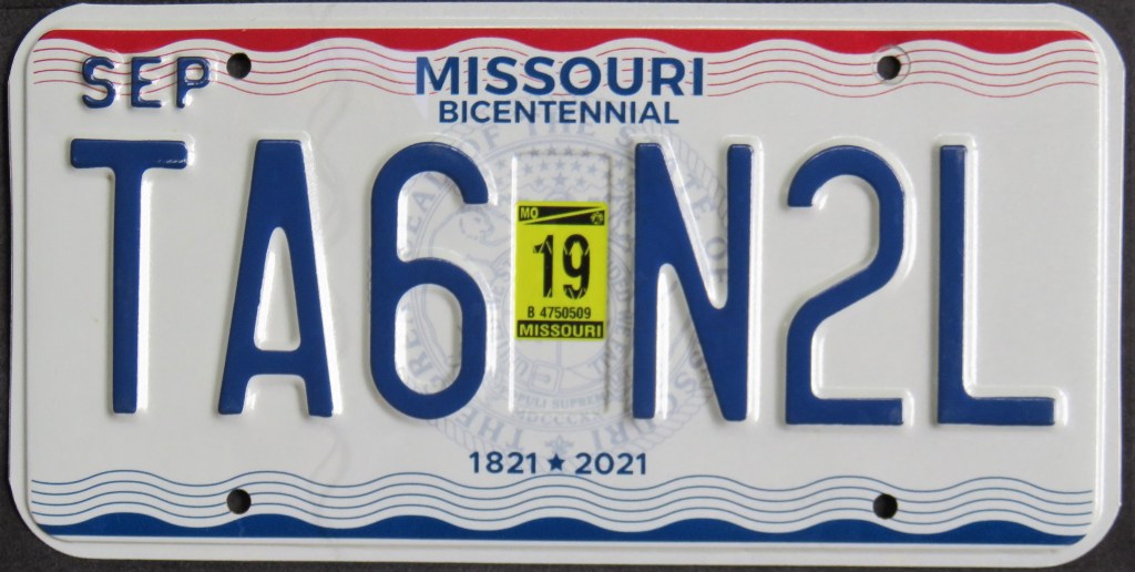
For many years Missouri had a rather unique coding system where the first letter indicated the month of expiration, even though the month was also embossed on the plate. The white and maroon base lasted from 1980 until 1998. The 2009 base featured a little state bird beneath a large state map. The 2019 state Bicentennial base has a state seal but it’s kind of compromised by the vertical sticker well, another unusual feature (which began with the 1980 base).
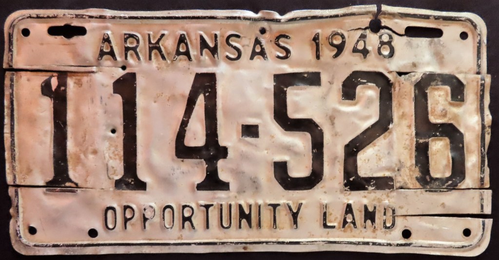
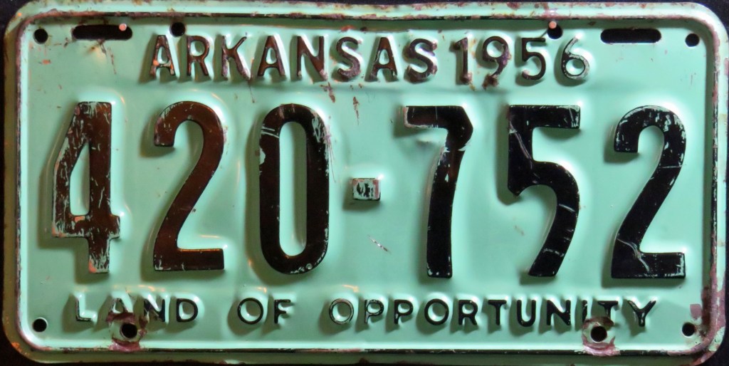
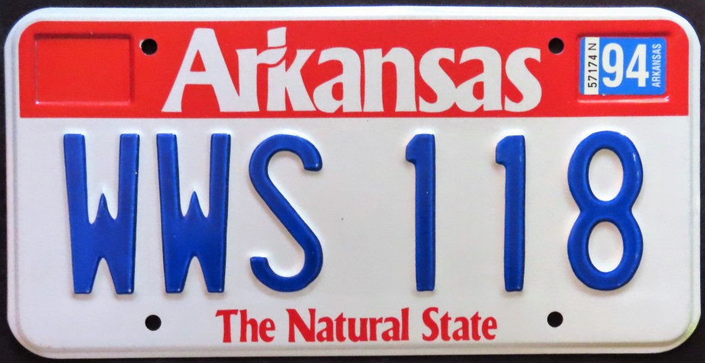
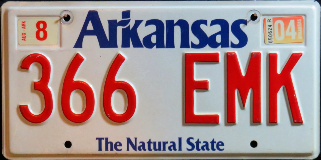
The 1989 base reflected the state’s official nickname change from “Land of Opportunity” to “The Natural State.” The 2006 base is a call to the Crater of Diamonds State Park, where visitors can mine for their own diamonds. In 2018, the state added security marks on the left side of the plate.
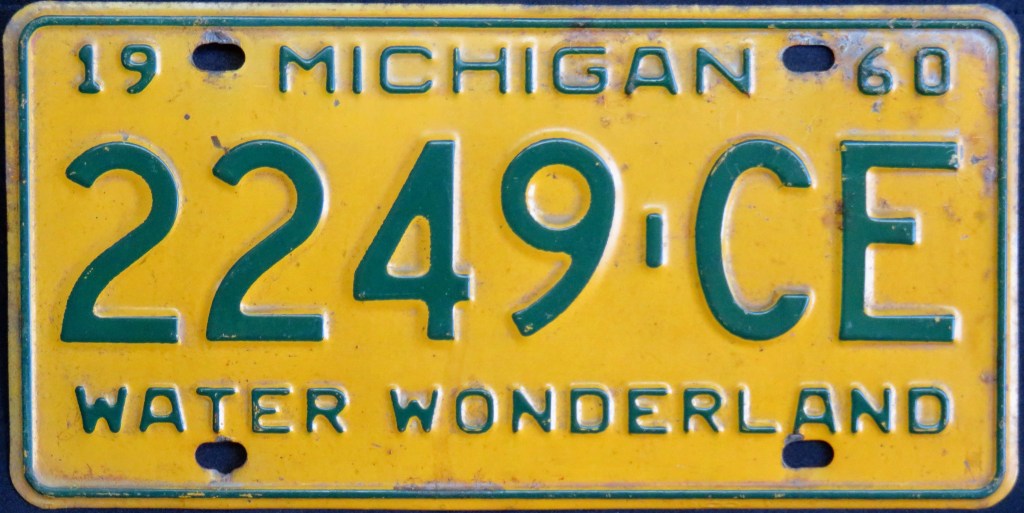
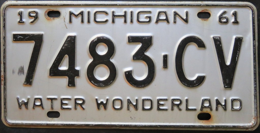
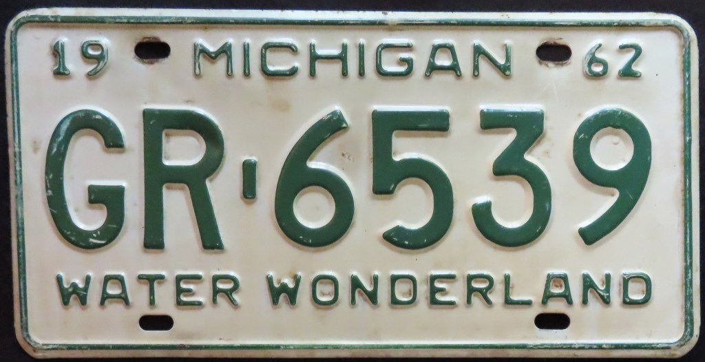
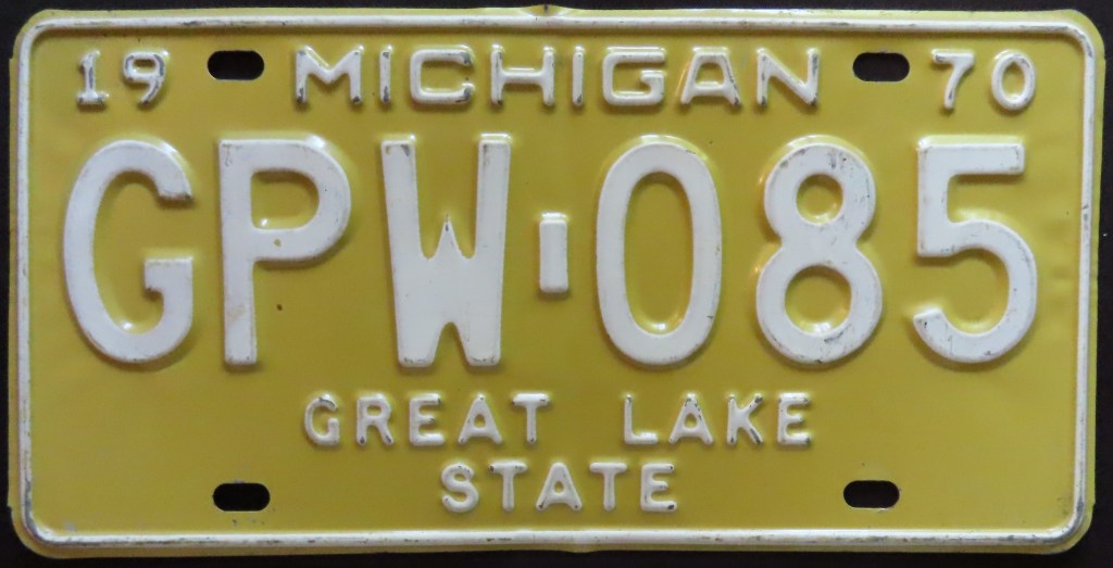
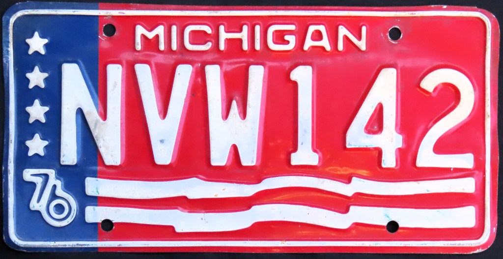
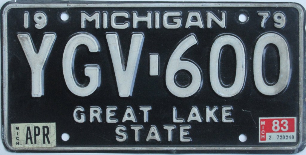
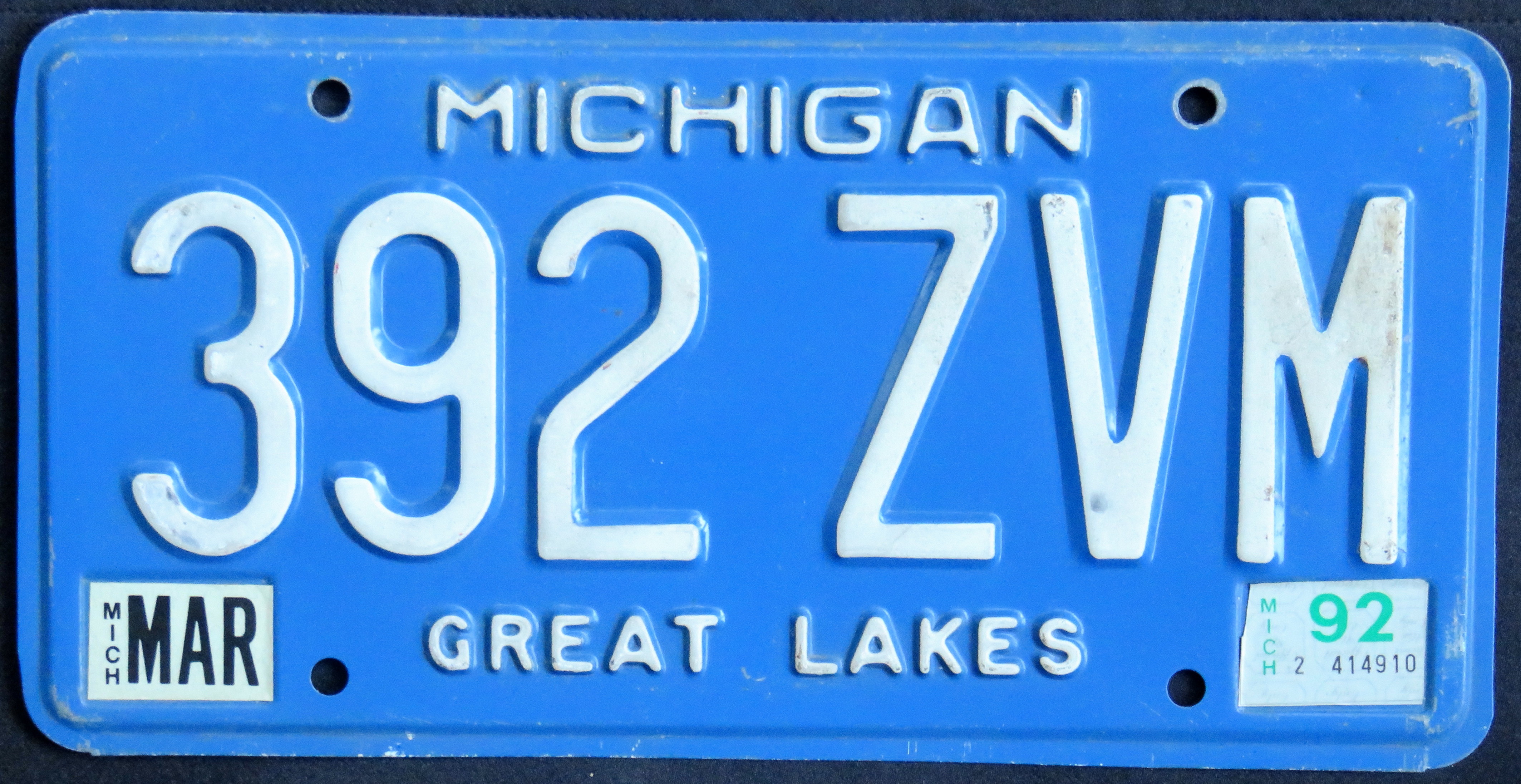
Michigan had the enchanting slogan “Water Wonderland” or “Water-Winter Wonderland” in the 1950s and 60s, then switched to “Great Lake State” in 1968. The popular U.S. Bicentennial base resembled an American flag. The 1984 white-on-blue base lasted for more than two decades with minor variations in sequencing, sticker wells, and dies. The last two bases have incorporated websites, and the current one also uses the new tourism slogan of “Pure Michigan.”
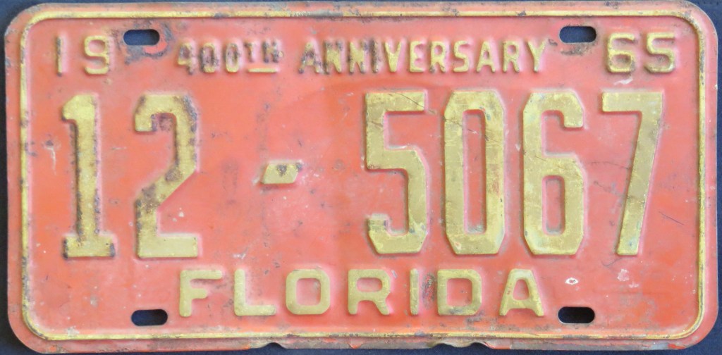
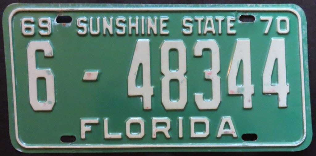
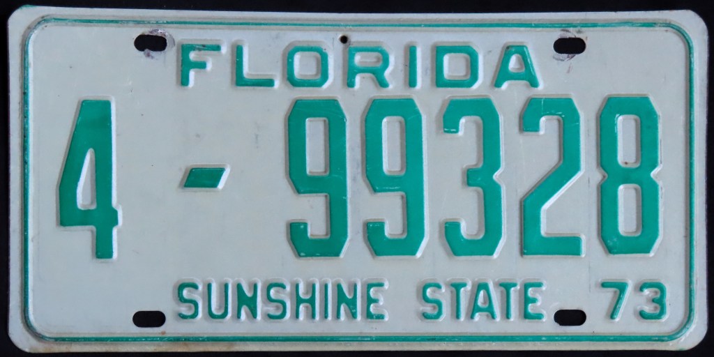
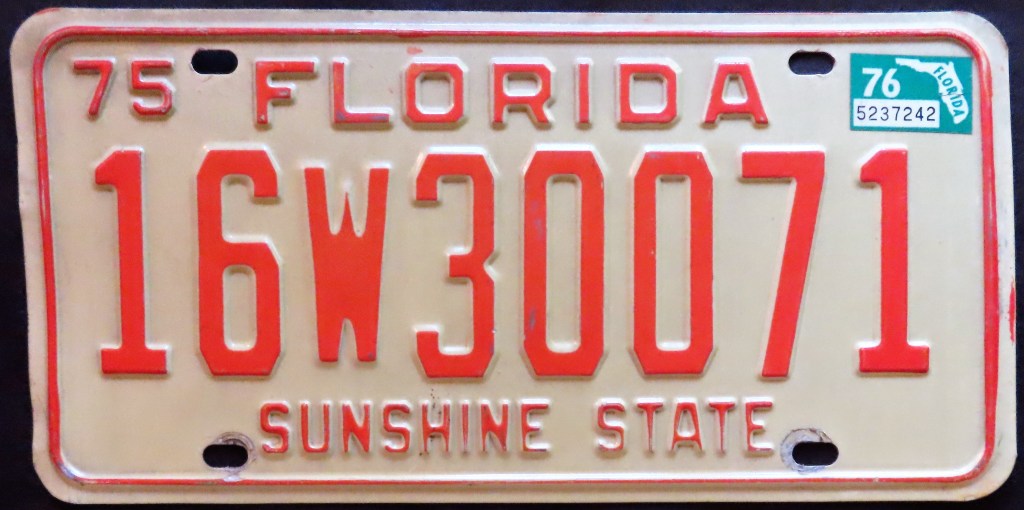
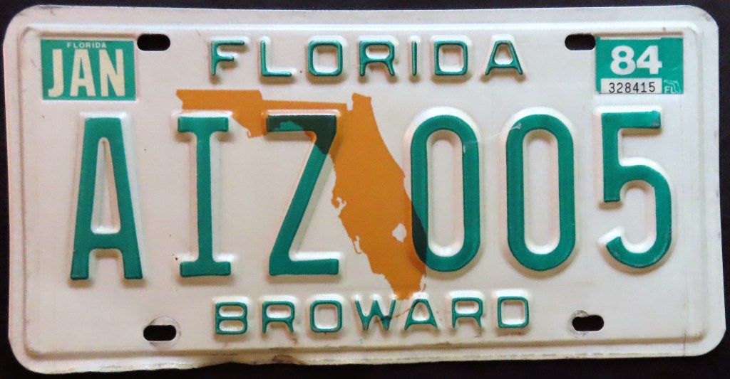
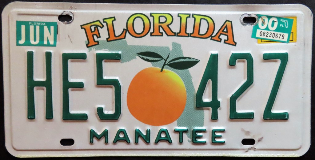
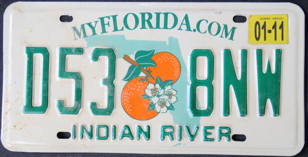
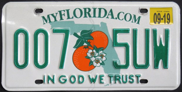
For awhile the state issued a new plate every 13 months, so what used to expire at the end of December did so at the end of January, then the end of February, then the end of March, etc. leading to the split year designs. The 1977 green-on-white base was unpopular with the public, and two years later the state added an orange map, which was then switched to a light green map with red letters, then switched back to an orange map with green letters. This base, along with the 1997 and 2004 (current) bases, could have the county name or the slogan “Sunshine State”; this came about for an unfortunate reason as tourists in Dade County specifically were targeted for crime. The current base also comes in a “In God We Trust” version. As the years have gone on, more and more residents statewide have opted for the slogan.
On the 1975 base, the separator went from star to state map, and it’s been used ever since. The state went graphic with the Sesquicentennial base (which celebrated settlement, not statehood). The 1990 flag base saw several iterations, including the move of the flag from left to right. The statehood Sesquicentennial was a limited run general issue. By 2009, the star and the flag were co-existing in harmony.
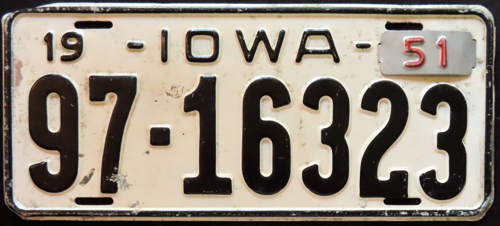
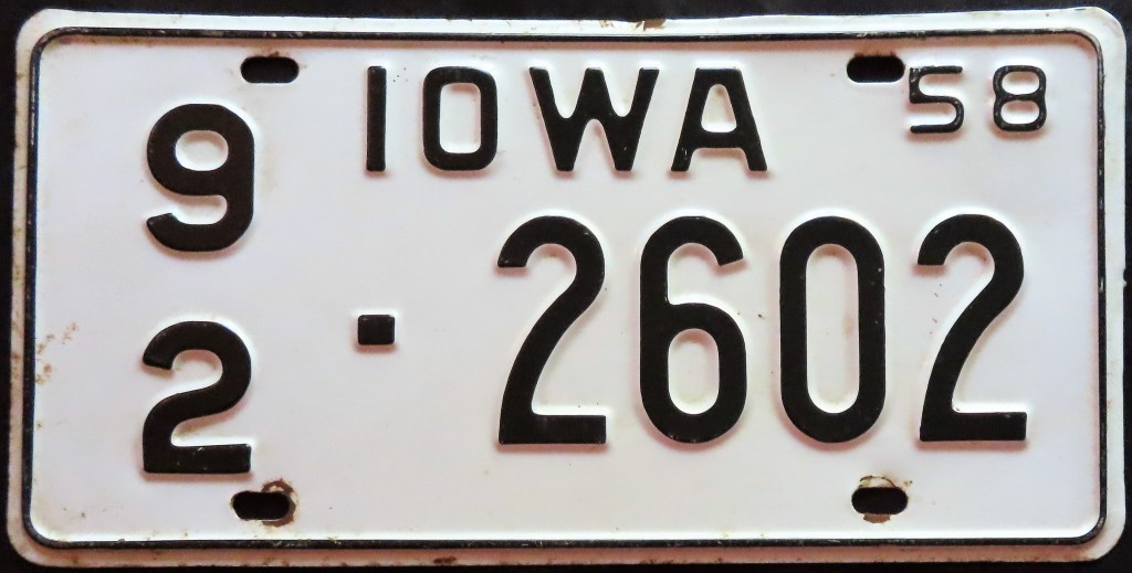
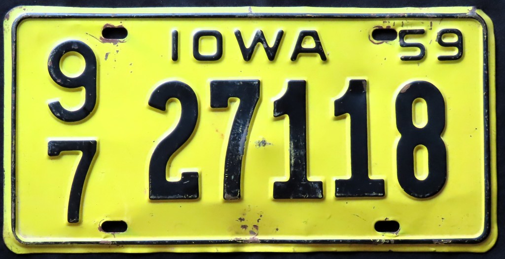
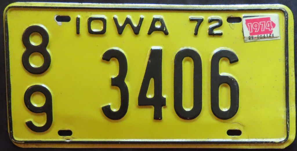
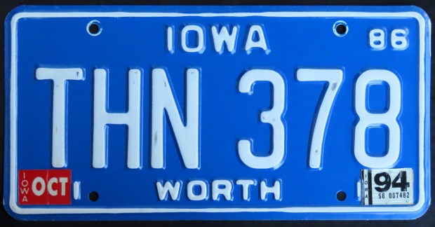
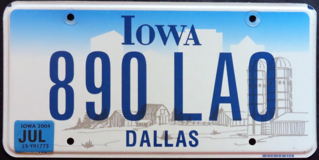
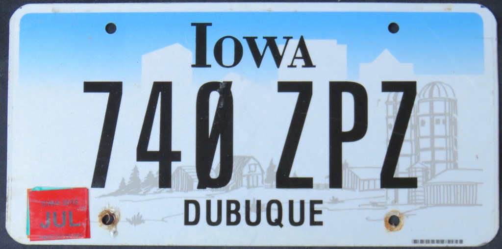
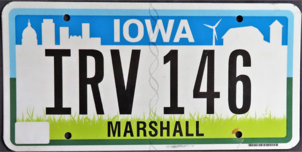
Iowa used (often stacked) county codes from 1922 through 1978. The 1979 base (which included two varieties, debossed on a lighter green and embossed on a darker green) employed names instead which has lasted through today. Note the changes to the 1997 farm scene base, which went from embossed to flat, then blue to black serials. Also with the black serial, zeros were given a slash to help differentiate from the letter “O,” given that it would soon switch format to ABC 123. In 2018, a new base retained a farm scene background but brightened it with more color.
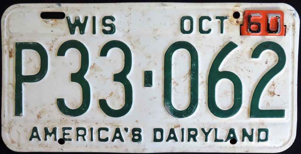
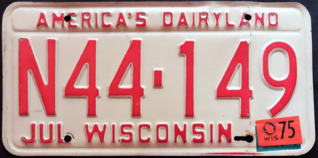
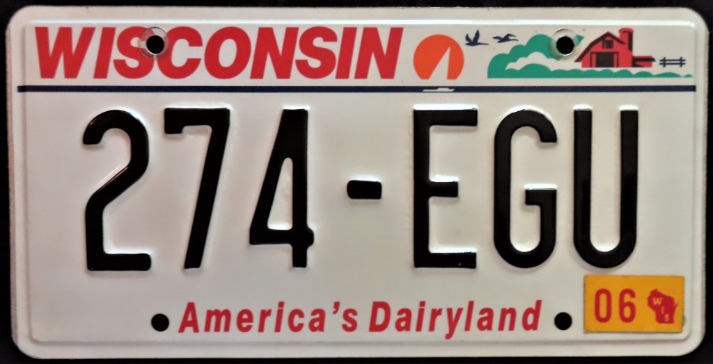
The state has used “America’s Dairyland” since 1940. Graphics were introduced on the 1987 farm scene base, which started off blue and changed to red less than a year later. In 2000, it was changed to black, the state name and slogan both enlarged and changed to red, the dash made horizontal, and the double thin lines switched to one.
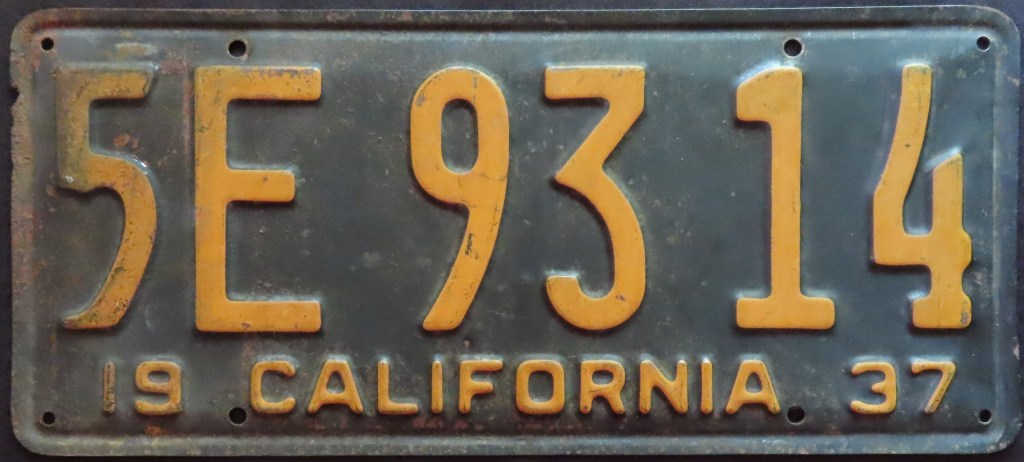
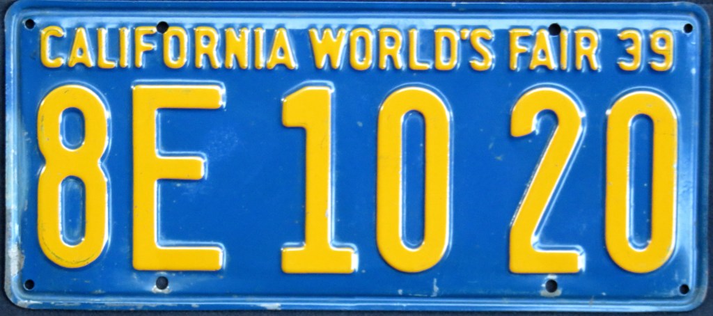
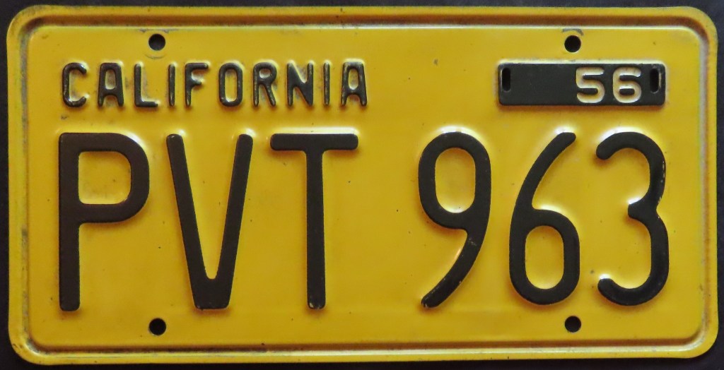
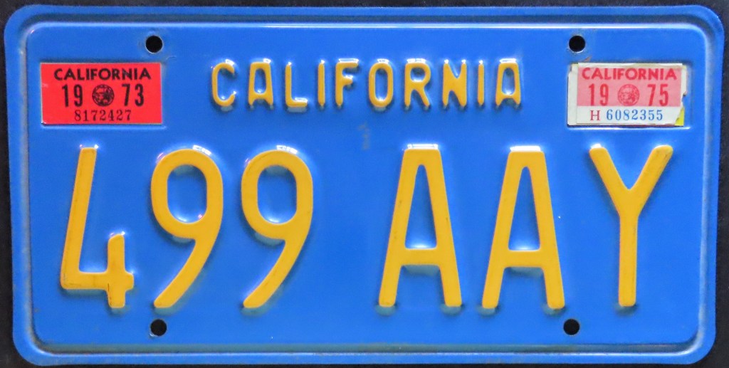
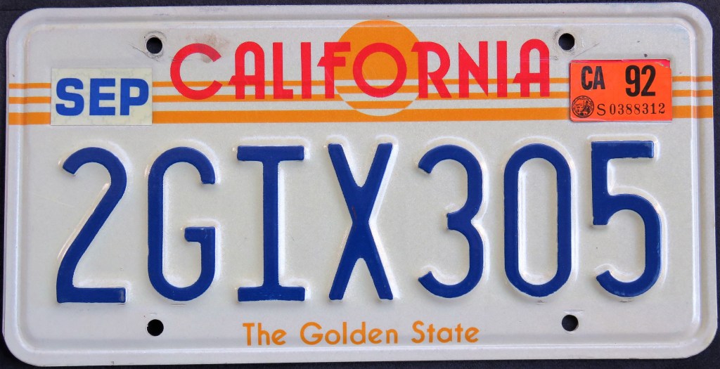
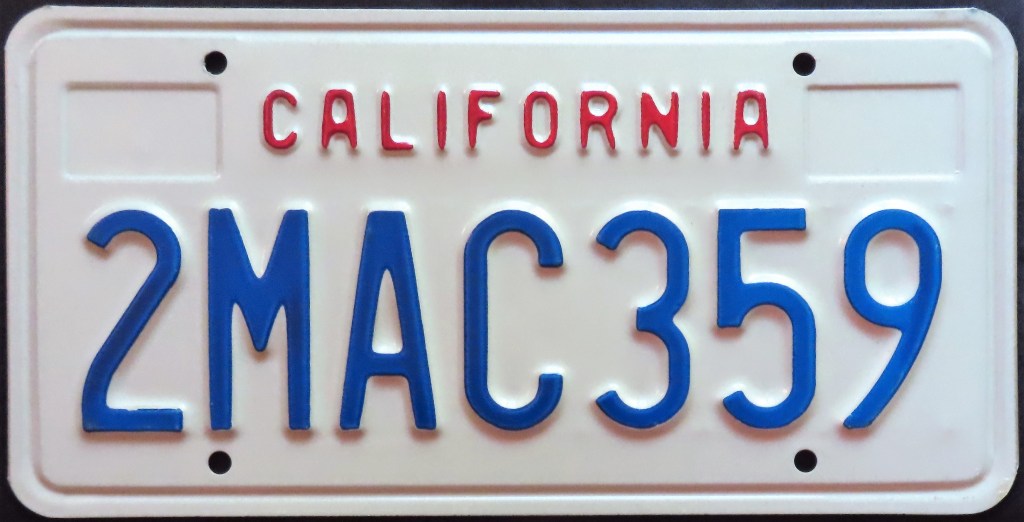
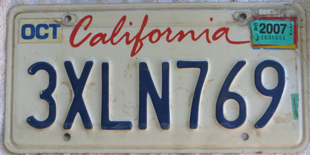
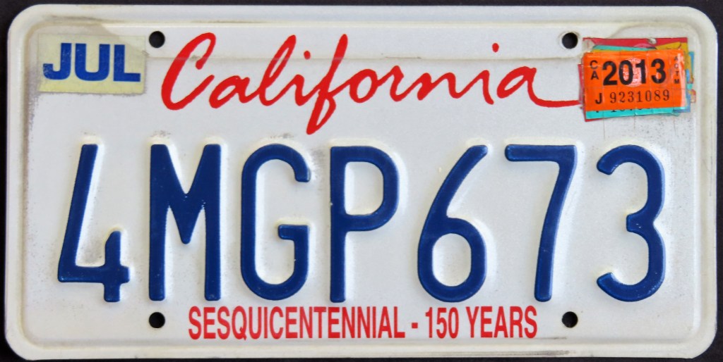
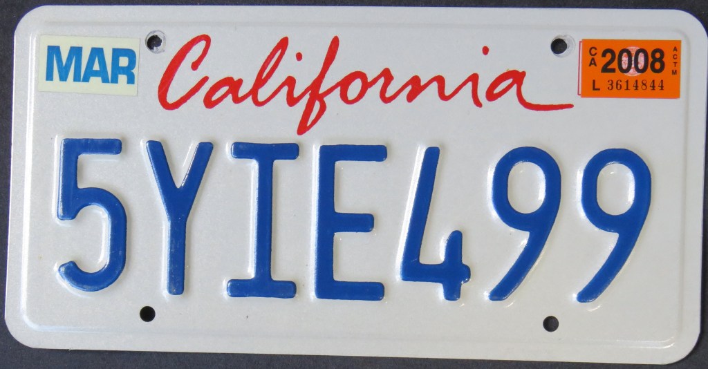
I don’t generally collect older plates, but this being my home state I’ve inevitably picked up a few. The 1956 base is one of my personal favorites, while the 1963 yellow-on-black base has won the hearts of many Californians to the point where a re-issue was made as a specialty version that can be seen often. The 1969 base saw a transition about 10 years later of six-character to seven-character plates. The “sun” optional became available at the end of 1982 for a very small fee; for a brief period (2F & 2G) it was the only general plate issued to new registrants. Then in 1987 the plain red, white, and blue plate arrived, followed by its cousin with “lipstick-style” state name in 1993, which remains on the roads today. For a short time the “Sesquicentennial” slogan was attached, and then in 2012 the state slapped on the pointless DMV web address. This resident is anxiously awaiting a new base plate to look at; thank goodness for the specialty plate program so I don’t have to have this monstrosity on my own car!
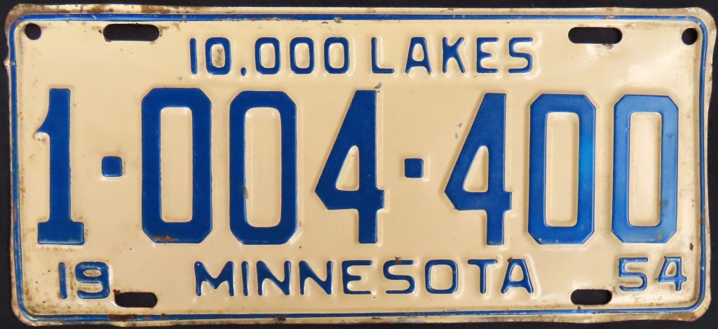
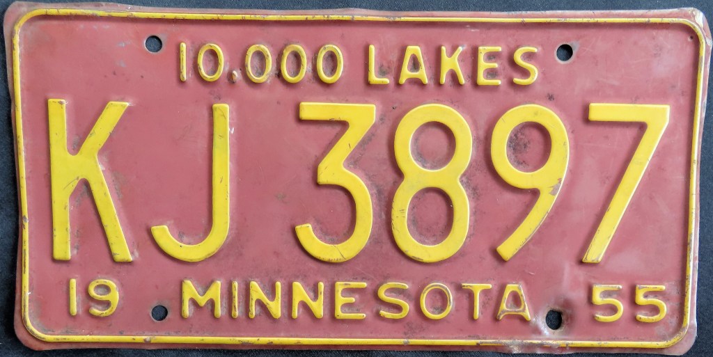
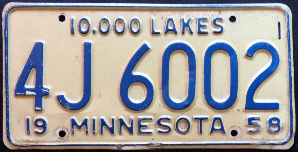
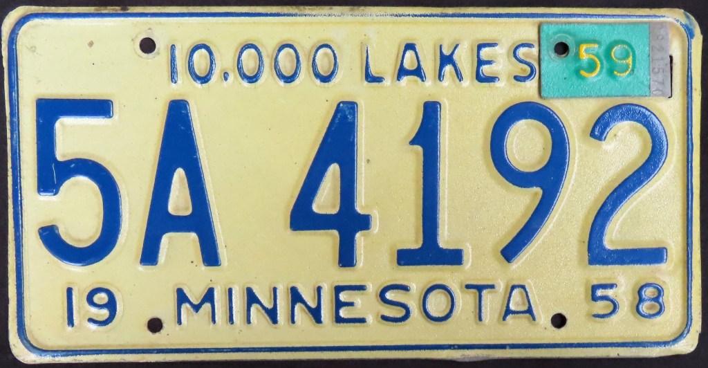
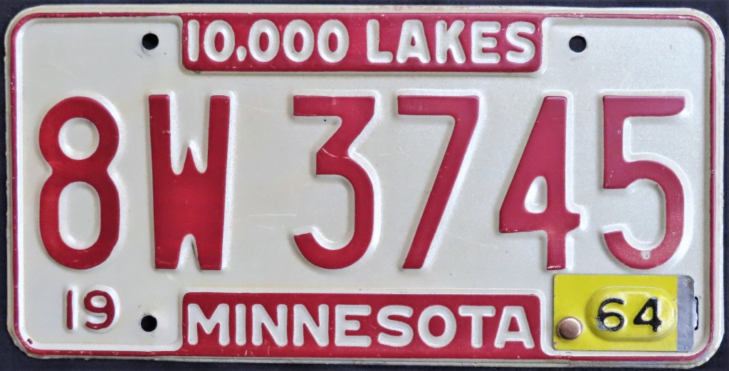
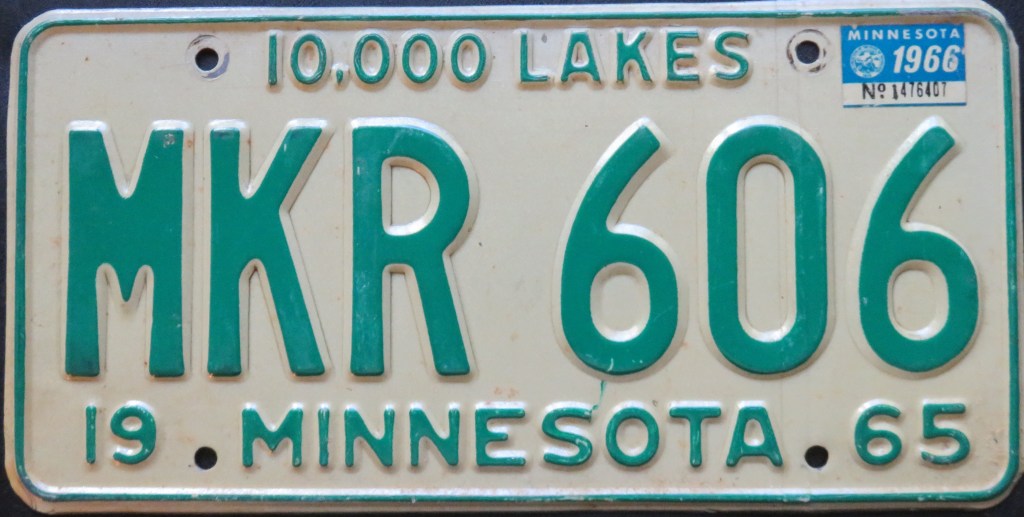
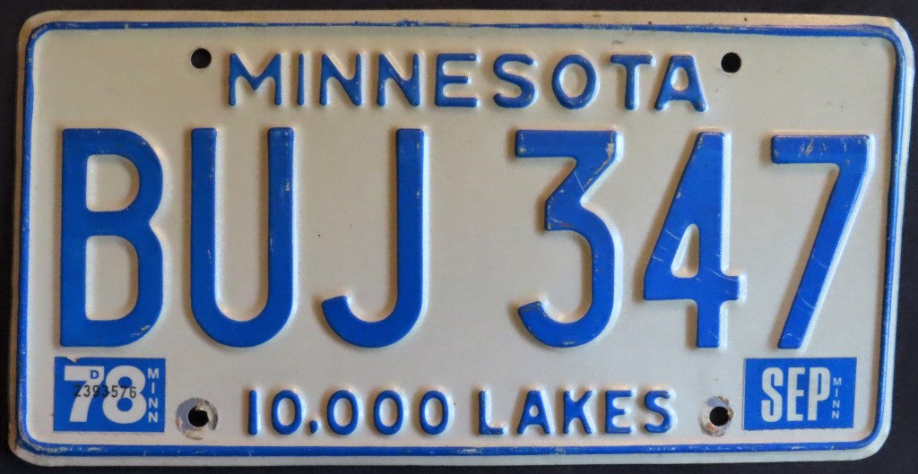
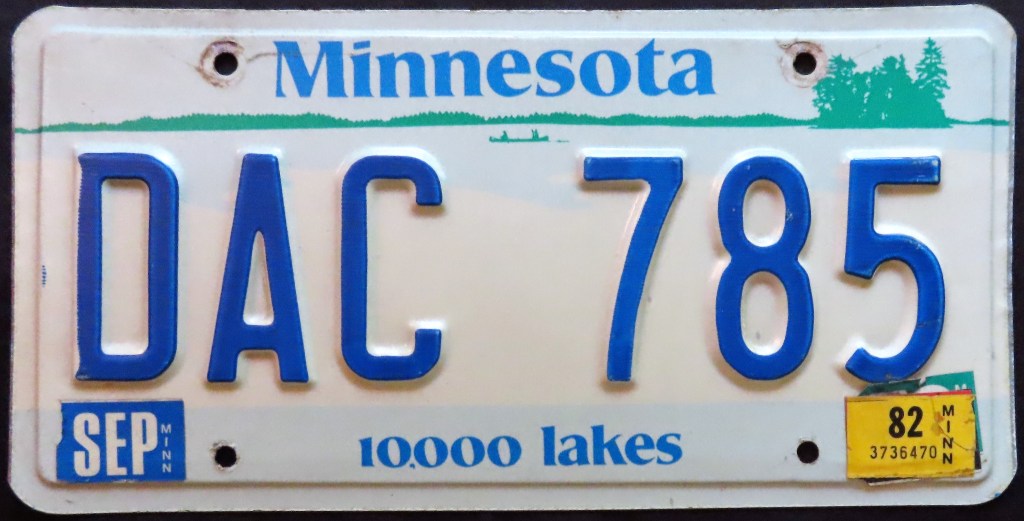
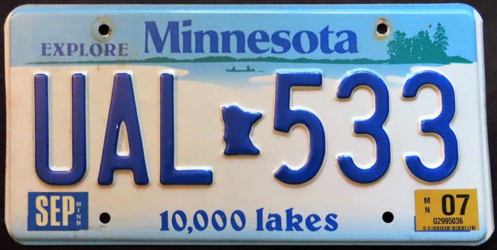
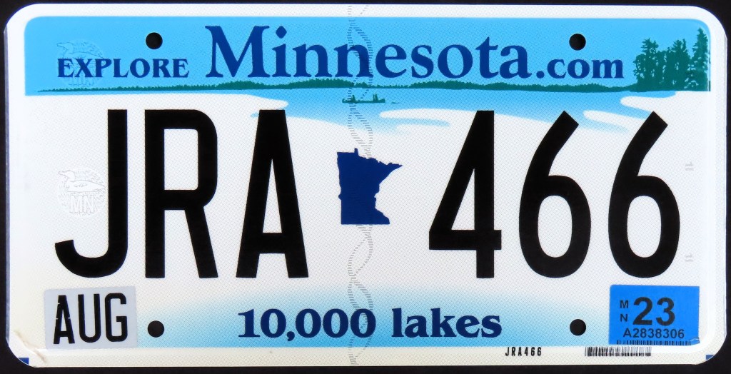
Minnesota’s plate history includes the “waffle”-style 1949 plate, the 1952 plate with unique dies, several versions of bases featuring debossed characters in embossed bars, and the long-running lake scene base, which has undergone a few transformations. On JRA 466, look for the loon watermark and other security features.
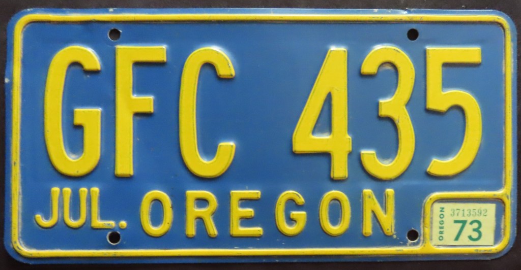
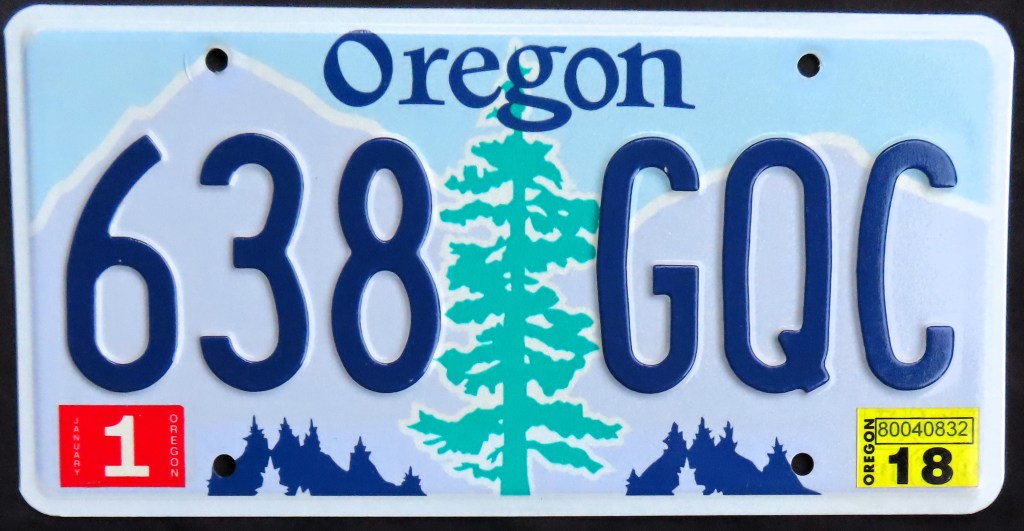
Oregon’s almost never had a slogan (only the 1960 base). The 1964 and 1973 bases were essentially mirror images of each other; the 1973 base (which included a transition from embossed months to stickered months) was followed by the fir tree base in 1987. The serials for this base started in the Ps and by the Rs the plate was redesigned. Since then the serial format has flipped but otherwise it’s the same one you’ll see on the roads today.
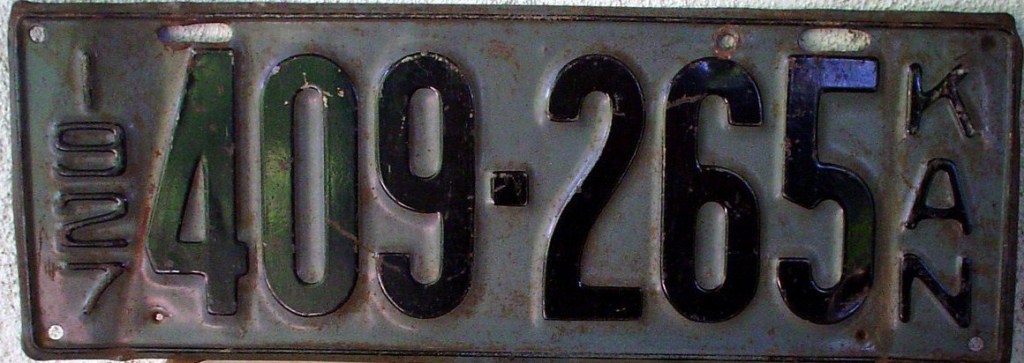
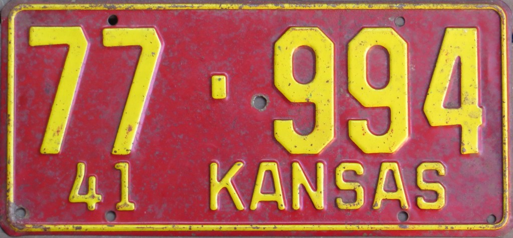
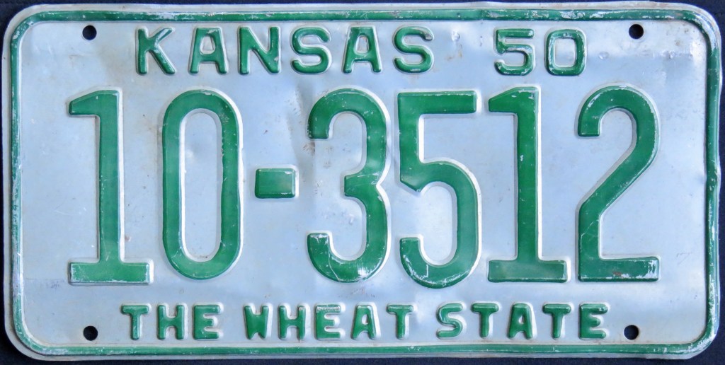
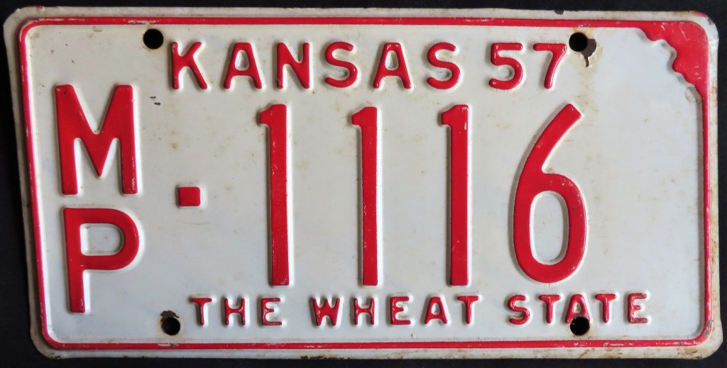
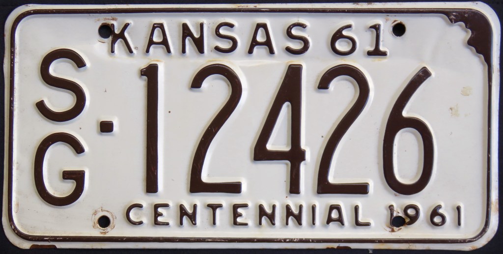
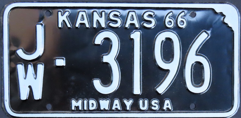
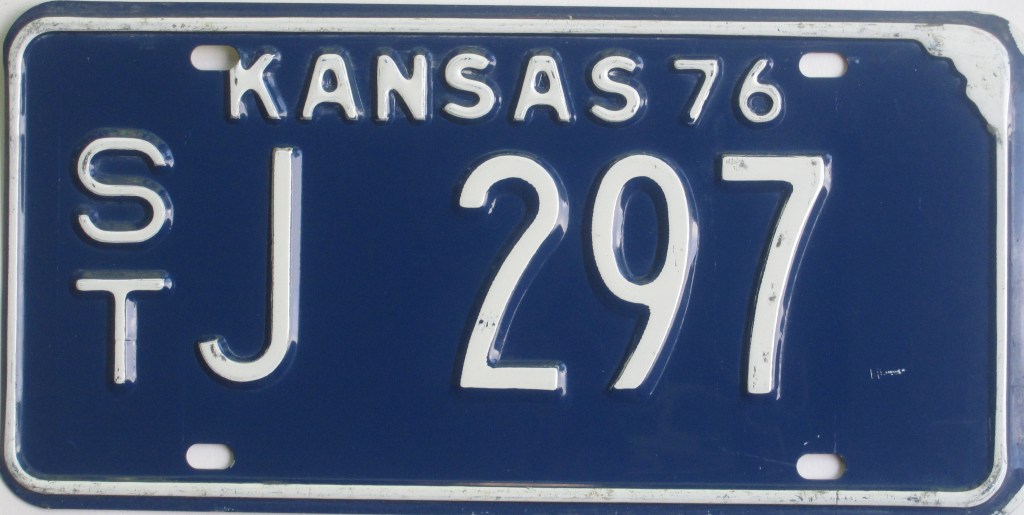
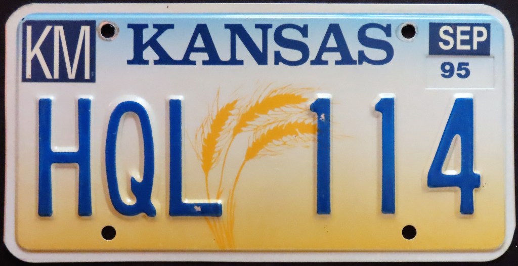
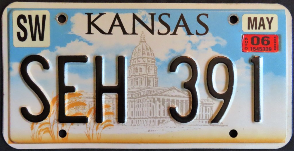
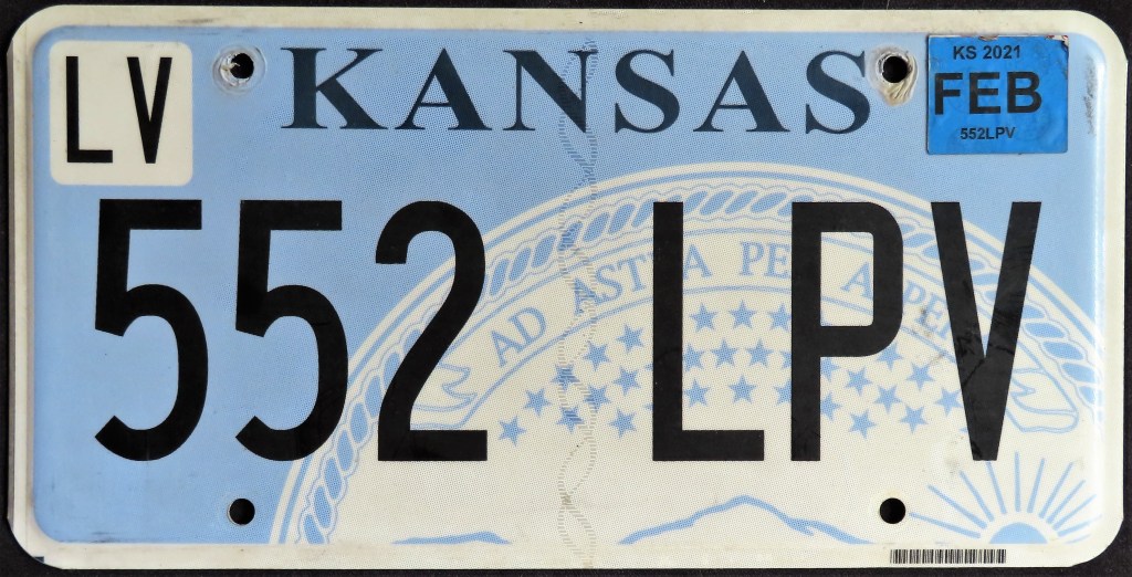
Kansas had a plate cut-out in the state outline (1951), then modified that to resemble the traditional 6 X 12 standard that came about in 1956. The “Wheat Centennial” commemorated the first planting of wheat in the state (according to folklore). The slogan appears on some issues of both the 1974 and 1975 plates. The 1976 base was the state’s first multi-year base. The 1980 base featured a graphic of wheat and was the first since 1950 to not include the state outline. The 1989 blocked-letter base underwent a revision near the end of the D serials to make it more legible. The current “state seal” base debuted in 2007; in 2019 it went flat and the dark blue characters changed to black. Since the ’89 base the two-letter county codes are on a sticker meant to be placed in the upper left corner; from 1951 until then the county codes prefaced the serial and were stacked; and from 1930 through 1950 the codes were numeric and separated from the rest of the serial by a dash.
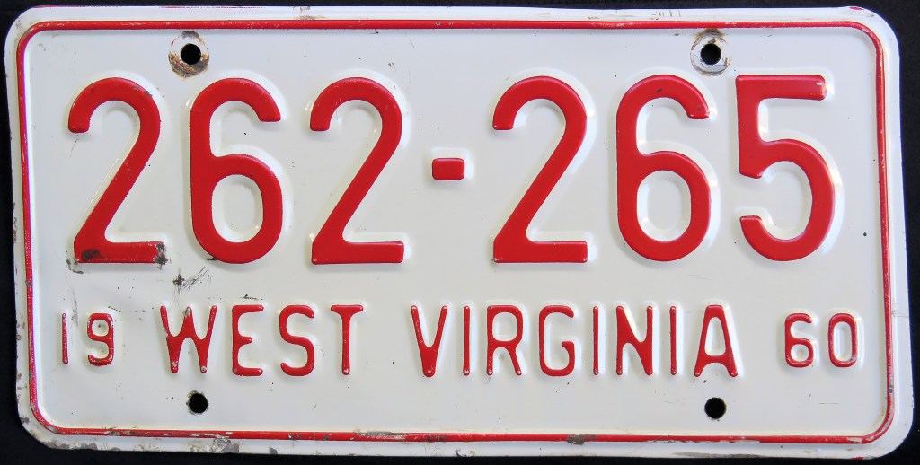
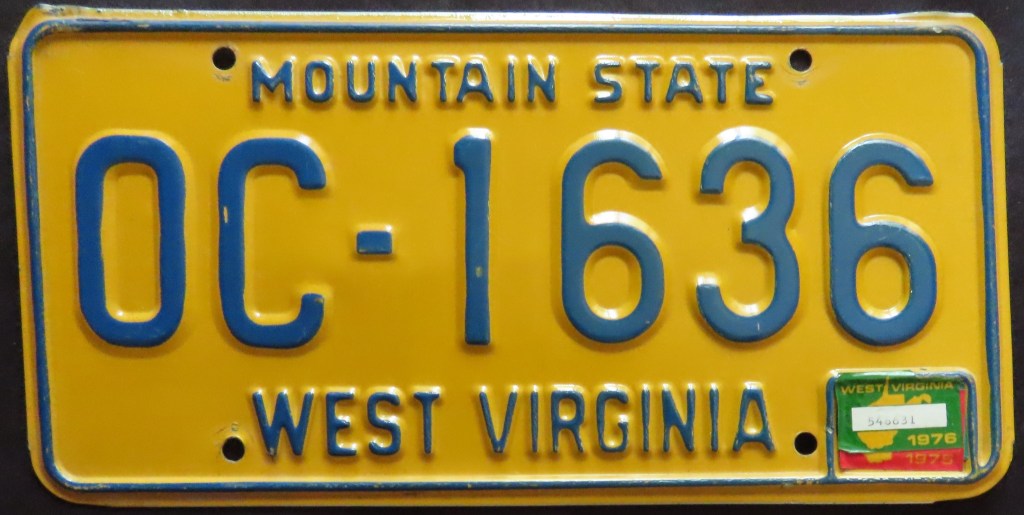
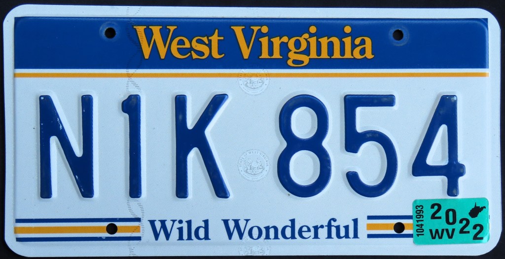
West Virginia is one of a few states that introduced a new base plate in 1976 that was NOT a U.S. Bicentennial. The outline on the state map graphic caused legibility issues so seven years later they removed the outline. In 1996 the “Wild, Wonderful” slogan and the colors were retained on a new base, which was later updated to include a web address in small letters below the state name.
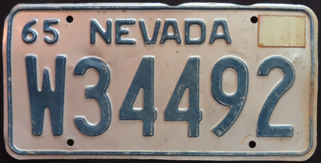
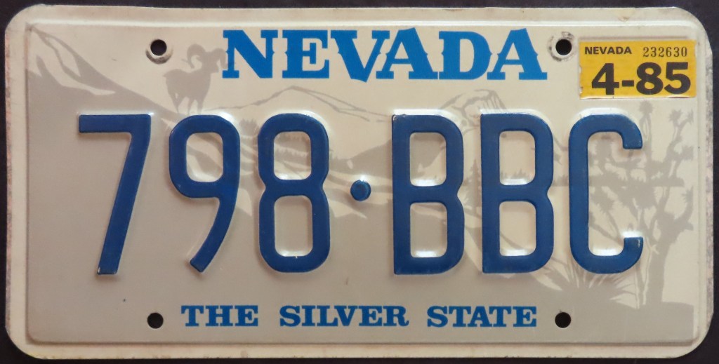
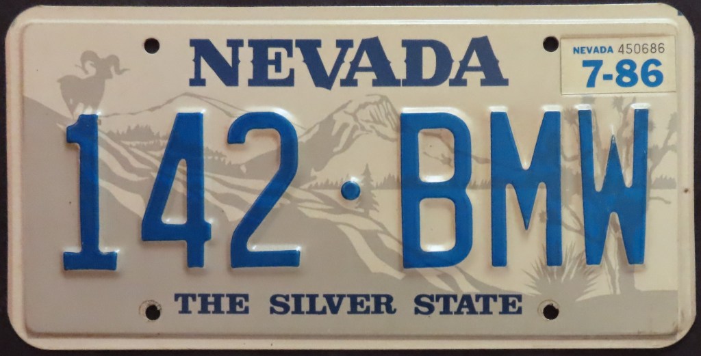
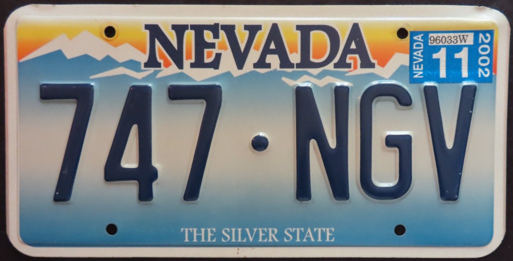
Nevada had confusing serial formats for many years, making it difficult to discern the difference between passenger and other types (most notably trucks). The 1961 base featured an awesome state-shaped sticker well in the upper right corner, but sadly this was not repeated thereafter. The 1985 bighorn sheep base went through a couple of iterations; 798 BBC is of the initial version which ran from somewhere in the BAC series to somewhere in the BGA series. The most notable difference is the color of the state name changes and the sheep moves west. Some 1985 bases and blue-on-white bases had a county sticker issued and utilized. The 2001 base had an equally long lifespan and went from embossed to flat back to embossed but with a state map separator. Also in 2001, Nevada came out with the “Circa 1982 Replica” optional plate which harkened back to the era illustrated by 444AKW; it is still available today. The “Home Means Nevada” base appeared in 2016 and has been filtered in over the ensuing years.
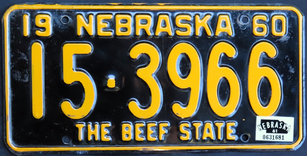
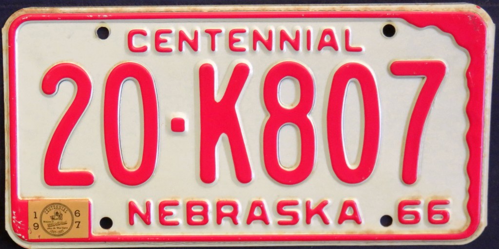
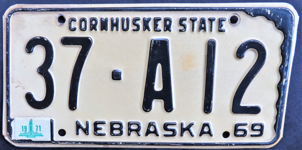
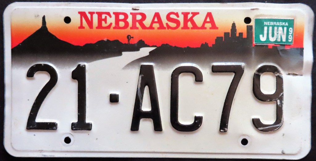
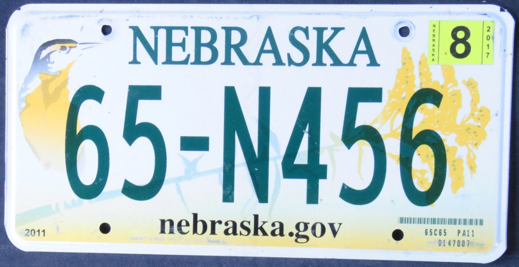
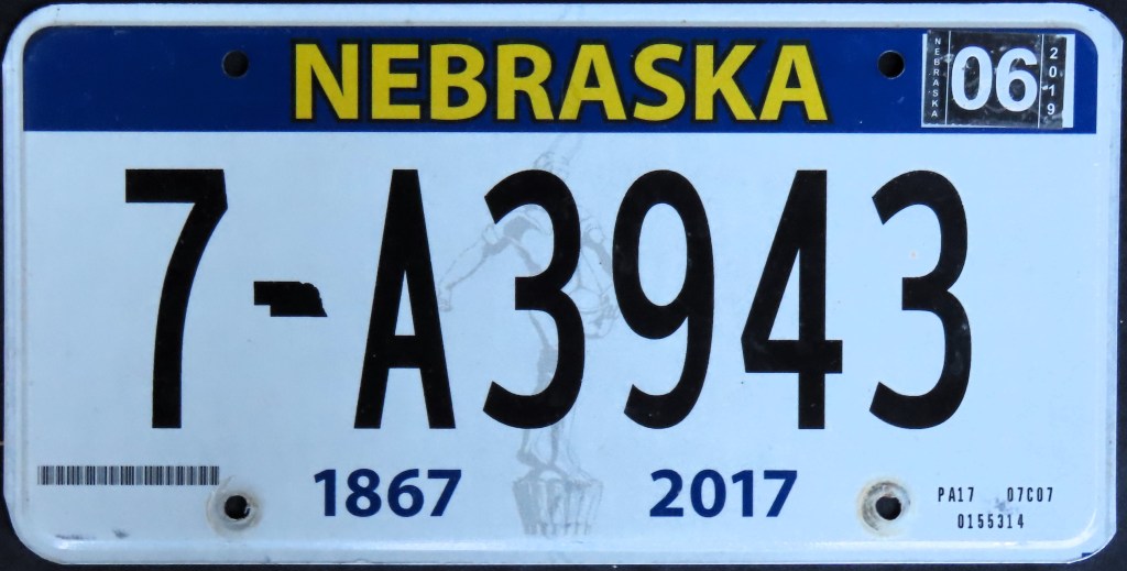
Nebraska’s Centennial base – one of a series of state outline bases – included a decorative registration sticker. The 1976 U.S. Bicentennial base is a busy plate with small graphics of a Calistoga and a Native American chief in the corners and a wavy graphic slogan at the bottom. The late 1980s through the 1990s included a run of “landscape” bases, most of which depicted Chimney Rock and a cityscape. The 2011 base included the state bird (western meadowlark) and state flower (goldenrod), while the 2017 state Sesquicentennial base furthered state pride with a graphic of the Sower statue, which rests atop the capitol building. Nebraska’s plates are county-coded, so the first or two digits represents a given county.
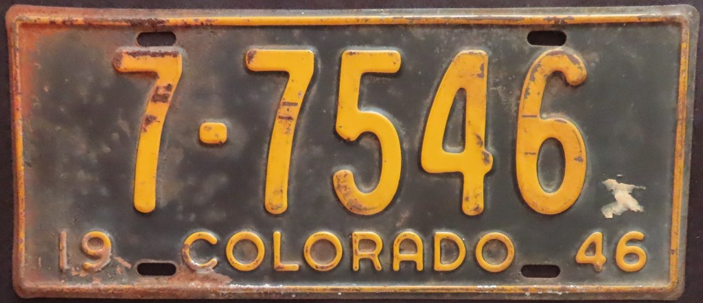
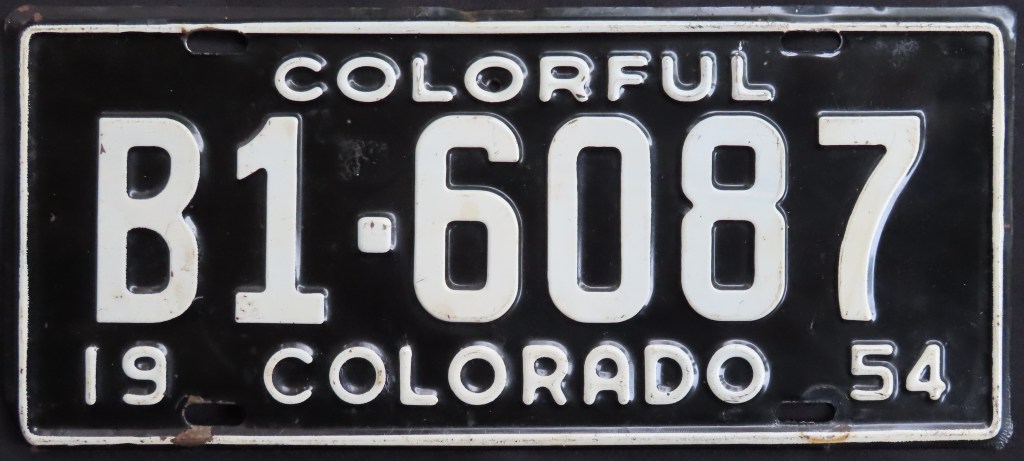
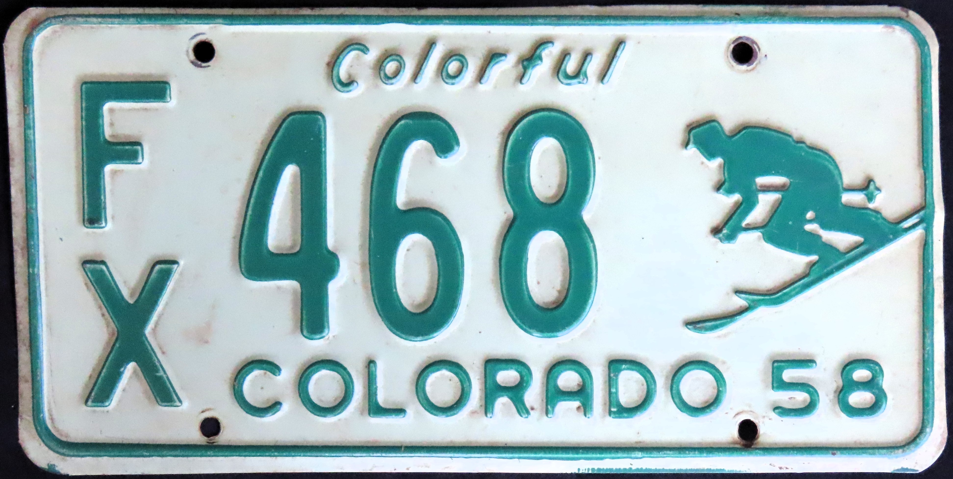
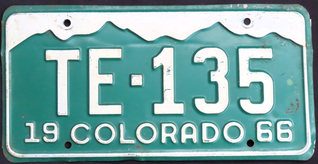
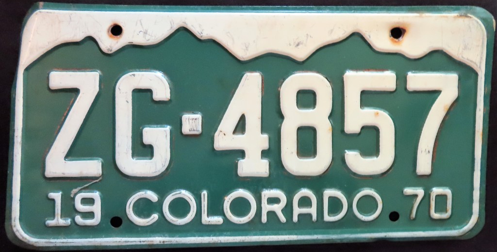
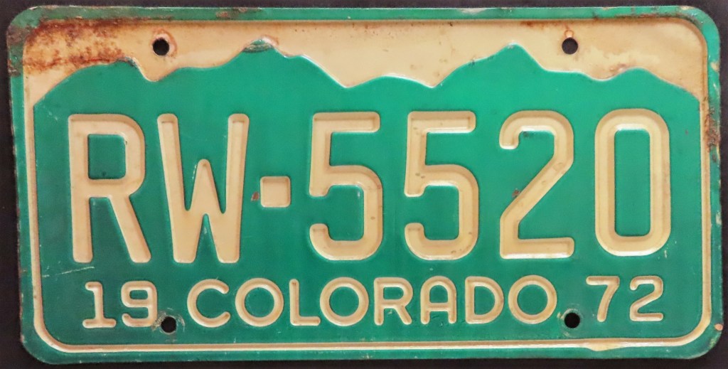
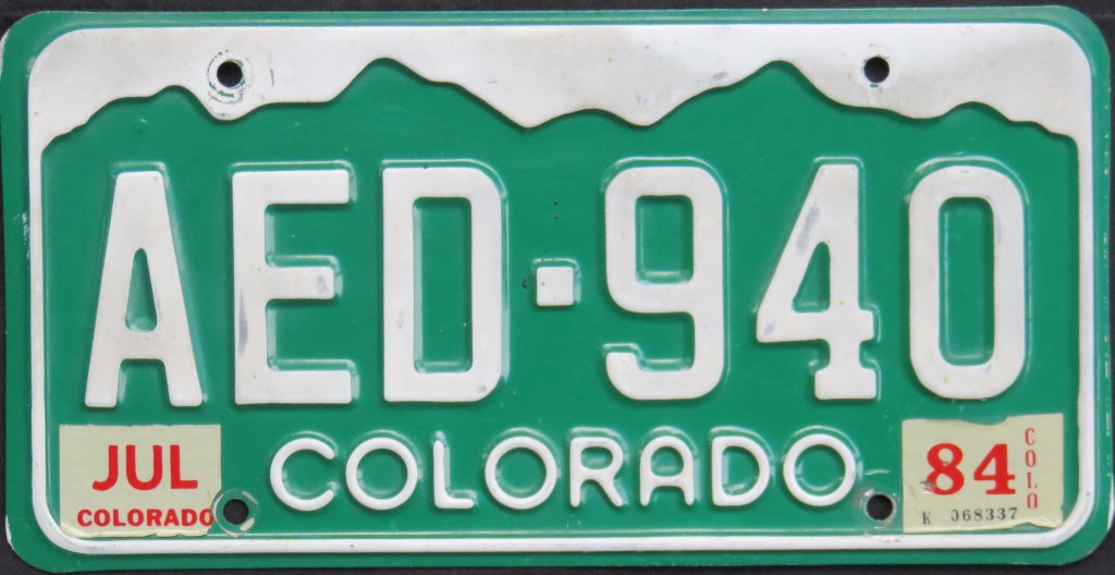
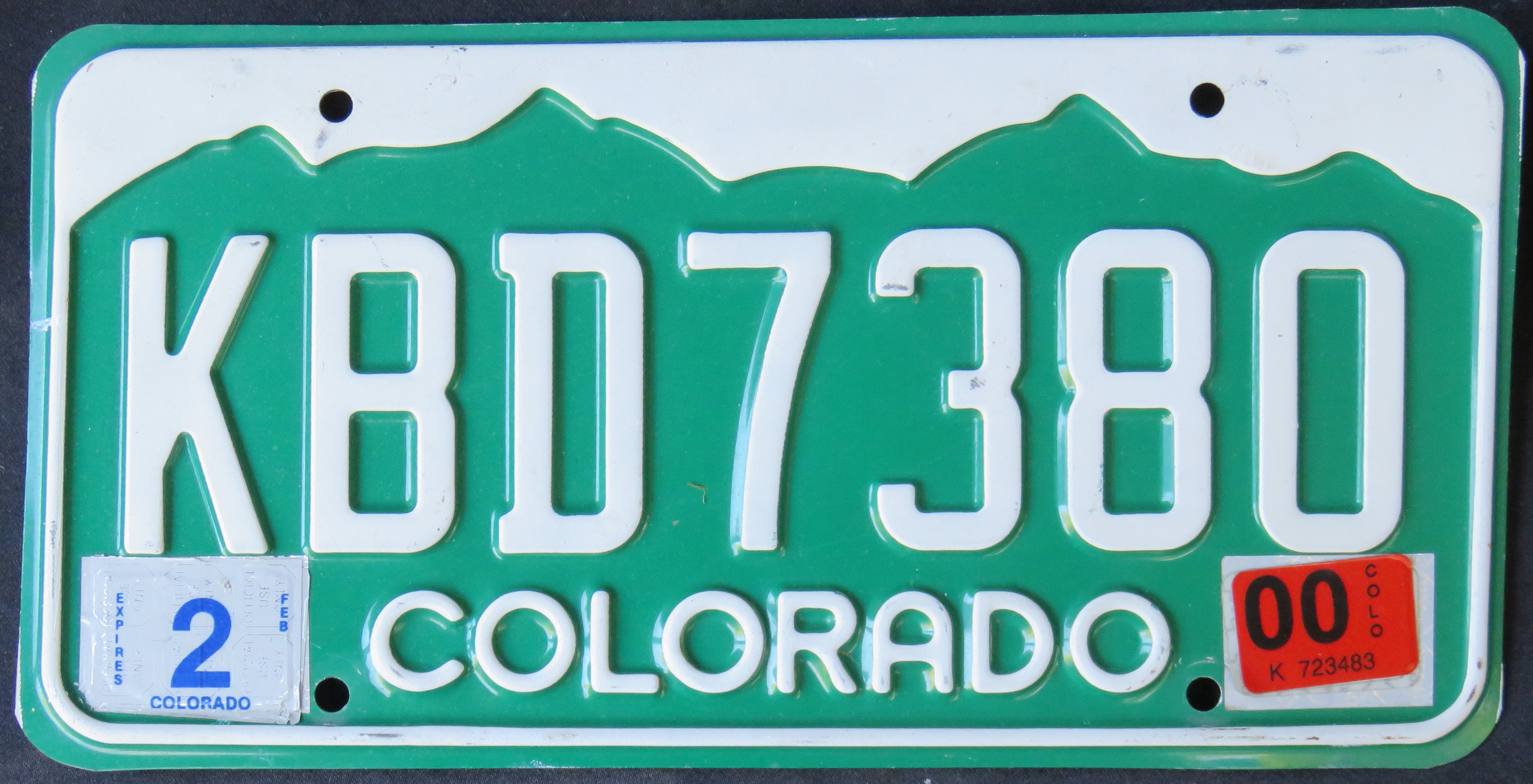
Colorado has put mountains front and center from 1960 onward, rarely using a slogan and when it did so didn’t reference mountains. Prior to 1960, the only graphic had been in 1958, with an iconic skier. The Centennial base ably threw in a nod to the U.S. Bicentennial with its color scheme. The 1977 base went for 23 years (changing formats a couple of times), and the 2000 base – the first one with screened mountains – remains in use today.
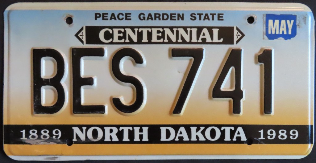
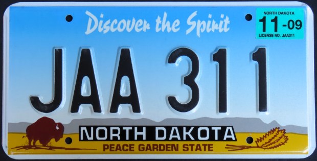
North Dakota ushered in the “Peace Garden State” slogan (referencing the International Peace Gardens, a place of unity between Canada and the U.S.) in 1956. The 1984 Teddy Roosevelt base paid homage to the former President, who had formative experiences in the state. The three bases since have all had a double-slogan, with “Peace Garden State” taking an increasingly smaller role.
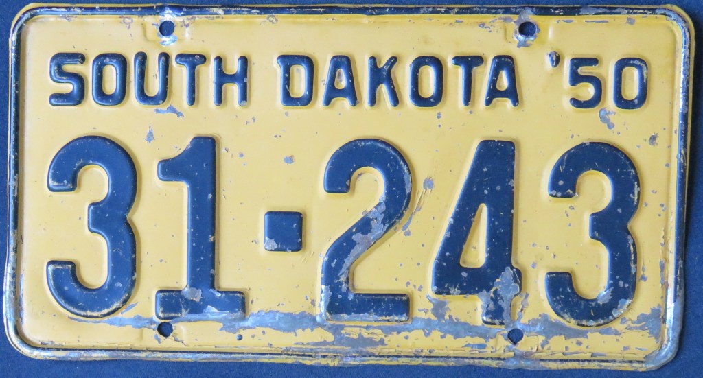
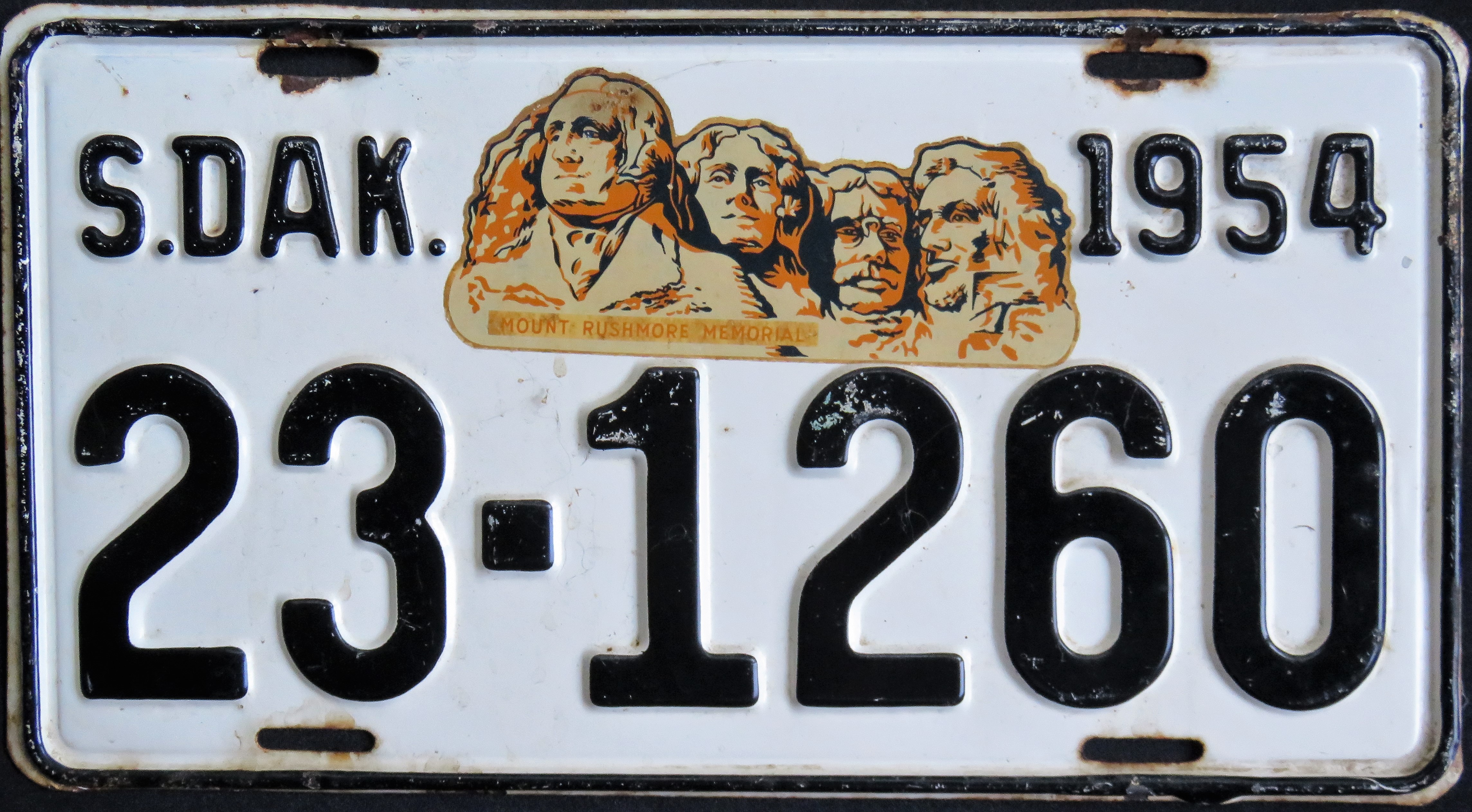
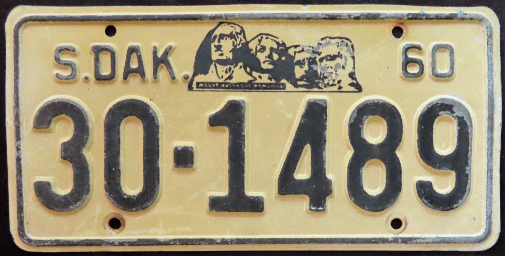
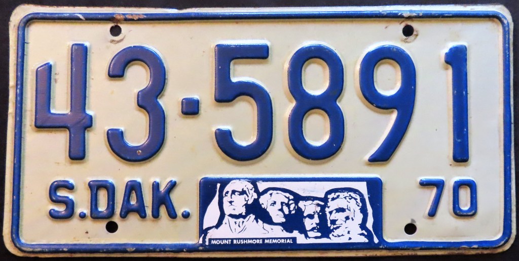
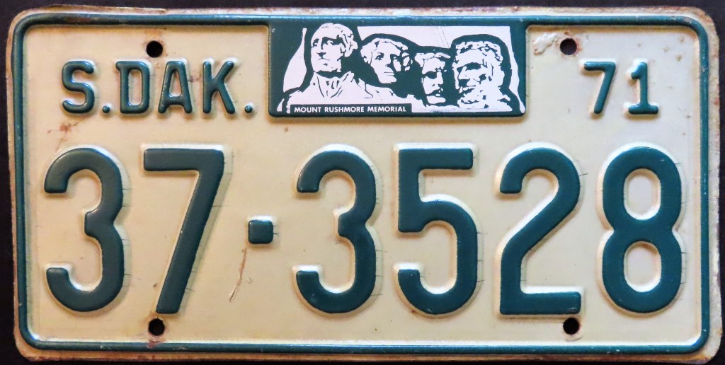
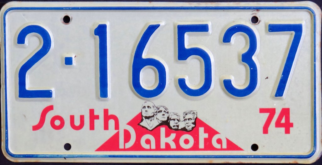
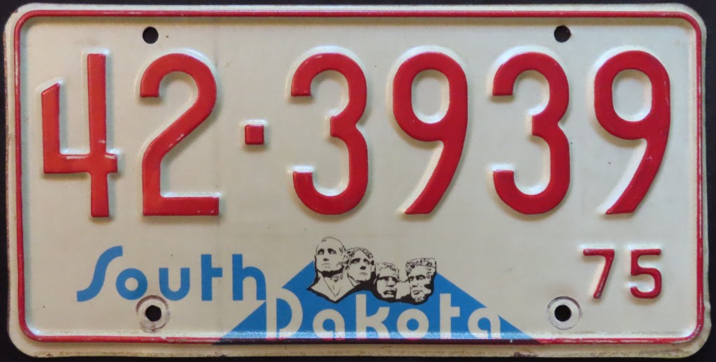
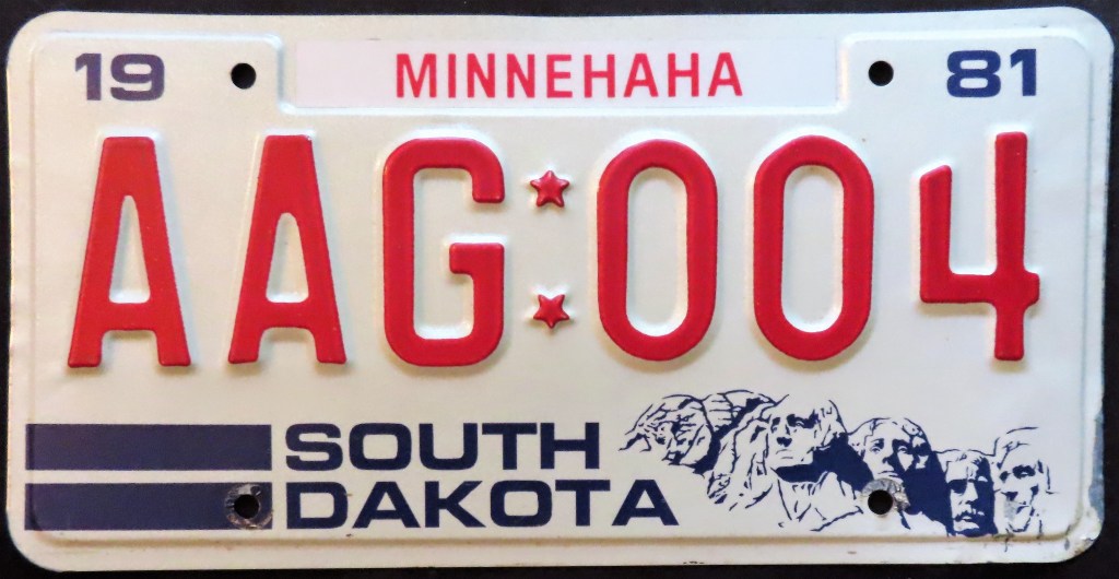
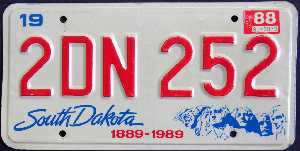
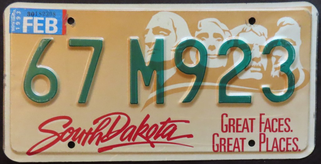
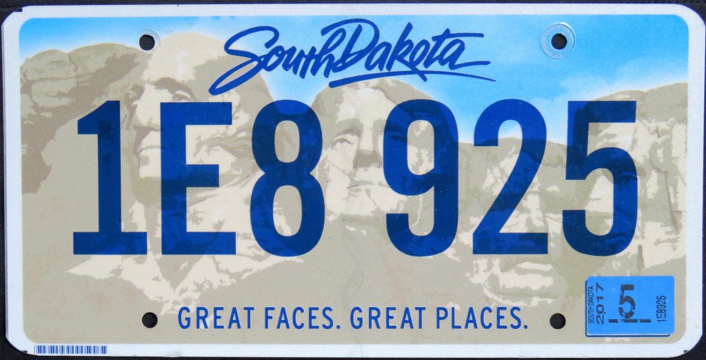
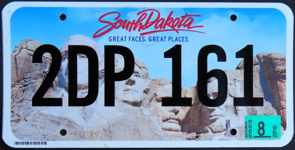
South Dakota plates have depicted Mt. Rushmore from 1952 through the present, from decal to embossed rectangles to screened graphics. The 1974 plate was the first in the U.S. to deploy the screened graphic, changing license plates forever. Like a number of other states, South Dakota plates are county-coded by number (the U.S. Bicentennial base used letters instead, and the 1981 base featured no codes but had stickers). On the 1981 base, JEX 411 is a later version wherein the state had a consonant-vowel-consonant combination of letters, and a modified county sticker (larger, thicker letters). The Centennial base of 1987 included an optional “Celebrate the Century,” but its issuance varied by county. The last three bases have all included a full-plate rendering of Rushmore.
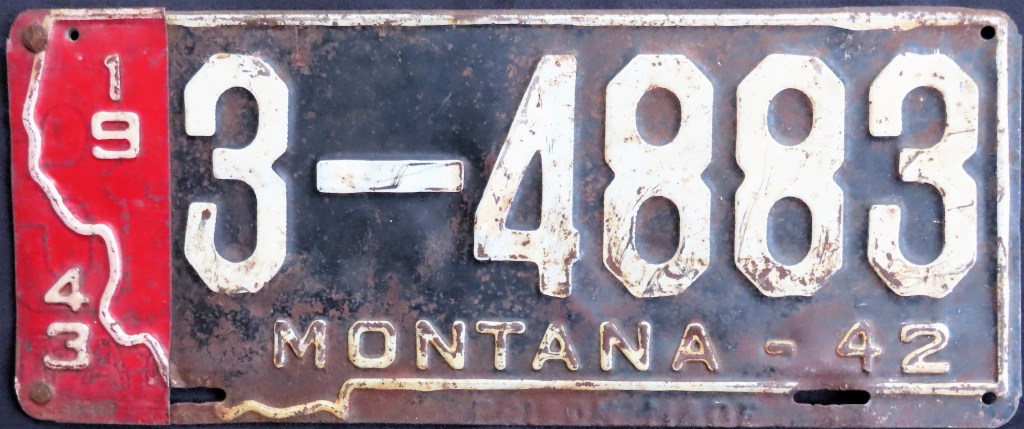
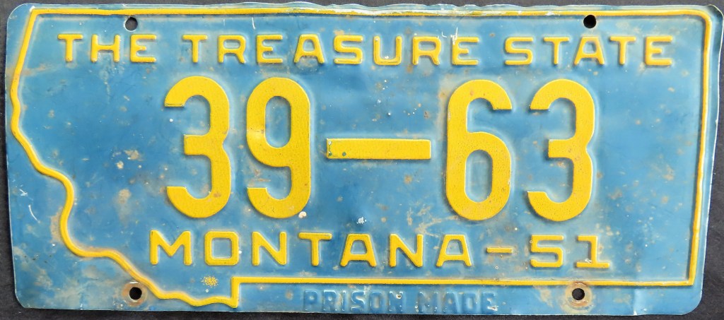
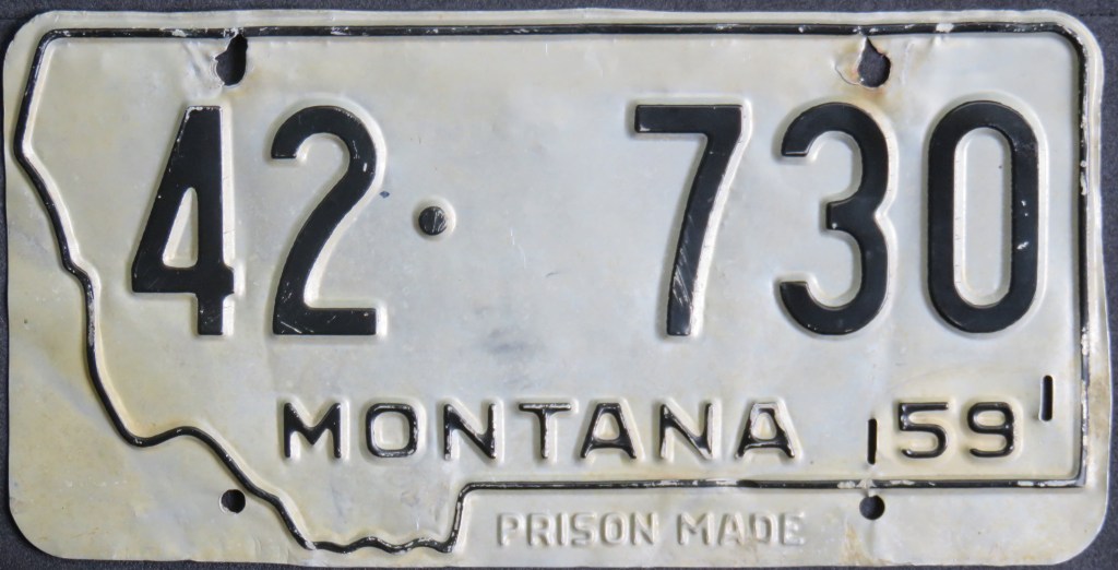
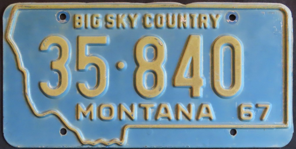
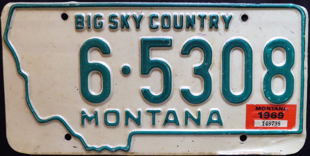
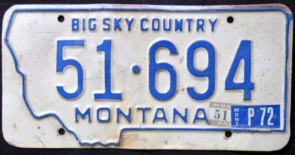
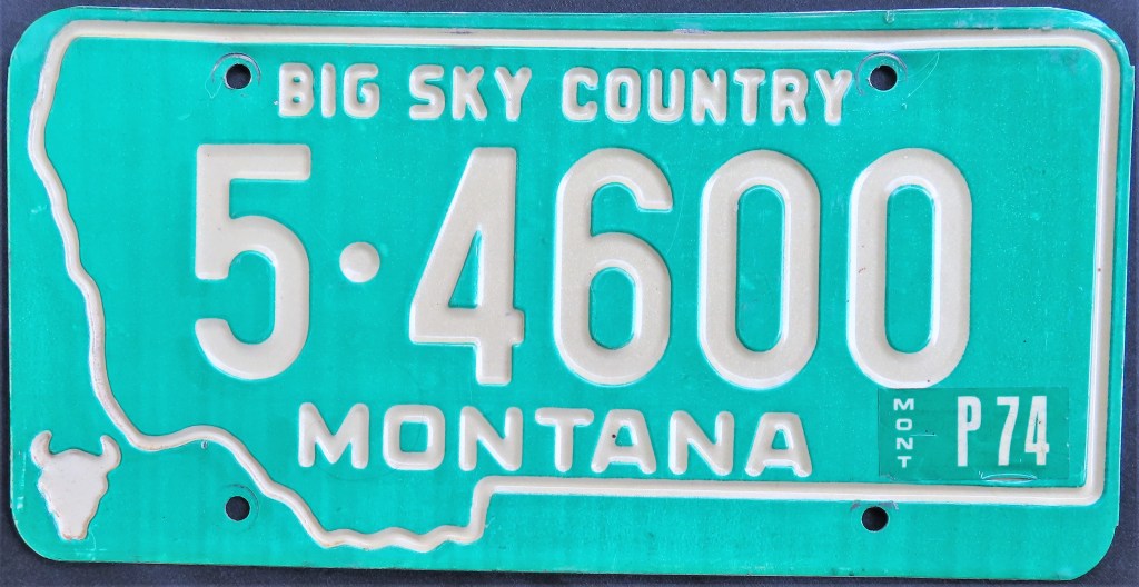
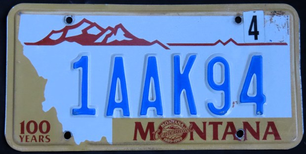
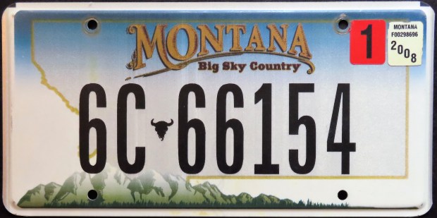
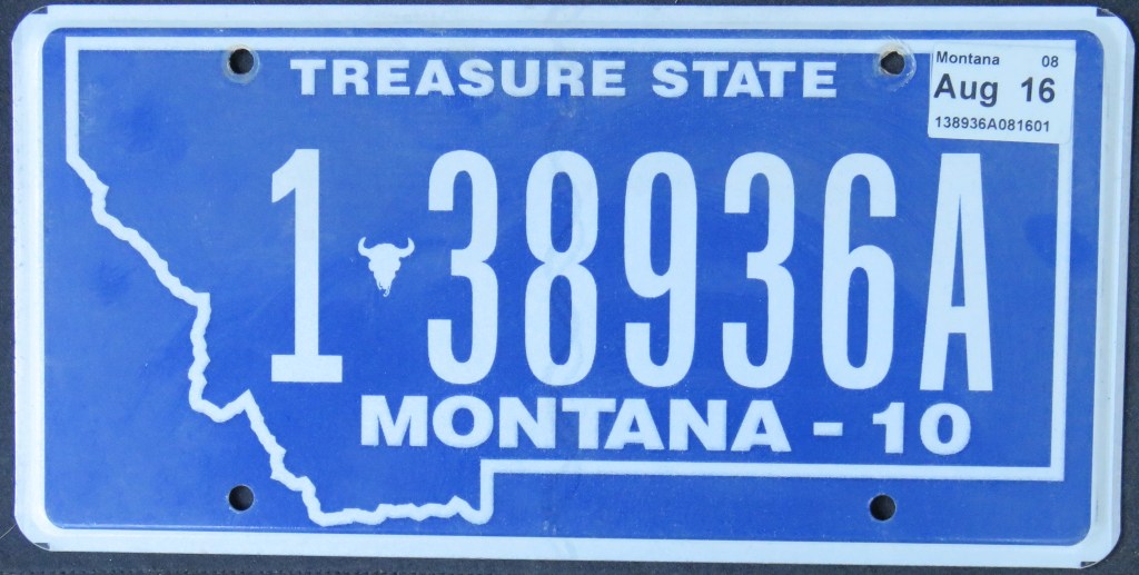
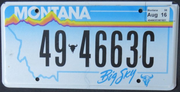
Montana has used a state map outline for decades. A steer head has also appeared consistently. Around 2012, the state started re-issuing old bases in flat format to those requesting them, so the Centennial base and sky base featured above are actually issued at that point or later, though the original versions were in 1988 and 2000, respectively. The blue “Treasure State” base is considered a retro in that it mirrored the format of bases from the 1960s and 70s with a slogan prevalent starting in the 1950s and last used in 1966. In 2012, Montana gave motorists the option to bring back earlier designs. These newer versions differed slightly from the first go-arounds, mainly in that they were all flat and carried a letter at the end of the serial.
The 1968 base featured various minor modifications (primarily with the dies of the state name). The Centennial/Mt. Rainier base of 1987 transitioned to the seven-digit plate seen on the roads today.
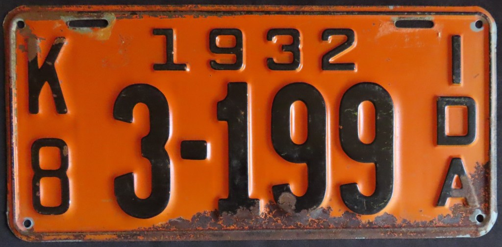
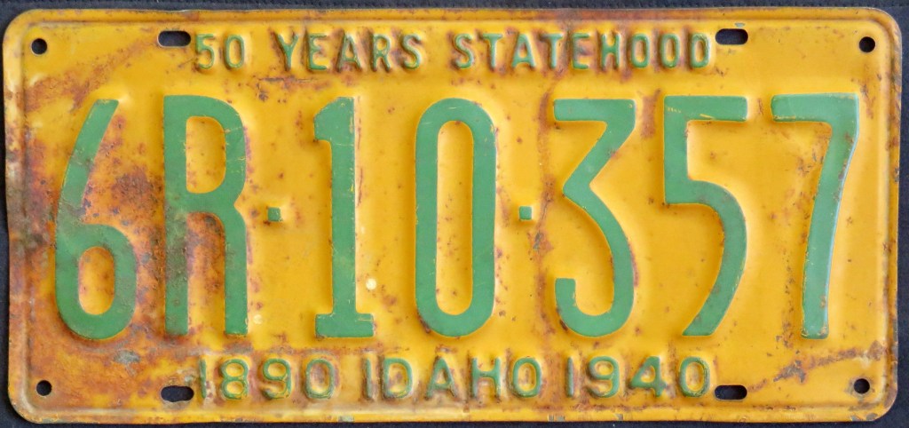
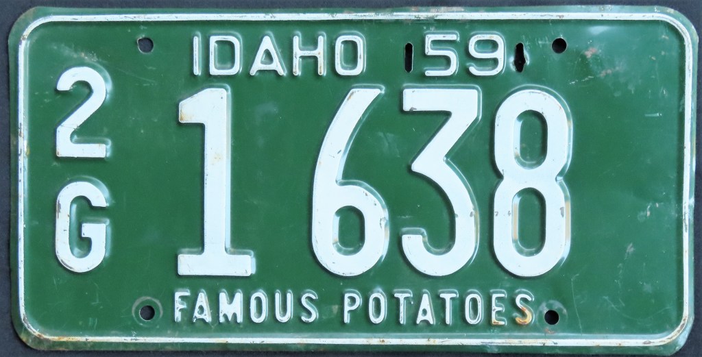
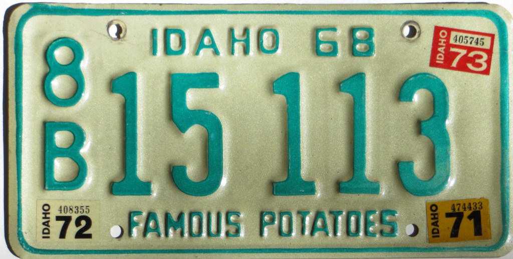
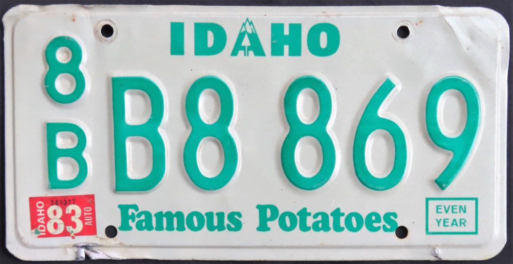
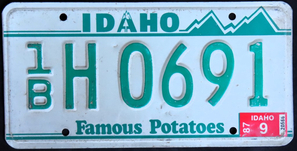
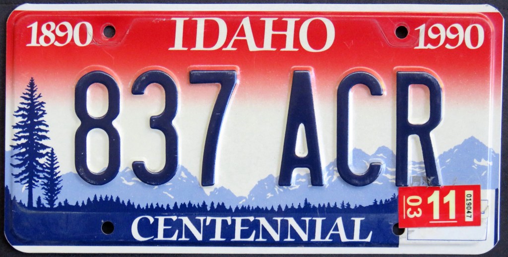
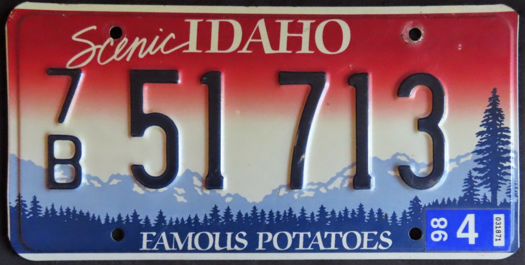
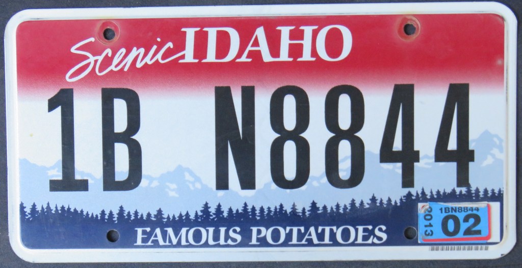
Idaho’s 1948 base has plenty of fans for its unusual baked potato decal. After that years of fairly straightforward, almost entirely green-and-white plates followed. Screened graphics were introduced in the 1980s – the “Snowcap” base in 1982 was modified with lines in 1986; a year later a full-replate occurred with a simple tweak of shortening the upper line to allow for a full height of stacked county codes. The colorful Centennial optional inspired the 1992 Scenic base, which is still going strong but with a serial that is black and flat instead of dark blue and embossed – one of a few minor changes.
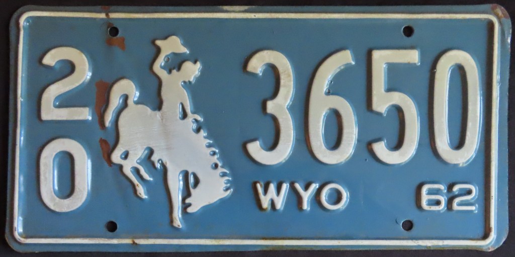
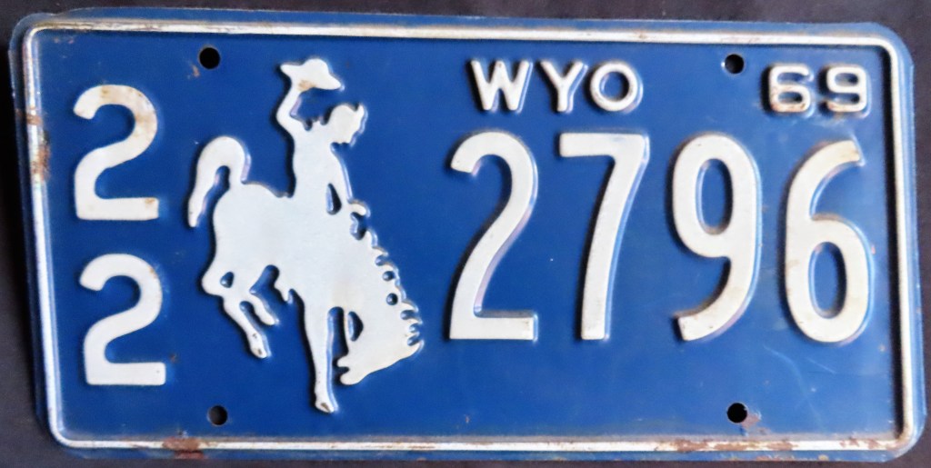
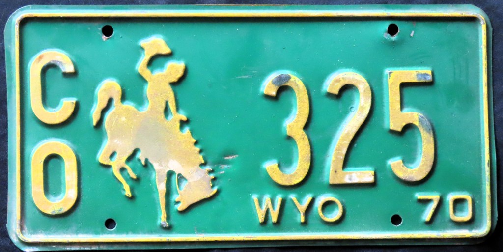
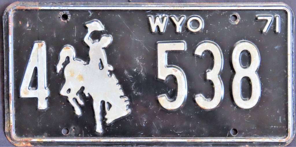
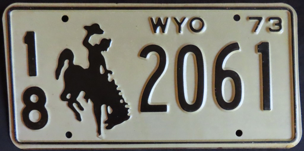
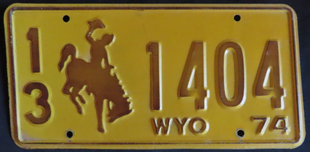
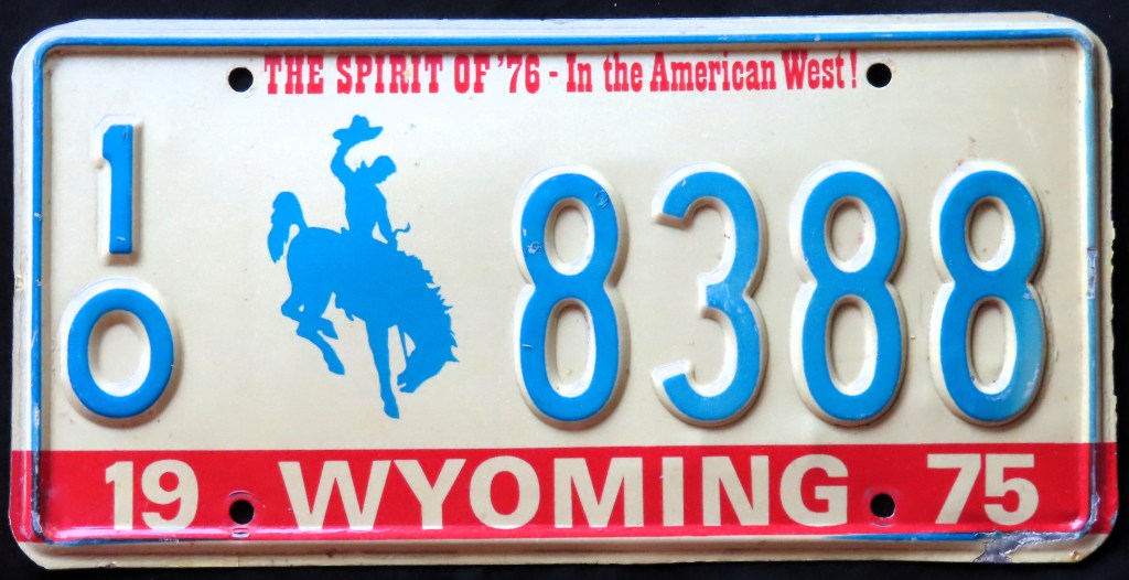
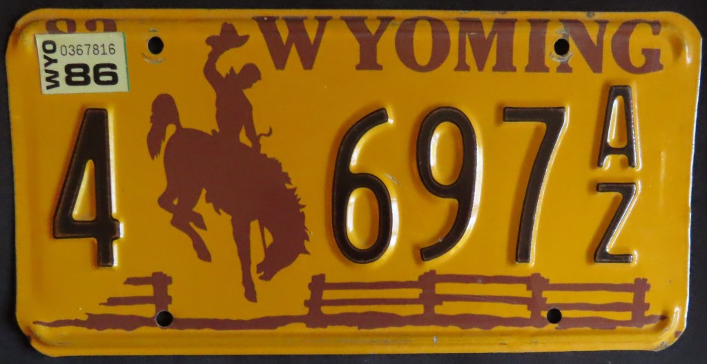
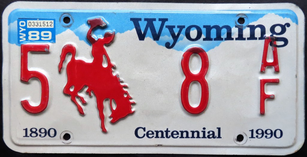
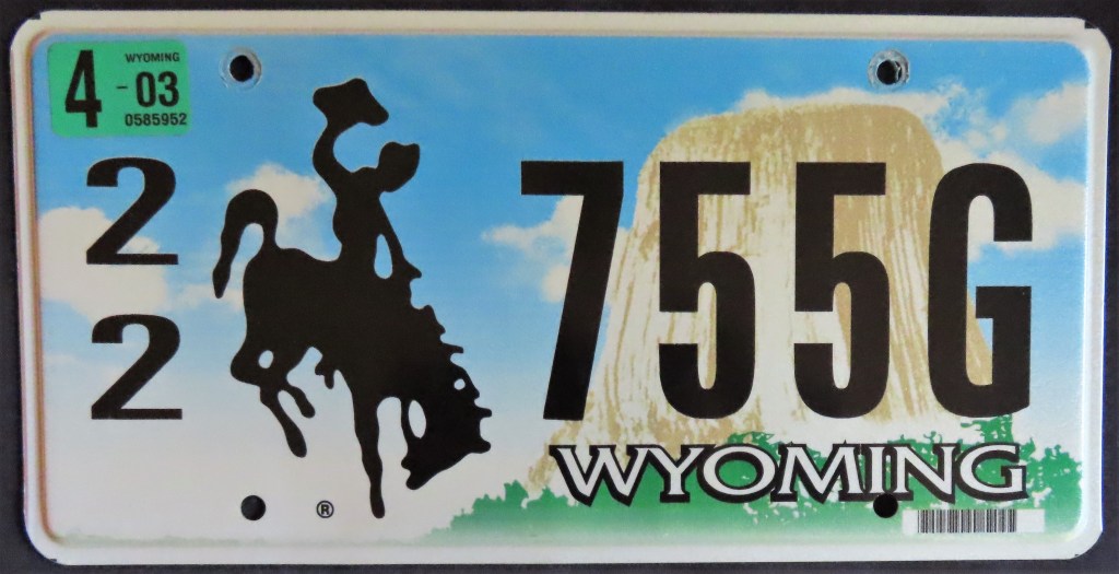
The Bucking Bronco is the longest-running graphic on U.S. license plates, having been part of the design every year since 1936. Many of the years between 1956 (when the U.S. went to a standardized license plate size) and 1975 (the U.S. Bicentennial base) have an abbreviated the state name. After the charming and unique slogan of the 1975 base, the state abandoned slogans apart from the state Centennial base. The 1978 base with the wooden fence is my all-time favorite design of any plate. Later bases featured Devils Tower National Monument and the Grand Tetons. The 2017 base (bottom center) is the most scenic to date but makes the bucking bronco look a little out of place. The newest base, introduced in 2024, incorporates the state flag.
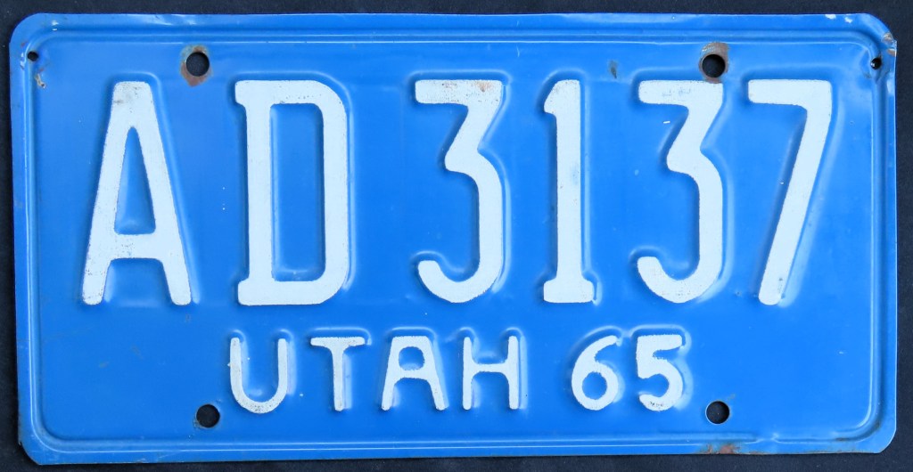
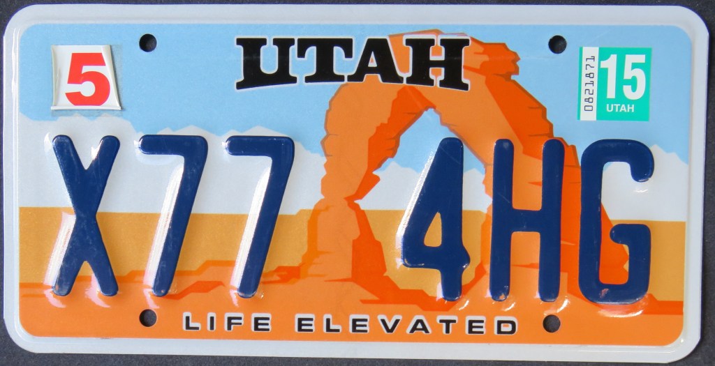
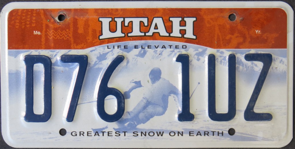
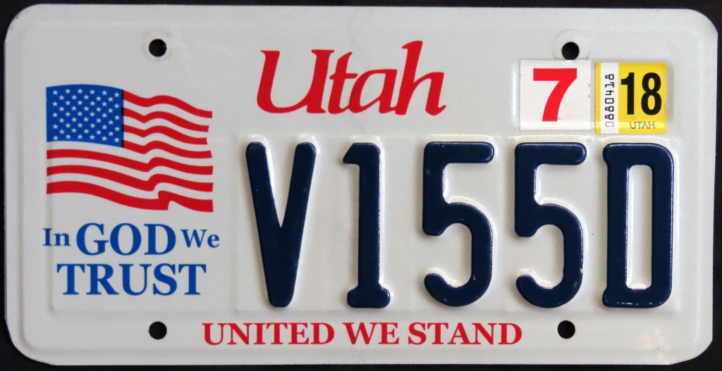
You might not know that Utah is The Beehive State, though the 1975 base makes a clever reference to it. That base underwent a couple of modifications, including the dropping of the beehive and later, the screening of the state name. The 1986 base promoted the state’s skiing potential with a catchy slogan to accompany an appealing graphic combo at the top. Similar to Idaho, the Utah Centennial “Delicate Arch” plate started as an extra-cost optional (the state name went from white-outlined-in-blue to just dark blue) and then became a general issue. Unlike Idaho, however, as a general issue it ran concurrently with another plate (the Ski plate). This practice of having multiple general issue bases to choose from has continued since; each got a redesign in 2008 with a new tourism slogan “Life Elevated,” and then in 2017 faith-subscribing residents could sign up for the In God We Trust plate. Note that the current ski plate features a graphic of Heidi Voelker, an Olympian who became the first living human and woman depicted on a license plate.
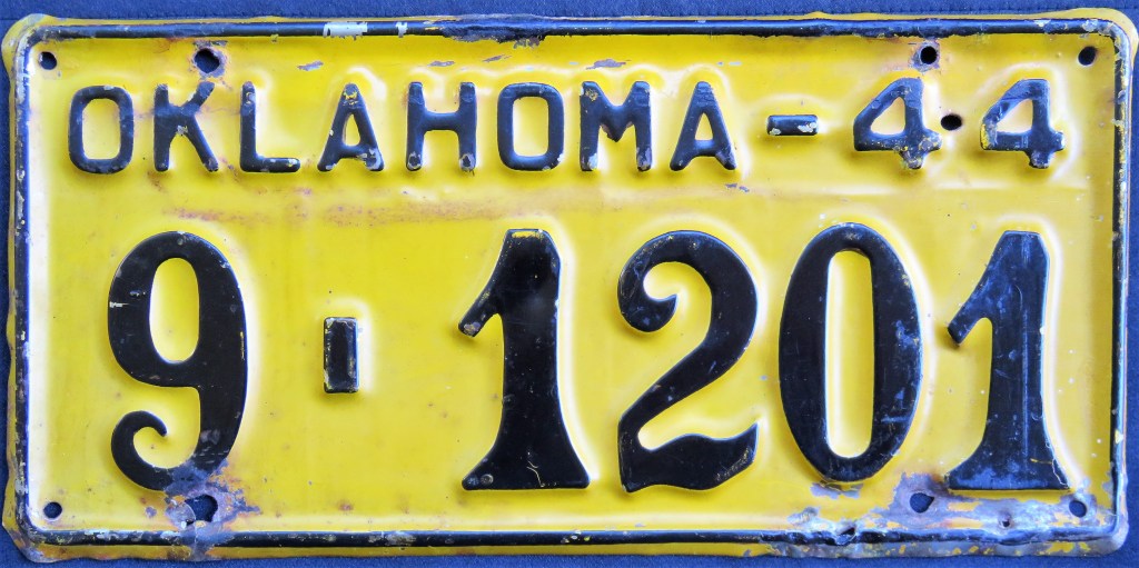
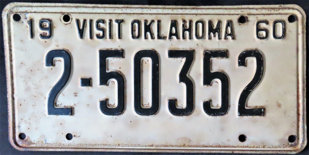
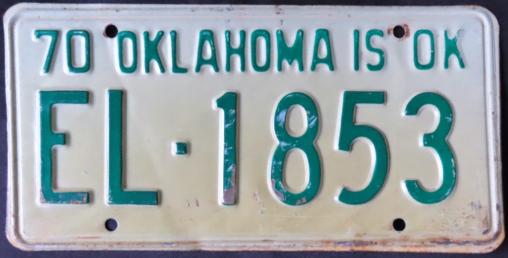
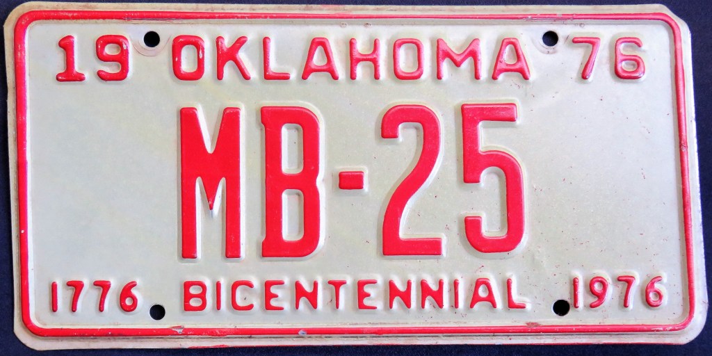
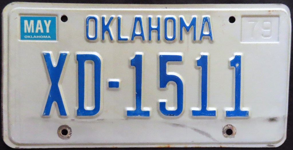
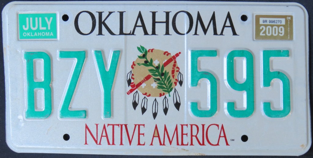
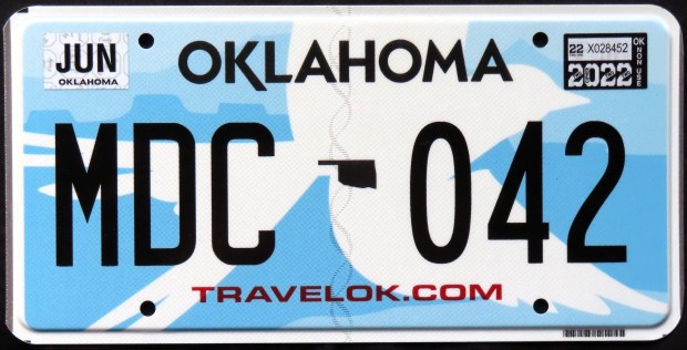
Interesting Oklahoma plates over the years include the 1944 issue with unusual script; the “Is OK” slogan found on the 1970 plate, the 1982 sun base, and others; the buckskin bases of 1989 and 1994; the 2017 scissor-tailed flycatcher, double slogan base, later modified to have just one slogan; and the “Iconic Oklahoma” design of 2024.
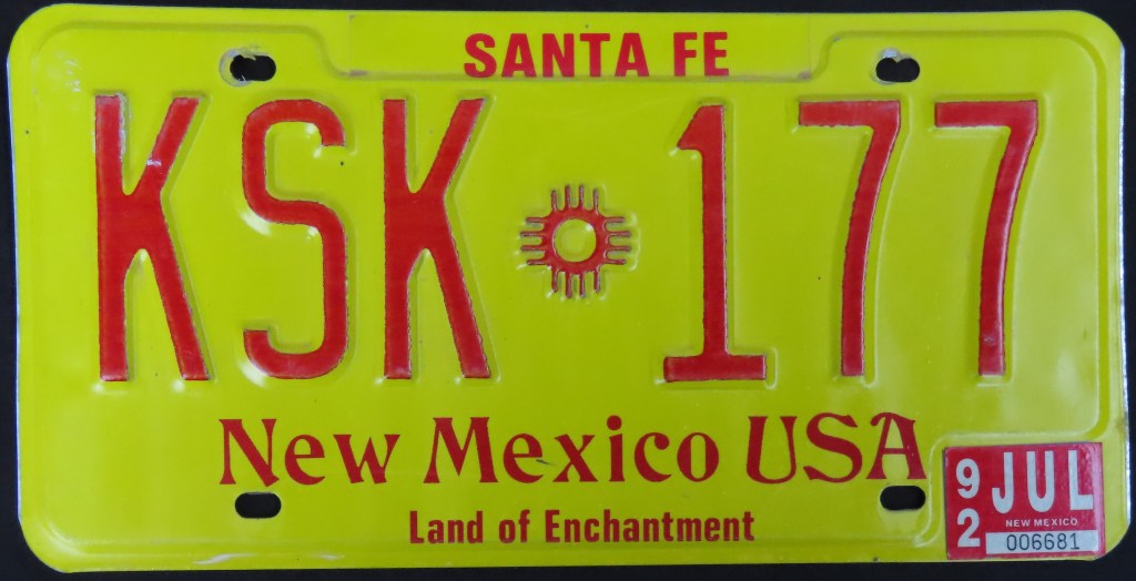
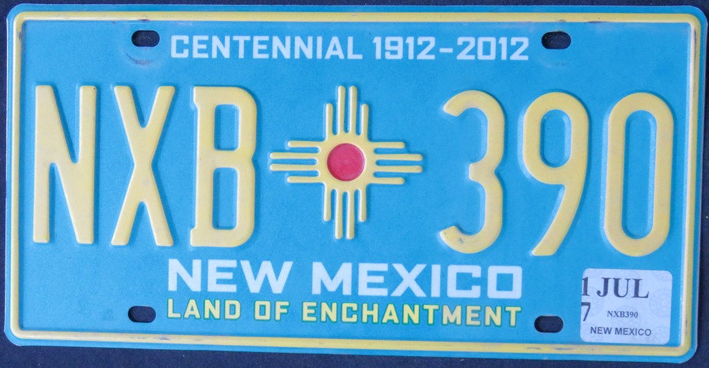
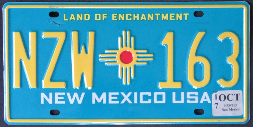
The longtime slogan “Land of Enchantment” continues to be on the bases of today. Like Utah, New Mexico offers motorists a choice of general issuances. The “Yucca” base has been on the roads since 1991, and the turquoise base (which started off as a Centennial) along with the more recent “Chile Capital of the World” base are the other choices. The design of the hot air balloon was an option from 1999 to 2010. The Chile plate is the first one since 1927 NOT to include the “Zia,” a sun symbol from ancient times tied to Native American culture.
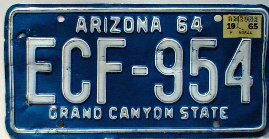
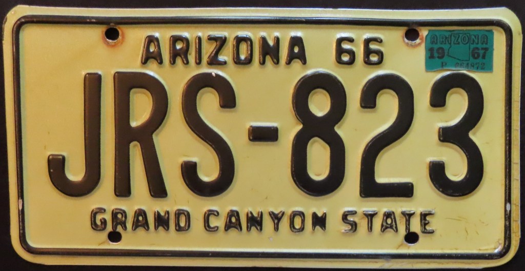
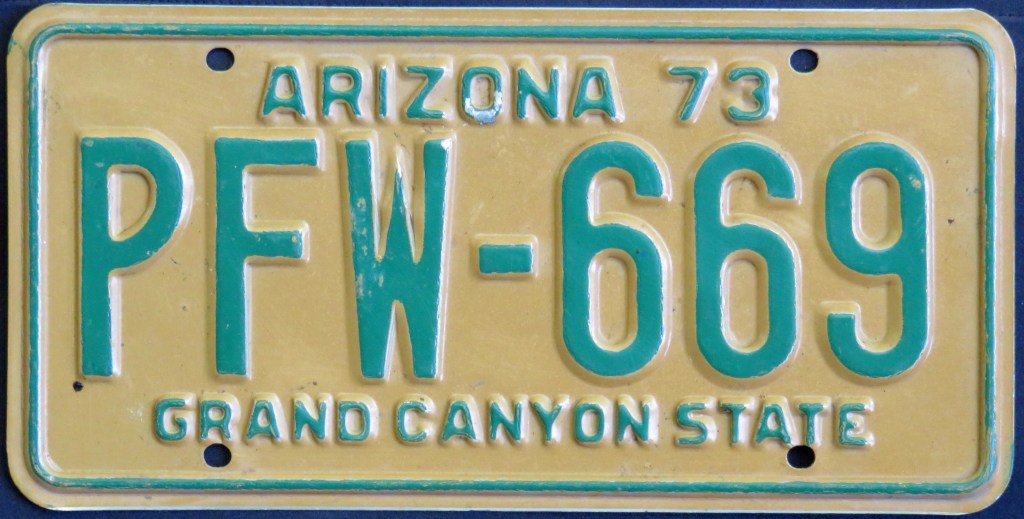
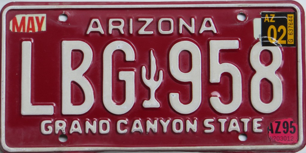
The desert scene plate, debuting in 1996, was the first fully graphic plate for Arizona. “Grand Canyon State” has appeared on every general issue since 1940 – almost exactly as long as “Land of Enchantment” has been on the plates of neighboring New Mexico. The white-on-maroon base started assignment in 1980 and had a few barely-discernible die changes (another subtle change being a shift in the slogan placement, compare where the letters sit above the left bolt hole). The desert scene base has also had a couple tweaks, most noticeably in the number of characters and going from embossed to flat, but also, as ADP9434 and BVC7826 illustrate, a minor shift in the serial placement (compare how close the first letter is to the cactus). I don’t often spot such differences, so thanks to Dave* and others for making them known.
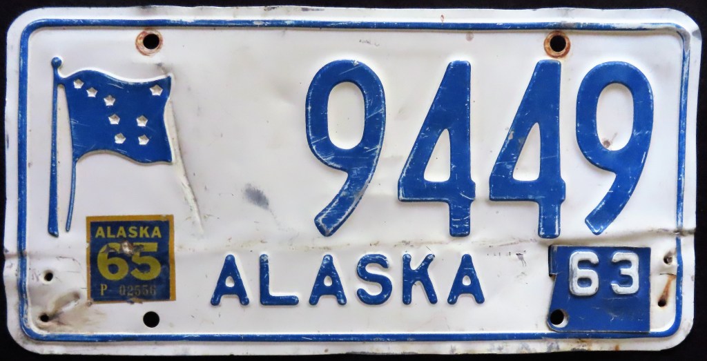
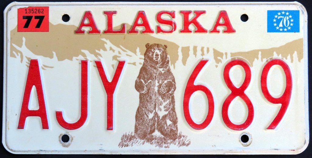
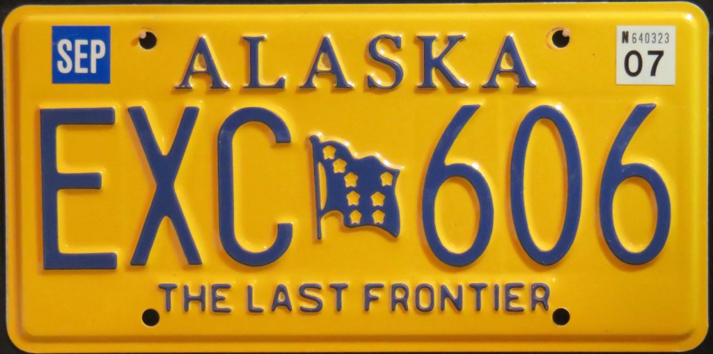
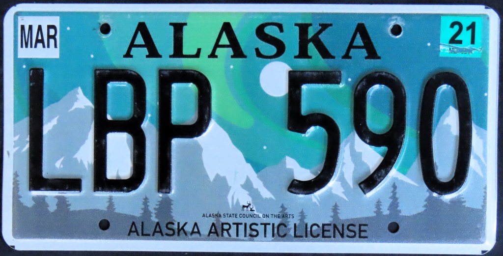
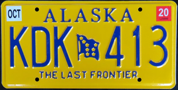
The 1967 “North To the Future” plate with the totem pole and stylized state name font is one of the best plates ever, in my opinion. Another all-time great is the U.S. Bicentennial base with the standing bear against a mountain backdrop. And completing a trifecta is the unusual 1998 base which celebrates the anniversary of the Alaska Gold Rush. Apart from these three, the state has often used a state flag, including a couple of different runs of the blue-on-gold “Last Frontier” base. The bear also made a comeback, appearing on a no-cost alternate 30 years after the first bear plate. In 2019 Alaska introduced a no-cost optional celebrating the arts, with a pretty Northern Lights scene. This plate was revised a year later, with lighter graphics.
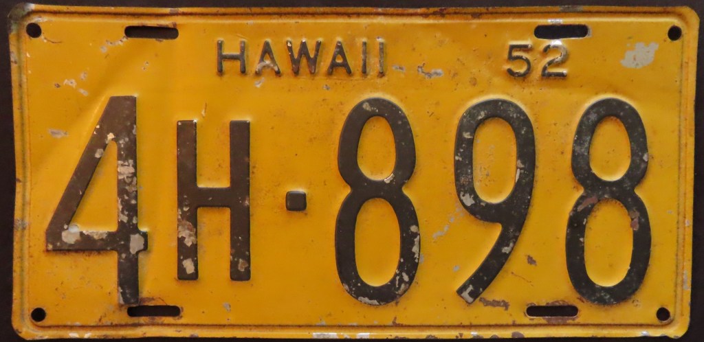
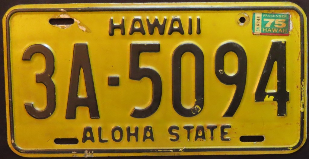
Hawaii splashed onto the graphic game with a plate featuring King Kamehameha, a former ruler of Hawaii. The King appeared on the following base (1981), but since 1991 it’s been just the rainbow base – Hawaii is known for having spectacular rainbows, which have cultural significance there as well.